
17 New Rules for Successful E-Commerce Websites
The author's views are entirely their own (excluding the unlikely event of hypnosis) and may not always reflect the views of Moz.
E-commerce has, for the most part, evolved far beyond the late 1990's cliches of hair-wrenching, sanity-shattering slogs through yet another "clever" designer's take on how shopping on the web should be. Standards prevailed, usability won out, and we're now free to spend our collective $107 billion (Census.gov e-commerce stats) per annum.
That said... It can still get better. Online shopping is in, if not infancy, at least a toddler stage. The advances that brought us here have made the process simpler and easier than ever, but some sites still haven't caught on.
Since I've been doing an inordinate amount of online shopping recently (thanks to the theft last weekend and my upcoming lengthy trip to China), I feel uniquely qualified to share a few e-commerce site design tips - 17 tips, actually. Enjoy.
_
_
#1 - Tell Me Where I Am
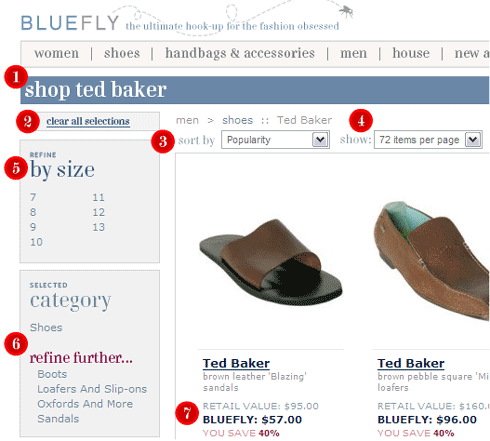
Whenever a user is navigating inside a store with more than 1 sub-level of navigation, it's critical to show them where in the site structure they are. This should be accomplished with headlines, sub-headers (when necessary) and breadcrumbs (e.g. Home > Category > Sub-cat > Product).
#2 - Let Me Remove Narrowing Options
When a user starts to "narrow" their navigation inside a particular category (in this case by selecting the designer "Ted Baker"), it's only right to allow them to remove those navigation selections rather than forcing the use of repetitive "back button" clicks.
#3 - Allow Me to Sort Every Which Way
The standards are "Price - low to high," "Price - high to low," "Popularity," aka "Best Selling," "Featured," "User Rating" (or "Editor Rating" if you don't have users rate products), and "New" or "Latest." You can eliminate "Featured" if you've got nothing to push, but all the other sorting options must exist (assuming it's possible to do so).
#4 - Show Me the Products
Unless you've got more than 200 products total in a sub-category, it's only right to offer the user the option of seeing every product on one page. Broadband has rendered the load time argument nearly irrelevant and I personally (along with Mystery Guest) can't stand sites lacking the feature.
#5 - Refining Options Bring Joy
If you can provide the user with a useful refinement option, you've made their experience better. In the instance of sizing, this is particularly important, as users loathe finding that "perfect" piece of apparel, only to discover you don't carry it in their size.
#6 - The More Specifics, the Better
Rule #6 is so worthwhile, I'm repeating it. Actually, #7 serves to illustrate a substantive difference between refining your browsing in a section (as #6 shows) vs. navigating to a new sub-category. Offering the latter as an option where relevant and valuable (and when the number of items warrants it) is a wise decision.
#7 - Tell Me What it Costs & What I'm Saving
Some product category pages shows items without the detail users are craving. It's particularly important for discount sites (anything off MSRP helps conversions) to show pricing, but nearly every website can benefit from providing an extra bit of detail before the click to the product page. Tell them materials, give a tiny description or list the sizes/colors/options you have in stock.
_
_
#8 - Keep the Search Bar in Easy Reach
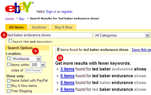
When a search has been performed, don't just show the search and the results, do like the engines and make the search bar front and center, while maintaining the user's query in the box for potential modification.
#9 - Give Me Search Refinement Options
If you have an advanced searching system, or can allow users to select prices, options, colors, sizes, models, etc, do it. Your bottom line will thank you - users often rate "search" as the most frustrating part of many e-commerce sites (apologies for not having the study to cite here).
#10 - Get as Close As You Can Get (while staying relevant)
In the example above, eBay has done a masterful job showing which queries would have produced results. This advanced technique should be a wake-up call to others.
_
_
#11 - Share the Critical "Fit" Information
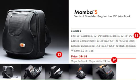
Many products are designed to "fit" certain criteria, whether it's a laptop (in this case) or a human body (with clothes) or another piece of equipment (when compatibility matters). In every instance of potential matches, show the critical information in the product details. I can't tell you how many laptop bag sites I browsed before finding this one that actually showed which laptop sizes it was intended for.
#12 - Tell Me If You've Got It
There are still sites out there that let you click "add to cart" or even "checkout" before discovering the awful truth - no more of your SKU in stock. It's the kind of experience that will lead you to permanently switch e-tailers.
#13 - You Can Never Have Too Many Photos
Since you don't get to see the item in real life, photos, reviews, videos and even fancy, 3D interfaces (where appropriate) are invaluable to helping the user feel like they've "experienced" the product prior to purchase. One photo, from one angle, sent by the manufacturer to every online store doesn't cut it. Go above and beyond the call of visual duty and conversions will skyrocket - links might, too.
_
_
#14 - Let Me See Delivery Options
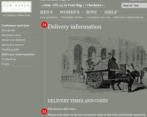
There is a certain subset of users that has to see the delivery options before they start shopping. Older generations often fit this stereotype, but those baby boomers still have a lot of online spending years to go, so don't ignore them. It's best to make the link obvious in the permanent navigation (it's most customarily at the bottom of each page).
# 15 - If You Won't Send it To Me, Tell Me Who Will
In the example, Ted Baker is refusing to sell me the $200 dress shoes I want, but what's worse is that he won't tell me who will ship them to his old colony. I ended up finding them on Amazon.com, eventually, but Ted's losing out on his commission with them by not providing the link (and if I wasn't so dedicated to the brand, he'd probably lose the sale, too).
_
_
#16 - Reassure Me With Email
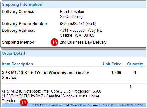
I panicked earlier tonight when I realized the replacement laptop I ordered may not have been shipped quickly enough to arrive in time for my trip to China (and no one wants to spend 28 hours on planes without a lappy). Luckily, Dell's order confirmation proved that I'd chosen wisely. Replicate this experience for your own customers, rather than leaving them in the dark (or, worse, crowding up your customer service dept. with e-mails that could have been answered in an automated fashion).
#17 - Give All the Order Details ASAP
When you send out order confirmations, make sure to include all of the product details to re-assure the buyer that they've selected properly. If I accidentally ordered the size 9 instead of size 8, I want to be able to fix it before the package arrives.
Hopefully, these techniques will find their way to your e-commerce sites, and when they don't, you'll grab the project manager and point them to this blog post. Together, we'll make the Internet an even better place to shop.


Comments
Please keep your comments TAGFEE by following the community etiquette
Comments are closed. Got a burning question? Head to our Q&A section to start a new conversation.