

7 Cutting Edge Web Design Trends (that Can Actually Improve SEO)
The author's views are entirely their own (excluding the unlikely event of hypnosis) and may not always reflect the views of Moz.
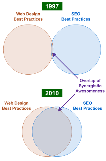
As the worlds of web design and SEO merge ever closer, we've been seeing design-specific elements produce a positive impact on SEO for the sites that employ them. It's terrific news for SEOs who love design and are capable of and passionate about making it part of their repertoire. It's also great for designers who find that as they evolved from Flash designs to machine-readable CSS and separated markup from content, they've earned more links and more organic search love.
In this post, I'll walk through examples of those design practices in use and describe how they can help improve your opportunity for organic search rankings and traffic.
#1 - Designing that Elicits & Conveys Emotion
A phenomenal article from Aarron Walter of Mailchimp on ThinkVitamin - Emotional Interface Design: The Gateway to Passionate Users - deeply explores the trend of designers using their talents to imprint emotion on users. Personally, I love this practice, and professionally, I see it as incredibly valuable for SEO, too.
Rather than simply providing a user with information, these sites attempt to convey a sense of the companies, products and services they represent in a tangible way.
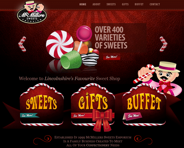
For McMiller's Sweets, below, the website expresses the brand's humor, whimsy and obsession with their product. I only wish I could buy online - there'd be a few boxes headed for the SEOmoz offices right now.
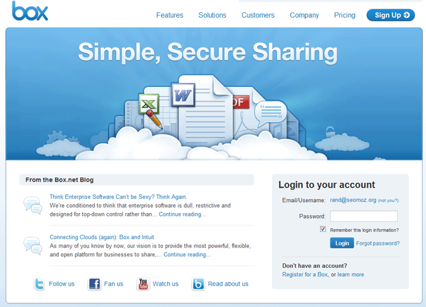
Box.net, an enterprise-focused software company, aims to achieve an air of simplicity and a feeling of the ease that comes from using a basic, consumer application but targeted at a business audience. Their redesign has me convinced - it's light and airy, it's up in the clouds (perhaps a double-meaning since they host in "the cloud") and it even calls out the "sexiness" of the application.
When users are emotionally invested in the websites they visit, they're more likely to:
- Link
- Share
- Contribute Content
- Participate
- Remain Loyal
- Invest in the Experience
- Browse more Pages
All of these have either first or second-order impacts on SEO in a positive way.
#2 - The Scroll-Triggered Call-to-Action
Sometimes, you don't want to overwhelm content with calls-to-action... At least, not until you're fairly certain your visitor has finished reading. That's where the brilliance of the scroll-triggered call-to-action comes in.
Browse any article on the New York Times website and you'll see this behavior in action, driving you to read the next article in the series only after you've reached the bottom of the current piece:
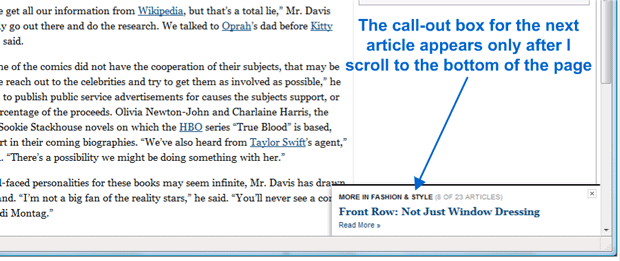
It's great for boosting page views, but also drives more awareness of those pieces, improving links and driving up visibility for previously less-well-publicized works. My guess is that clicks are quite high.
In the next example, the OKCupid Blog leverages precisely the same tactic:
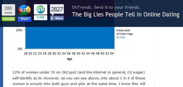
This use case might be even more brilliant. After wrapping up a remarkable article about what statistics tell us not to do in online dating, my first instinct is to share the piece with some single friends. OKCupid's flawlessly timed, dropdown overlay synchs with this internal compulsion and makes it easy to tweet, like, stumble or buzz away.
Scrolling + triggers = more browsing, more awareness and more sharing (and I think the potential applications for SEO are far greater in quantity than just what's been shared above).
#3 - User Badges
If your users are passionate about your site and their experience or participation, why not make it easy to share?
For years, sites have been offering users the virtual incentives of points, badges and status to encourage greater participation. Andrew Follet from Concept Feedback authored a brilliant piece analyzing this precise behavior and exposing some terrific examples.
We've noticed an interesting behavior as it relates to user badges as well, and it's spurred me to whiteboard the following chart numerous times for those who have online communities considering SEO:
![]()
The lesson? Make great communities, encourage participation and reward your users with badges that will make their sites look good. It's the online equivalent of giving out high quality, well designed t-shirts - fans won't just wear them to bed; they'll actually show off your brand.
#4 - The Animated HTML Multiheader
I wrote about the multiheader a long time ago, and the evolution of design has made them tremendously more compelling and useful since then. Case-in-point, Unbounce, who has 5 different messages/features on their homepage all accessible to engines and all part of a single multiheader. I've screencaptured them elegantly "swooshing" in and out of the headline position:
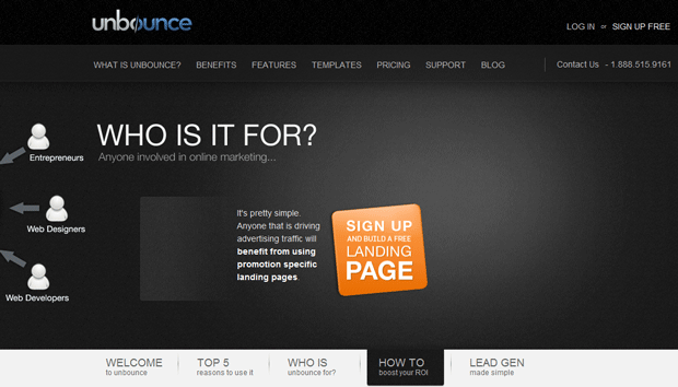
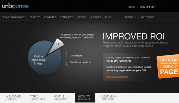
The advantage is two-fold - more content on the homepage that's accessible to search engines (thanks to clever CSS/HTML usage) and everyone who links to any one version is concentrating the link juice singularly on the home page. In some cases, that could cause problems, but in others, it's a great opportunity to leverage design to focus the links you acquire where you need them most.
BTW - Speaking of Unbounce, If you have yet to read Oli Gardner's 12-Step Landing Page Rehab Program, you're seriously missing out.
#5 - Sexy, Embeddable Infographics
Infographic linkbait is certainly all the rage these days, and I think it's a well-justified trend. The brilliant part is that you benefit by producing the infographic and other bloggers benefit by sharing it and attracting views, attention and links of their own. So long as the embed works seemlessly and the infographic is compelling, you're off to the link acquisition races.
Some examples I enjoyed came from Smashing Magazine, who put together this piece on programming (and the how-to behind it's creation):

And this smart contribution from Visual Economics:
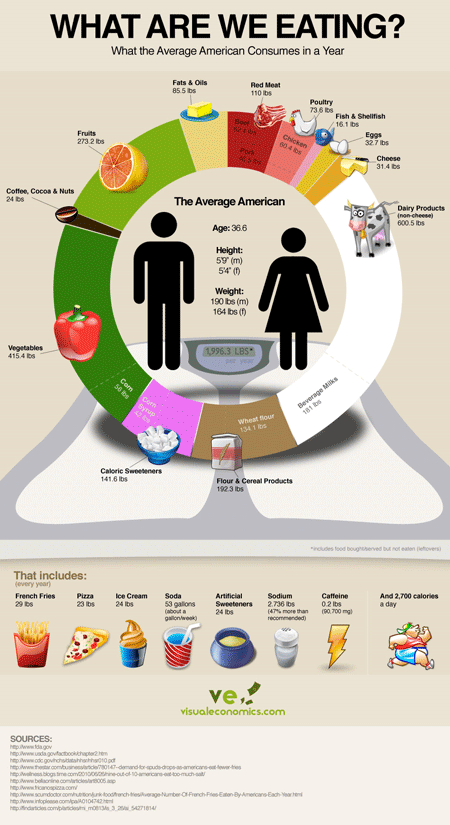
As with badges, the "beauty rule" applies - the sexier your infographic (and the most interesting/useful/compelling the content), the higher adoption will be.
#6 - Designing Around Illustration (with CSS)
It used to be that I'd see a website built around illustrations and artistry and shake my head in sadness, knowing that the beauty of the UI was unlikely to be experienced by anyone except those coming via type-in. Today, with the amazing progress of CSS, sites like Carbon Made can have their design cake and eat their SEO, too.
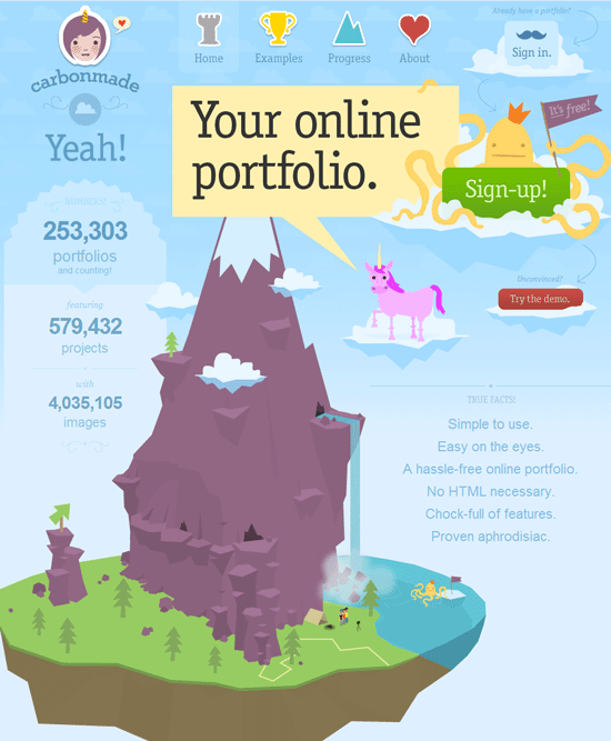
Google's "text only" cache shows every word you can see in the screenshot - we've come a long way indeed. And, darn it if that design doesn't make me want to just climb a mountain and jump off a cliff into an octopus-filled lake below... errr.. make an online portfolio (yeah, that's the one!)
For another look, check out Ruby on Rails developers, Pioneers:
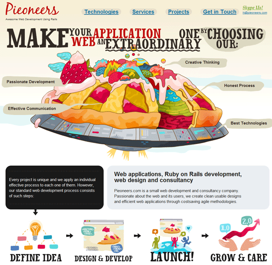
Pretty, accessible and indexable, what more could an SEO ask?
#7 - Creative Content Formats Unleashed
Sometimes, you visit a site that stands out from everything else you've seen on the web in the past. Historically, many of those sites have also been tragically obscured from search engines. Nowadays, a new breed is emerging, showing off massive creativity, brilliance in design innovation and a compelling combination of link-worthiness and search-accessibility.
A few of my favorite recent stumbles into this realm include:
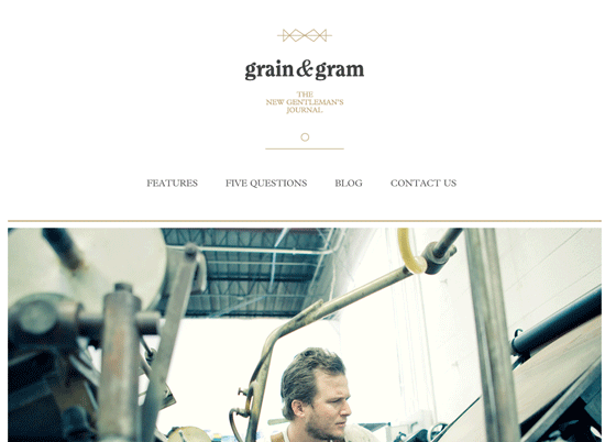
Above: Grain and Gram Gentleman's Journal
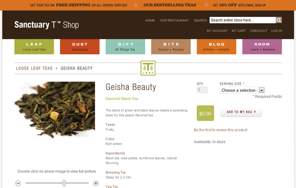
Above: Sanctuary T Shop (who knew a small e-commerce shop could be this pretty?)
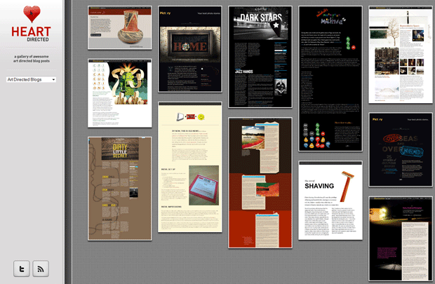
Above: Heart Directed (a great place to find more remarkable creative formats, though lacking the machine readable content to be an SEO example itself)
It's a great time to be on the web, thinking about SEO, design and the brilliant things that can happen when they overlap strategically. Here's to hoping that more of us who invest in organic search traffic will bolster that task with the power amazing design can bring. It's not just more links - it's greater engagement and a higher liklihood that sharing of all kinds will occur. However the search engines evolve, you can be sure this is the type of behavior they'll seek to reward.
p.s. If design inspires you, I'd recommend checking out Drawar and Six Revisions list of 10 Fresh Galleries for Inspiration


Comments
Please keep your comments TAGFEE by following the community etiquette
Comments are closed. Got a burning question? Head to our Q&A section to start a new conversation.