

Advanced Link Analysis Charts
Bored of sorting massive lists of links in all kinds of different directions to understand the link profile of a new site?
Struggle to understand how to gather actual insights about link profiles from lists of thousands of links and persuade management of the actions needed?
Don't panic. Help is at hand.
I'm going to share some data visualisation tips today that I reckon I could use to beat up on Rand in a presentation-off (umm, again). We have recently been doing some deep dives into clients' and prospects' link profiles which gave me an excuse to mash up some Linkscape API data in Excel. I've used Linkscape data, but you could use any link analysis tool you like as long as you can get some metric to sort the linking domain by (I have used domain mozTrust in most of the examples below). Equally, I've used Excel, but you can use any data analysis package you like. If you want to use Excel, you will need the Data Analysis Toolpak (for the histogram function).
I'll get into how to make the charts in a minute, but first I'm going to just show you some pretty pictures:
Impress the boss
This one is of questionable use (I think there are better ways of actually visualising the data) but it's pretty, and bosses like pretty (allegedly). This is a surface chart of number of linking domains by domain mozTrust shown across 4 data points - all links, links to the homepage and links to the next two strongest pages:
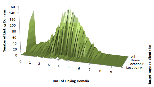
The bit of insight this does give us at a glance is that the vast majority of the site's very low DmT links go to the homepage and that the most trusted domains linking to the site (DmT >= 8) don't link to the homepage or the next two strongest pages.
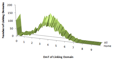
The same chart just showing links to the homepage compared to all links which shows the top end a litle more clearly:
Gathering insights
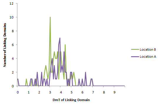
I think this data is actually easier to see as a line chart like this (locations A and B are the top two strongest pages on the site after the homepage):

What we just about see here is some bumps up at the top end of the DmT scale in the light blue line which is the same bit of insight I mentioned above.
Drilling down
Diving into this data to show only the top end of the DmT scale, we get:
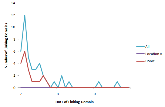
And we see that although the homepage and these top two location pages are the most powerful pages on the site, they are not the ones with the links from the biggest / most trusted sites. This is an area for further examination that would be hard to discover by looking at endless lists of links.
This is just an example of the kind of insight you can gather. I'm showing off tools and techniques here rather than specific insights. I'll leave you to do your own playing to discover interesting things about your clients and competitors. I didn't know what I was going to find when I started diving into the data for this site. You likely won't know either, but graphs are great discovery tools. Sometimes, of course you find nothing of interest:
Comparing just the top two pages doesn't give us any very meaningful insights except that the big links out at 6.5-7 DmT to location A probably explain why it's more powerful than B. It might be more insightful at a lower granularity.
Equally, I haven't yet learnt to understand the meaning that I am sure is buried in charts like this one:
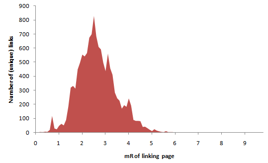
This is the number of links to a whole site by the mR of the linking page. Like the mythical guys who can understand network traffic by watching LEDs blink on routers, I'd love to be able to look at this kind of chart and really understand things. The closest I've got so far is that I think these charts should look roughly smooth in the absence of manipulation. If we assume that the difficulty of acquiring a link is roughly correlated to its strength and that we get links at a rate inversely proportional to their difficulty, then I think this chart should look roughly like a Poisson distribution:
Which this one does, so I'm happy.
Persuading management / bosses
The next thing that some of these charts helps with is making the case to management when you know something is true, but they need more persuading. This next example takes two different sites (neither of them is the site above) that are in different industries but have remarkably similar link characteristics at the macro level (don't ask me how I found these sites - I am just that sad). The spider chart shows how similar they are:
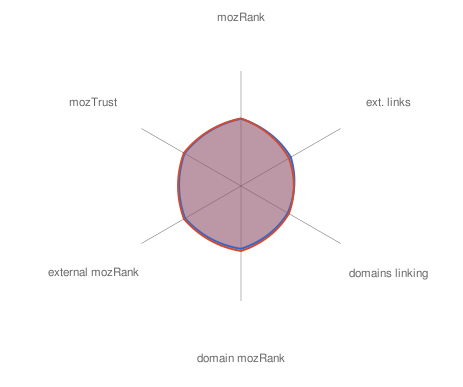
However, if we dig in a little further, we find quite a difference behind the scenes:
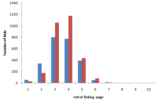
The red site seems to have loads more decent links (mR 4, 5, 6) than the blue site. So how does the blue site end up with similar domain metrics?
It's all about the relatively small number of very powerful links the blue site has. Zooming in on mR 6 & 7 links:
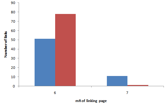
If you were just to look at this chart, you might imagine that the red site was getting more juice passed via these links than the blue site is. However, you'd be being fooled by the logarithmic scale. In terms of total juice passed by just these mR 6 and 7 links, the actual story is:
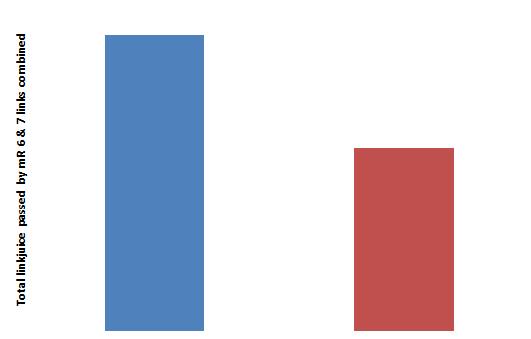
In other words, the blue site is competing almost purely on the basis of the big mR 7 links it has that the red site doesn't. That's kinda interesting in terms of strategy generation isn't it?
How do you do this analysis?
Pretty much everything in this post was generated using the histogram function in Excel running over Linkscape API data. It's pretty straightforward with the online help. The only gotchas I noticed that you might need to know about were:
- Align the 'bins' (which are the x-axis values on most of the charts above) either with mR / mT intervals (e.g. 1, 2, 3, 4, ...) or go much more granular (e.g. 0.1, 0.2, 0.3, ....). Anything in between tends to generate artifacts
- The bin range has to be on the same sheet as the data - if you try to pull in a bin range from another sheet, it fails silently
- If you want to do the surface chart, you need to do some interpolation between your points. In the examples above, I just did a linear interpolation (i.e. drawing a straight line between the different page levels) - so if the homepage has 100 mR 2 links and the next page has 50 mR 2 links, I just created 10 imaginary pages with 55, 60, 65, 70... mR 2 links to spread the surface out far enough to see it. This may not be the best way of doing things. I'd love to hear from anyone who has a better method
Thanks to foliovision for the photo from the ProSEO seminar.
The author's views are entirely their own (excluding the unlikely event of hypnosis) and may not always reflect the views of Moz.


Comments
Please keep your comments TAGFEE by following the community etiquette
Comments are closed. Got a burning question? Head to our Q&A section to start a new conversation.