
Moz Pro shows when AI Overviews appear so you can dominate visibility, not just rankings
Track and monitor the presence of AI Overviews in the SERPs for your target keywords to better inform your content strategy and stay ahead of the competition.
Our Latest Updates

AI Overviews now tracked in Keyword Explorer
You now have the ability to see when AI Overviews are included in the SERPs for your target keywords. Track and monitor AIO presence in Explore By Keyword to stay ahead of the competition and make strategic content decisions.
AI Overviews now tracked in Keyword Explorer
You now have the ability to see when AI Overviews are included in the SERPs for your target keywords. Track and monitor AIO presence in Explore By Keyword to stay ahead of the competition and make strategic content decisions.
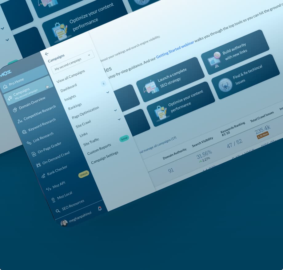
Introducing improved navigation in Moz Pro
The Moz Pro tools suite now features an all-new left-hand navigation menu. With hover actions, pop-out sub-menus, and a sleek new look, this improved design will help you better navigate the tools you love.
Introducing improved navigation in Moz Pro
The Moz Pro tools suite now features an all-new left-hand navigation menu. With hover actions, pop-out sub-menus, and a sleek new look, this improved design will help you better navigate the tools you love.

Streamline review management and improve response times with Reviews AI in Moz Local
The new Reviews AI feature in Moz Local can help you spend less time on better quality review responses. Engage with your customers quickly and efficiently while maintaining your brand’s voice and personality with this easy-to-use addition to the tool.
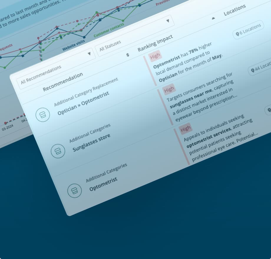
Increase visibility and stay competitive with Moz Local’s Listings AI feature
Listings AI in Moz Local streamlines competitive research and helps you stay ahead with data-driven profile update recommendations. Make sure potential customers can find you with up-to-date suggestions based on your industry and local business landscape.
Simplify your keyword research with AI-powered keyword suggestions by topic
Keyword Suggestions by Topic in Keyword Explorer will help you cut research time, discover smarter topics, and create content that ranks. This AI-powered feature helps you cut through the noise and eliminates manual sorting so you can spend more time creating great content.
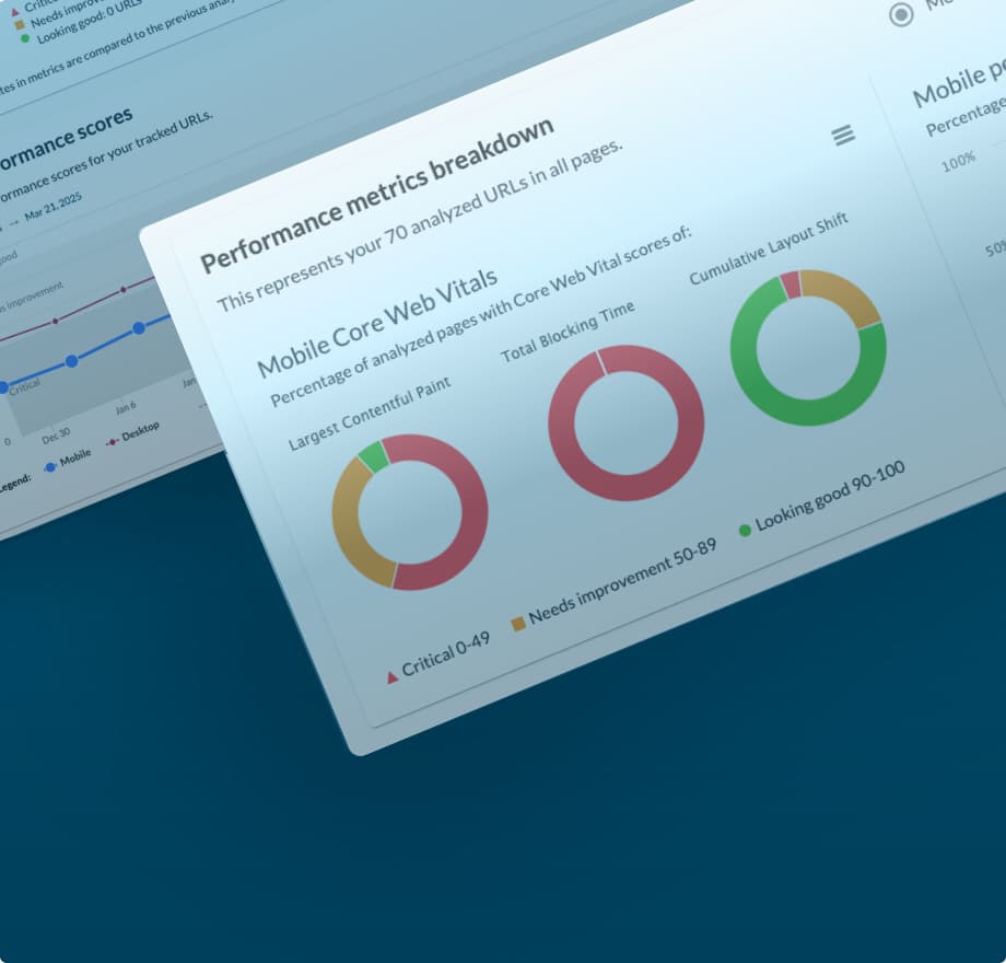
Performance Metrics updated to provide improved accuracy and better insights
We’re happy to announce that we’ve updated our system to provide you with more accurate and reliable performance scores in Performance Metrics in Moz Pro Campaigns. This improvement allows us to show you results that better reflect real-world performance.
Ready to discover the Moz tools?
With a new user experience, enhanced UI, and the introduction of Moz AI, it’s now even easier to keep an eye on your competition and dominate the SERPs. Give it a try with a free month of Moz Pro, on us.
From the Moz Blog

Elevating Your SEO Career and Team in the AI Era — Whiteboard Friday
![Convince Your Boss to Send You to MozCon 2025 [Plus Bonus Letter Template]](https://moz.rankious.com/_moz/images/blog/banners/eee4a4a8-d4aa-457e-80b1-0ffa186b88ff_2025-06-27-174747_coli.png?w=1180&h=400&auto=compress%2Cformat&fit=crop&dm=1751046467&s=c0894b475f5b75a6880f71d73b200b87)
Convince Your Boss to Send You to MozCon 2025 [Plus Bonus Letter Template]
The MozCon London 2025 Final Agenda Has Arrived!
