
Conversion Rate Lessons for Newspaper Paywalls
The author's views are entirely their own (excluding the unlikely event of hypnosis) and may not always reflect the views of Moz.
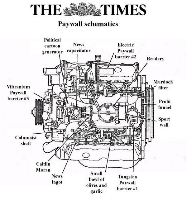
Paywalls are a hot topic online at the moment. In the UK The Times has recently put their whole site behind a pay wall and in early 2011 the New York Times is set to also go behind a pay wall. Both of these sites will join sites such as the Wall Street Journal which has been behind a paywall for some time already. For those who aren't familiar with how paywalls work this image might clear things up:
There has been an awful lot written online about paywalls so I'm going to try and cover new ground in this post and focus exclusively on the conversion rate issues which are unique to paywalls and how news sites might seek to overcome them. Although that's a pretty niche focus for this post hopefully the lessons and techniques can be applied to many different websites. Firstly, I'm going to look at the difficulties:
Objections To Overcome
In my eyes newspapers struggle with 3 unique problems which sets them slightly apart from other conversion funnels:
- Micropayments - People are unfamiliar with making small payments online. Much as you and I (being internet savvy hopefully!) are comfortable shelling out small payments and going through the hassle of remembering our verified by visa password, the average joe still isn't familiar with this.
- Subscriptions - Again, this is related to the above point but there's an objection which needs to be overcome which is paying for something regularly. We're all a lot more comfortable paying once for a single product, paying regularly for access to something is a concept we're a lot less familiar with.
- News is free right? - The last, but perhaps most obvious of the objections and the one people vocalise a lot is "surely I can just get my news from a free source?". We've been living in a news-free world now for about as long as the internet has been around and certainly the younger generations simply assume news should be free.
So if you're going to launch a paywall I think you have to consider these 3 factors very carefully. How are you going to overcome them?
Countering These Objections
Since there are 3 objections, I'm going to present 3 solutions!
- Smooth The Funnel - As one client mentioned to me recently, "we try to smooth the sides of our funnel as much as possible". This approach to conversion rate optimisation I think overcomes the first objection. The idea being that if you're going to make a micropayment (and certainly if you're going to make more than one micropayment) then the process should be very quick and very painless.
- Educate Your Users - Whenever you try and sell something it's important to answer the question "Why do I get if I buy this?". For ecommerce websites this often results in making sure delivery options are very clear, or ensuring it's clear which version of a product you're selling. For paywalls I think it's crucial to educate very strongly about what exactly the product is that you're offering. Which sections of the site do you get access to, how long for, what's in those sections etc. Even though it's a micropayment, it doesn't mean that you don't need long sales pages and a lot of persuasion to get people to buy. Long sales copy is useful not only to persuade people to purchase but also to educate people on what exactly it is they're buying.
- Sell The Benefits - To overcome the "news is free" objection it's crucial to sell the benefits of the content you have. Likely this needs to be something above and beyond "just" news. Consider what else you get, opinion, rich media etc.
Pay Walls In Action
Now, let's look at some real life examples of paywalls in action and see what we can pick out from them considering the above objections and counter objections:
The New Scientist
One thing I hate about paywalls, is the idea that they are in fact a wall. I think there should be a psychological shift to think of them not as walls but instead as desirable products. I feel the New Scientist does this really well - take a look at the below call to action which appears at the top of an article which you can't read in full online:
.jpg)
This isn't saying "you can't read this article unless you pay", this is saying "look how great it would be if you subscribed to New Scientist!". There are really nice visual calls to action and there's even a 20% discount in there! Sweet.
Looking further at the actual conversion funnel we see they've greased the sides of the funnel nicely since it only takes a matter of seconds to whiz through the clear and simple checkout process.
The Times
The Times is a fascinating case study for conversion - they've been doing some things well, some things not so well but it's a really interesting case study. Firstly, as above the thing I hate most of all about the times website is that you run into the paywall. It's a wall. A barrier. There's no way (no easy way) of signing up to The Times unless you try and click on one of the headlines on the homepage. This doesn't make any sense to me - the only way into the funnel for a user is to click on a headline that interests them, only to be denied access to that article. I think it would be immensely valuable to have a call to action on the homepage to actually subscribe - this means that people looking to subscribe can do so easily and by clicking on something which has the desired outcome.
Once you've clicked a news story you're presented with a pop-up overlay like this:
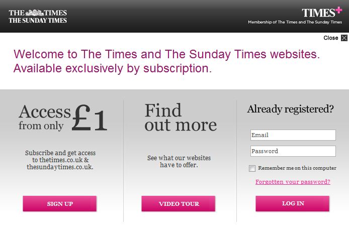
Now, what I can't show you with this screenshot is the painstakingly long time it takes for this pop-up to load. This will likely be their biggest source of lost conversions - the popup is so slow that often the page will re-load and nothing will happen for a few seconds before the popup starts to render and even when it does render it takes at least 7-8 seconds for the "already registered?" box to even appear. For a website trying to persuade me to buy a subscription to an online product slow loading technology like this really matters and will put many people off.
Ok, I don't mean to be too negative about The Times but there's another very weird conversion killer. When you actually click to subscribe to the site the first page you're presented with is this single function page:
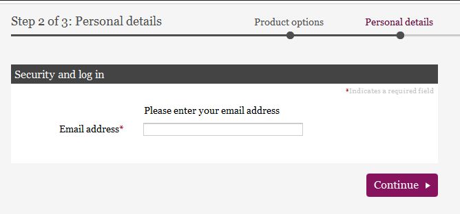
I find this page very odd. Talking about greasing the sides of the funnel, this is like sandpaper on the walls coated with glue. Why should I enter my email address? What purpose does it serve? There's not even any security or trust given that my email address won't be sold to 3rd parties. There's a reason that websites give those assurances, it's because users are worried about it! Once you've entered your email address the next step of the funnel prompts you to re-enter your email address anyway so this page is more or less totally redundant for me.
Ok, enough negativity - time for some positives! The first thing I really like about The Times is the development of Times+. This website is an entire micro-site dedicated to educating users about the benefits of signing up, along with example pieces of content including videos and articles. This really plays well into point 2 above.
Another aspect I find really intriguing about The Times is that they have the opportunity here to create a worthwhile online community with intelligent comments on their articles. This would genuinely set them apart from other newspaper sites where the comments quickly descend into madness or idiocy or both! The very fact that you're within a walled garden and the fact that The Times prides itself on intelligent debate should offer them an opportunity set themselves apart. I can see the beginnings of this as a marketing tactic and I can only assume this will grow as the website matures but this is a perfect example of point 3 - overcoming the "news is free" concept.
The Wall Street Journal
The Wall Street Journal gets quite a nice thumbs up for one specific page they have which is this one:
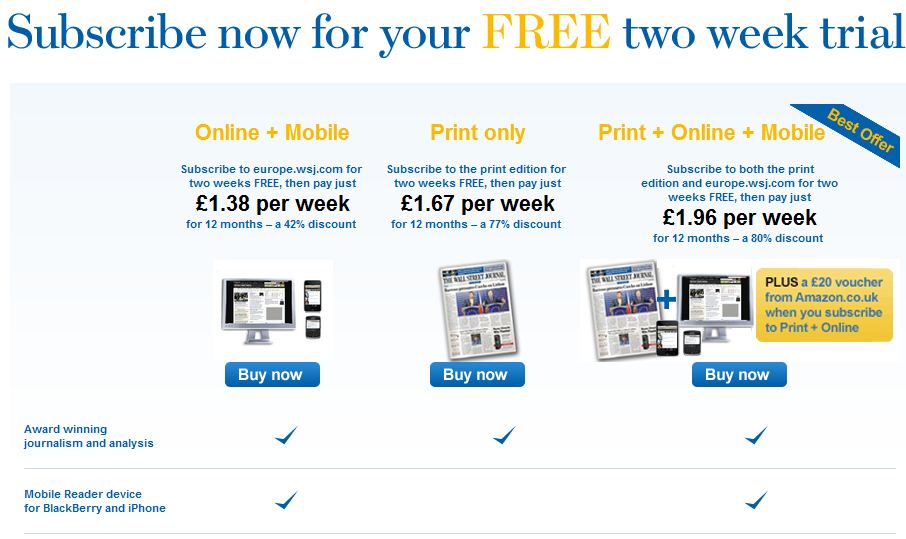
There are two things I love about this page. Firstly, this type of feature comparison table works very well at driving conversions. It's clear for users and has nice strong calls to action throughout. The second reason I love this is because of the more subtle perceived value proposition that's included alongside the Print + Online + Mobile option where there is included a free £20 Amazon voucher. This instantly makes your perceived value of the item shoot up which I think is really clever!
Conclusion
In conclusion, I don't mind the idea of charging for content online. This has to happen I think as the web evolves. But I really hope we can stop thinking of them as paywalls. I dislike the idea of running into a wall or barrier which prevents a user from getting what they want. Instead I hope that we can start treating this more as a membership service with benefits, bonuses and bells and whistles. Also, I couldn't write this article without linking to this very ironic page on The Economist...
Note: CRO, is not an exact science. That's why you run testing. Almost certainly some of the advice I've given here will NOT convert better than the current sites. That's the reality of CRO and it's why testing is key. Testing testing testing. However, the analysis of the conversion path I think throws up interesting debate so hopefully I've at the very least given some of these sites some ideas of what they might be able to test.
Also - final note, thanks to Ed Fry who has been in the Distilled offices the past two weeks on work experience and helped me gather some data and put this post together!


Comments
Please keep your comments TAGFEE by following the community etiquette
Comments are closed. Got a burning question? Head to our Q&A section to start a new conversation.