
Data Visualization Principles: Lessons from Tufte
The author's views are entirely their own (excluding the unlikely event of hypnosis) and may not always reflect the views of Moz.
When I began to practice SEO 8 years ago, I never would have guessed that I'd be writing a post about data visualization. Perhaps I might have foreseen myself writing about web analytics or information architecture, but data visualization seemed like something for the statistics fans. But today in web marketing, the emphasis on content has never been stronger, and it just so happens that one eminently shareable form of content is the data visualization. And I've come to love the crap out of data viz.
.jpg)
Another person that loves the crap out of data viz is Edward Tufte. 'ET', as he's sometimes referred, has been preaching the merits of quality data visualization since before the world wide web existed, let alone SEO. He has authored 4 books on the topic, is a professor of political science, statistics, and computer science at Yale University, and actually serves on Barack Obama's American Recovery and Reinvestment Act panel in order to provide transparency in the use of recovery funds. I was fortunate enough to catch him when he was in Seattle during his traveling seminar tour. I learned a lot that day, and have since learned quite a bit more through reading his and others' writing on the topic.
David McCandless's Information Is Beautiful Blog is a must-bookmark, and his TED talk below is a great data viz primer.
What's This Gotta Do With SEO?
Alright, enough with the intro. Let me quickly lay out what I hope this post will accomplish for the SEOmoz reader.
- Understanding of what makes great data viz great.
- Inspiration to think up and create (great) data viz for your company or your clients.
- (Maybe slightly self-serving, but…) Influence readers to cast a more discerning eye on data visualizations.
So far I've yet to say it, but there's an elephant in the room. Infographics. The buzz around the word has reached a fever pitch. Yes, infographics are a form of data visualization, but there are so many ways that infographics are being abused that the backlash seems to be rightfully mounting. Are all infographics bad? Of course not. Just the bad ones.
So, Wait. Am I Gonna Get Links or What?
As I stated earlier, and as you've probably seen, data visualization is a super-effective and shareable form of content creation. Now stay with me here: In this post I'm going to detail some of the principles of great data visualization as per Tufte's teachings, with examples that fit the bill. As of the writing of this sentence, I've yet to pull link metrics for any of the examples I've got planned. By the end of this post, I'm hoping to prove to you (and myself, really) that Tufte's principles aren't just highfalutin, hoity-toity, stats nerd stuff, but a checklist for highly effective data visualization link building.
These principles to which I'm referring are discussed in the first chapter of Tufte's Visual Display of Qualitative Information
1. Show The Data
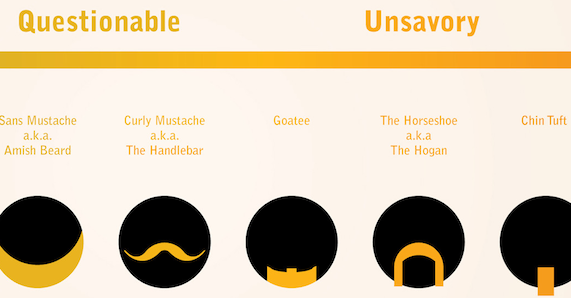
Well, yeah. There have certainly been successful "infographics" that don't actually display any real data, but that's not really a piece of data visualization, is it? The Trustworthiness of Beards by Matt McInerney comes to mind. Regardless, it's funny as hell and was viewed by everyone and their mom.
No matter what the rest of this post says about data visualizations for attracting links, the bottom line is that if you've got a good idea that would be best be shared in graphic form, roll with it. Because this graphic was originally hosted on imgur.com, the link metrics behind it are a bit fragmented. The .jpg file itself has over 200 linking root domains in OSE, and according to the designer it was, "Viewed over 1,000,000 times and featured #1 on the reddit homepage, LaughingSquid, FHM, and the LATimes".
2. Provoke Thought about the Subject at Hand
Tufte's full thought on this:
Induce the viewer to think about the substance rather than about methodology, graphic design, the tech of graphic production, or something else.
Tufte wrote this originally in 1983, and while the spirit still holds, I think it should be revised for today's times, especially framed in the context of link building: Our data visualization should provoke thought AND influence the reader to share.
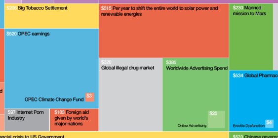
Data visualizations built around economic and social matters are surefire ways to get your audience thinking and also have an inherent shareability (a product of the times and the human condition, I suppose). David McCandless's The Billion Dollar Gram is a visualization that provides context to the incomprehensibly large monetary figures we hear in the media.
Despite not offering an embed code or dead-simple social sharing buttons, this visualization was a success: 2,801 tweets, 4,677 Facebook Shares and Likes, and 298 linking root domains.
Regarding the focus on substance rather than methodology, Tufte explains that the map makes a fantastic visualization medium because we've no reason to question methodology. A map is recognizable, allows us to put a lot of data in a small space, and displaying the data within allows us to easily understand and compare as needed. We'll see a map before this post is done.
3. Avoid Distorting the Data
It should go without saying that a great piece of data visualization should tell the story honestly. Pie graphs, and especially exploded 3D pie charts, are the favorite whipping boy of data viz geeks, often because of their distortion and lack of clarity ("chart-junk").
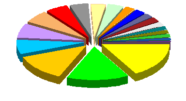
Bad 3D Exploding Pie Chart
I can't believe I'm putting this in a blog post, but 'with great power, comes great responsibility'. Yikes, quick shower, hold on.
But, it is true. If you've got great data, do it justice by presenting it honestly.
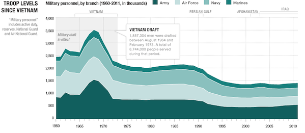
NPR did a visualization about the makeup of the US military that took a ton of interesting data, and represented it in a variety of formats.
Did it work? Well, it didn't exactly kill it according to OSE (12 linking root domains, handful of tweets, and 700+ Facebook shares/likes), but I don't suspect a news organization like NPR makes much of a link building outreach effort.
4. Present Many Numbers in a Small Space
Charles Joseph Minard was a French civil engineer that created what Tufte calls, "The greatest statistical graphic ever drawn": A map of the Napoleon's Grande Armée's advance and retreat into Russia.
The graphic impressively manages to depict 6 different sets of data: latitude, longitude, direction of movement, time, temperature, and size of the army.
Obviously, because this is a graphic made in the 1800s, looking up link metrics would be a bit silly.
5. Make Large Datasets Coherent
Distilling down a big chunk of data is not easy, and the onus often falls on the designer. Tufte laments that the "lack of quantitative skills of professional artists" is what makes designing a great data visualization difficult. The best designed visualizations exist as a symbiosis between smart quantification and beautiful and elegant design.
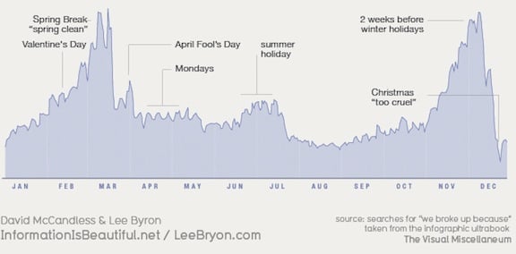
David McCandless and Lee Byron made a graphic of Facebook post-break-up status messages by the time of year. Over 10,000 status updates in this pretty little graph:
Some fun data, for sure, and people loved it. Open Site Explorer shows 92 linking root domains, 3,000+ Facebook shares/likes, and nearly 1,000 tweets.
6. Encourage Eyes to Compare Data
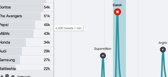
Though not necessary, interactivity makes comparing data in a visualization particularly fun and engaging. Sometimes the best use of a dataset is to present the viewer with the controls, letting them uncover things on their own.
I had a lot of fun playing around with Hotspots' interactive display of Twitter buzz for this year's Superbowl ads. It's too new for link metrics, but I'm honestly surprised at the lack of social mentions: Only 29 shares/likes and 96 tweets?
7. Reveal Data at Several Levels of Detail
Many ambitious datasets call for a visualization that gracefully handles the large, 30,000 foot figures way down to the super granular, all while maintaining the proper spatial relations. This allows the viewer to explore the data; he or she understands the big figures quickly, but has the opportunity to pick out some of the more minute details.
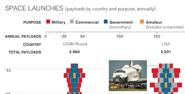
This infographic by the Technology Review details the space launches by country. It's a two horse race between the US and the USSR/Russia, but it's pretty fun to see how other countries have done space launches as well.
Its links were split between the PDF infographic and the post announcing the infographic. All told, it's still one of the least linked-to (roughly 30 LRD) and socially mentioned visualizations (~300 likes/shares, 29 tweets) in this post, but as with the NPR visualization, there likely wasn't much link building outreach done.
8. Serve a Reasonably Clear Purpose
What's the hook? After brainstorming ideas for clients at Distilled, this is how we narrow down our options. If you're not telling a story to an audience that will care, you're destined for a piece of linkbait that'll fall flat. I could expend the effort to visualize, say, the number of fast food restaurants in Bergenfield, New Jersey (my home town - I cried when Roy Rogers was closed) over time, but who would really care?
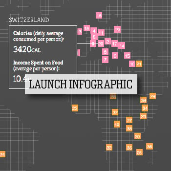
We put together an interactive visualization for Food Service Warehouse that compared the average calories consumed per day with the percent of income spent on food broken down by country.
The result was a successful infographic (still a bit new for link metrics, but 26 LRD including newyorker.com, one.org and heifer.org, to go with 2,000+ likes/shares, and 1,200+ tweets) that highlighted the food consumption and economic disparity throughout the world.
9. Be Closely Integrated with Statistical and Verbal Descriptions of the Dataset
While your data visualization should be able to speak for itself, every release should include a link off to the raw data, and some explanation of the how and why. Your writeup provides you with an opportunity to explain why your findings are important, as well as highlight other interesting findings. Sometimes your visualization warrants further explanation, but doesn't fit within the graphic itself.
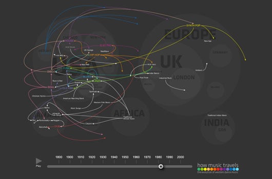
Thomson Travel's How Music Travels - The History of Western Dance Music was a one-page interactive graphic, with further explanation and sources in the announcement blog post.
This data visualization was arguably the most successful of the ones in this post, with almost 250 LRD, 24,000+ shares/likes, and 5,000+ tweets.
In Conclusion
So if you follow each of these principles will you definitely succeed in getting links for your data visualization? Of course not.
It's important to remember that the data visualization is still just a medium for presenting (hopefully) interesting content, in the same way that the a blog might be home for a link bait blog post. Sure it helps to have a beautiful visualization or a crazy-awesome design for your blog, but it's still just a frame around what matters most.
Still, in the same way that your blog should follow some best practices for allowing maximum exposure like proper keyword research, social buttons, comments, etc., I'm hoping some of Edward Tufte's principles help improve the quality of your next great data visualization.

.png)


Comments
Please keep your comments TAGFEE by following the community etiquette
Comments are closed. Got a burning question? Head to our Q&A section to start a new conversation.