

Demystifying Data Visualization for Marketers
The author's views are entirely their own (excluding the unlikely event of hypnosis) and may not always reflect the views of Moz.

I presented on wrangling and demystifying the data visualization process for marketers at MozCon this year, and it turns out there was far more to talk about than could fit into that half-hour. For the sake of those who couldn’t make it and those who could but want to learn more, I pulled together this overview of my presentation, offering more detail than I could in the slides.
To see all of the links shared in this post, check out my MozCon Bitly bundle.
You may want to open the SlideShare file in another tab or browser window, so you can easily toggle between the post and the SlideShare.
I’m going to go through the presentation slide by slide to bring the narrative to print.
Slide 3
I have a confession: Although it’s probably safe to say I’m a fairly advanced Excel user — at least among marketers — until recently I had no real charting strategy. In fact, I signed up to do this presentation partly to force me to carve out a strategy, particularly with Google Analytics data.
Slide 4
In this presentation I have focused on Google Analytics data for a couple reasons:
- If you can wrangle Google Analytics, other marketing data is a walk in the park.
- It has naming conventions that map beautifully to Excel, making it an ideal tutor.
Slide 5
My approach may seem a bit Karate Kid-esque, but if you can grasp the interplay between Google Analytics and Excel, you’ll never be left wondering how to visualize your data.
Although there are many aspects to data visualization, I focus primarily on charting.
Slide 6
In Excel there are two components to charts that are critical to understand: data series and categories. They are always used together.
Think of categories as buckets for your data and data series as the data itself.
Slide 7
If you dumped a pile of Legos in front of a group of kids and told them to organize them by color into their corresponding, labeled containers and then count them, the containers would be categories. And the data series would be the count of Lego bricks.
Slide 8
First let’s peek under the hood on a PC by cracking open the Select Data Source dialog. You get to it by right-clicking on your chart and choosing Select Data.
Slide 9
Excel for Mac also has data series on the left and categories on the right. And that’s about all they have in common.
Slide 10
But, as with most features in Excel for Mac, the functionality of the Mac’s Data Source dialog is far inferior to that of the PC.
Slide 11
This sort option is helpful if you have a stacked chart and want to sort the individual data series. I like to put the larger series on the bottom and smaller ones on the top. But if you have a stacked chart on the Mac and you want to reorder the data series, you actually have to delete the series you want demoted and manually add it back in.
It’s kind of like that game, Hand on Hand, you might have played as a kid where kids go around in a circle putting their right hands in the middle, followed by the left hands. Then they go around the circle moving the bottom hands to the top of the pile as fast as possible.
Although in this case, you’re moving the data series to the bottom of the pile.
Slide 12
To move the Sessions data series to the bottom of the pile, first select it from the Series list.
Slide 13
Then click the Remove button to delete it from the list.
Slide 14
Then click the Add button to add it back to the list of data series.
Slide 15
Click the data selector button to the right of the Name field and select the series name, as directed in the screenshot.
Slide 16
Click the data selector button to the right of the Y values field and click-and-drag over the values. If the column is long, just click the first cell and press Ctrl-Shift-Down Arrow (Mac: Command-Shift-Down Arrow) to select the entire column without scrolling. (We are nothing if not efficient.)
Slide 17
And finally you need to click-and-drag over the category axis labels. Which brings us to the Mac’s other issue ….
Slide 18
In the PC version, there’s one place for the category axis labels. On the Mac you have to choose the axis labels for each series. It’s counter-intuitive.
Slide 19
Categories end up along the horizontal axis — or the vertical axis for horizontal bar charts.
Slide 20
The data series ends up in the legend and is usually a metric (from GA). But there are a couple exceptions, which we’ll get to in a minute. The categories populate to the horizontal axis label or vertical axis label with the bar chart.
Slide 21
Transition to Google Analytics.
Slide 22
The two major players in Google Analytics – that we’ll be mapping to Excel – are dimensions and metrics. They’re (practically) inseparable.
Slide 23
Dimensions are the buckets your data is broken up into. These come into Excel as text – even if they’re values – like you get with the Days to Transaction dimension (which you can get from Conversions > Ecommerce > Time to Purchase). They are always the far-left column of the table.
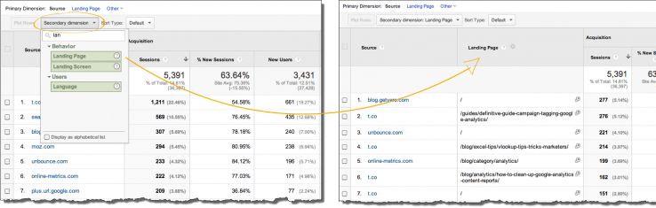
- Add a secondary dimension in any report (standard or custom).
- Create a custom flat table with two dimensions. Learn how in this post.
- Use the API. This is the only option that will allow you to use more than two dimensions. You can pull up to seven dimensions in one API call.
Slide 24
Metrics are anything that can be measured with a number.
Slide 25
If you’re in a custom report (or have clicked the Edit link at the top of most standard reports), metrics always show up to a party in blue.
Slide 26
And dimensions show up as green.
You can learn more about custom reports from the video tutorial I created to help marketers.
Now it’s time to marry Google Analytics and Excel.
Slide 27
In most cases dimensions in Google Analytics map to categories in Excel.
Slide 28
And metrics map to data series in Excel.
Slide 29
I’m going to break this down systematically, based on the number of dimensions and metrics you’re wanting to visualize.
Slide 30
Dimensions: 0
Metrics: Multiple
You want this if you want to know aggregate numbers, e.g, sessions for the month, or revenue, or goal completions.
Slide 31
I hate to start on a downer, but you need the API to do this. The GA interface requires at least one dimension.
Slide 32
As with most things, if you prod enough, you’ll discover hacks and workarounds. But the name of the game here is to come up with a dimension that will only have one bucket. Going back to the Legos analogy, it would be kind of like saying, “Put all the plastic Legos in this bucket and count them.”
Slide 33
Workaround: Set dimension to something that will encompass all of your data, meaning you’ll only have one row in the report. One example of that would be the User Defined dimension (under Audience > Custom > User Defined).
As you’ll see in the screenshot, all of the values are consolidated as (not set) since this profile (now called view) doesn’t use the User Defined dimension.
Slide 34
If you’re still using the User Defined dimension (and, therefore, have multiple rows reporting), you really need to update.
If you’re using classic GA, you should be using custom variables and custom dimensions if you’re using Universal.
Slide 35
Another option is to use the Year dimension with a custom report. This is ideal if you are gathering data for a single month. You can aggregate data beyond one month, as long as the date range you choose doesn’t straddle more than one year.
Slide 36
Here's what the custom report looks like under the hood. Learn how to create custom reports in Google Analytics in a video tutorial I did.
Slide 37
You can access this report here while logged in to Google Analytics.
Slide 38
This data isn’t conducive to charting, but you can sexy up a table with sparklines and conditional formatting.
Slide 40
Dimensions: 1
Metrics: 1
An example of this might be revenue segmented by country or bounce rate segmented by device category.
Slide 41
Pie Chart Basics
Here are some highlights about the pie chart:
- They use angles to show the relative size of each value.
- You should put data in descending order to put the most significant data point at 12:00 and radiate clockwise.
- Avoid 3D pie charts. They distort data.
- Data points must add up to 100%. So you can’t take traffic from 5 of your 8 campaigns and chart them.
- Microsoft says no more than seven categories; I say no more than five.
- None of the values in your data series can be negative.
- Learn more
Pie Chart Tricks
Ways to trick out your chart:
- You can grab a piece of the pie to isolate it and drag it out slightly to draw attention to it. This is called exploding pie pieces.
- You can also change the values to percentages in the data labels or even add the categories, thereby negating the need for a legend.
Slide 42
Donut Chart Basics
Here are some highlights about the donut chart:
- Donut charts show data in rings, where each ring represents a data series
- It uses the length of the arc to indicate the size of the value.
- You should put data in descending order to put the most significant data point at 12:00 and radiate clockwise.
- Data points must add up to 100%. So you can’t take traffic from 5 of your 8 campaigns and chart them.
- Microsoft says no more than seven categories; I say no more than five.
- None of the values in your data series can be negative.
- Learn more
Donut Chart Tricks
Ways to trick out your chart:
- You can put the title or the value you want to highlight in the center.

- I don’t recommend using the donut chart for multiple series or dimensions. They’re more difficult to interpret.

- Like the pie chart, you can pull one out to draw attention to it.
- You can use a donut chart to create a speedometer chart.
- You can fill it with an image that resembles the surface of a donut to make it look like a … Okay, yeah, never mind …
Slide 43
Column Chart Basics
- Should sort in descending order.
- The axis should start at 0.
- Categories don’t have to add up to 100%
- Learn more
Column Chart Tricks
- You can add a trendline to make trends stand out.
- Consider going totally minimalist with the techniques I demonstrate in this video tutorial. (You can skip to the 15:53 mark.)
- Don’t be afraid to move the legend around.
- Excel’s default axis tends to be dense. I typically double the Major Unit, so if the major unit is set to 100, I typically up it to 200. Learn more about the major unit from the Microsoft site. (But I also show how in the above-mentioned video tutorial.
- You can use a column chart to create a bullet graph to show current data vis-à-vis goals or projections.
- You can use a column chart to create a waterfall chart.
- You can add a target line to your chart.
- If you have many categories to chart, you can use a scrollbar.
- You can use a column chart to create a thermometer chart.
- Just remember safety first when working with column charts.
Slide 44
Bar Chart Basics
- You need to sort your data in ascending order to put the longest bars at the top.
- Bar charts are good for categories with longer labels.
- You shouldn’t use bar charts if your dimension is time based (date, month, etc.).
- Learn more
Bar Chart Tricks
- You can use all of the tricks (except the last two) listed in the Column Chart Tricks list.
Slide 45
Radar Chart Basics
- Category labels are at the tip of each spine.
- You can use a fill with your radar charts.
Radar Chart Tricks
- Radar charts can be compelling when you compare multiple entities at once. For example, I saw a set of 50 radar charts that compared metrics like crime rates for different types of crime for each state.
- If you don’t want the axis labels to show, you can set the number formatting to ;;; to hide them altogether. You can then include an annotation on your chart that lets viewers know the intervals.

Slide 46
Notes about the Heat Map
Learn how to create a heat map in this video tutorial I did.
Slide 47
And now let’s look under the hood at a typical chart that uses 1 dimension and 1 metric. Let’s say we have this table of analytics data ….
Slide 48
If we create a column chart from this table, this is what it’s going to look like (with some cleanup).
Slide 49
Now if we look at the data source this is what we’ll see ….
Slide 50
The mediums show up over here in the categories …
Slide 51
And the sessions values show up here in the data series …
Slide 52
Which populates to the legend. But you can delete the legend when you only have one metric (or data series). You’ll then want to include the metric in the chart title.
Slide 53
And the mediums populate the horizontal axis labels.
A little piece of Excel trivia: The Select Data Source dialog still says Horizontal Axis Labels, even for bar charts where the labels are on the vertical axis. #pedantic
Slide 54
Example of 1 dimension and multiple metrics: Sessions, goal completions, and revenue broken down by Device Category (mobile, tablet, desktop)
BTW, the Device Category dimension is one of the most important in Google Analytics. By itself it’s pretty useless, but in the context of other data, it’s very useful. You should be segmenting all of your data by it.
Slide 55
Notes about the Clustered Column Chart
- Clustered column charts are good for showing comparisons (e.g, sessions vs revenue for each month or ROI vs Margin by campaign (or keyword).
- You could transform the clustered column chart into a combination chart by adding a line chart on the secondary axis that adds a percent value.
Slide 56
Notes about the Stacked Column Chart
- The stacked column chart is good for showing how each data series contributes to the whole.
- An example might be revenue broken down by medium.
- If you want to order the columns by overall height, you can create a total column for the series. You just won’t chart that column.
Slide 57
Notes about the Clustered Bar Chart
- All of the notes in the above-mentioned stacked column chart.
- Like the [single] bar chart, the clustered bar chart is better for categories with long labels.
- You can hack the clustered bar chart to create a double-sided bar chart. You can view a video tutorial I did on how to do this.
Slide 58
Notes about the Stacked Bar Chart
- If you want to sort the bars so that the longer bars are on top, create a totals column and sort it in ascending order.
- You shouldn’t use the stacked bar chart if your dimension is time oriented (date, month, etc.).
Slide 59
Notes about the 100% Stacked Column Chart
- Use the 100% stacked column chart when you are working with percentages.
- The data series must add up to 100%.
- For example, if you wanted to see what percentage of social referrals came from desktop, tablet, and mobile devices.
Slide 60
Notes about the 100% Stacked Bar Chart
All of the notes under the 100% stacked column chart apply here.
Slide 61
Notes about the Radar Chart
- Category labels are at the tip of each spine.
- You can use a fill with your radar charts.
- Radar charts can be compelling when you compare multiple entities at once. For example, I saw a set of 50 radar charts that compared metrics like crime rates for different types of crime for each state.
- If you don’t want the axis labels to show, you can set the number formatting to ;;; to hide them altogether. You can then include an annotation on your chart that lets viewers know the intervals. See the screenshot under the Slide 45 note above.
Slide 62
Notes about the Combination Chart
Learn all about combination charts in this post I wrote on the Search Engine Land site.
Slide 63 – 69
Self-explanatory as they follow the same dialog as slides 46 – 52.
Slide 71
Notes about the Line Chart
- In a line chart, category data is usually distributed evenly along the horizontal axis and value data is distributed evenly along the vertical axis.
- Line charts can show continuous data over time, so they're ideal for showing trends in data at equal intervals, like months, quarters, or fiscal years.
- You can add markers and set the lines to none to use them in ranking charts.
- Avoid using stacked line charts. It’s not always apparent that the data series are stacked. If you want to stack, use an area chart instead.
- You can add interesting line markers like the ones I created in this video tutorial to replicate the charts in Moz’s tool set.

Slide 72
Notes about the Stacked Area Chart
- Ideal for showing stacked data series over time, especially if you want to demonstrate a fluid trend. Stacked column charts should be used if you want to keep each of the categories more disparate.
- You should order the data series so that the larger series are at the bottom of the stack with the smaller series being clustered together at the top because people’s eyes naturally travel from the horizontal axis upward with stacked area charts.
- If you keep the gridlines, make them significantly lighter. A light gray works well.
- Make sure you have adequate contrast between contiguous data series. Sometimes Excel puts two colors next to each other that blend.
- If you have smaller data series that are difficult to see, use stronger colors to make them easier to view.
- If you have all larger data series and you want to add some finesse, give your data series a line (what would be called a stroke in graphic design programs) that’s slightly darker than the fill.
- You can create a combination chart with a stacked area chart. Just don’t use a line chart for the other style. I like to use a chart style that stands out from the area chart, such as a column chart. You may want to increase the transparency of its fill so that you can easily see through to the stacked area chart.
Slide 73
Notes about the Clustered Column Chart
- You use the clustered column chart to show comparisons between data series (as opposed to how they contribute to the whole).
- The clustered column chart is especially effective for showing year-over-year data. The categories would just have the name of the month (I abbreviate to three letters, which you can learn how to do in this tutorial), and one column would be used to show data from one year and the other colored column would indicate the previous year. To show the month from each year as a disparate data series, you would have to make each year a separate column in your data.
- You can add a line chart on the secondary axis that highlights the percent change between values.
- You can play with the gap width and overlap settings to adjust the series. You get to those by selecting a column, pressing Ctrl-1 (Mac: Command-1), and navigating to the Series Options (Mac: Options) area of the Format Data Series dialog.
- Excel doesn’t provide the option to add a data label that indicates the total of all the data series for each column. You can hack one by adding a total column that you include in the clustered column but then change to a line chart. From there, remove the line and add data labels above the line.
Slide 74
Same as Slide 60.
Slide 75
Same as Slide 58
Slide 76 – 77
Self-explanatory.
Slide 78
Things get more complicated when you want to chart two dimensions. There are three ways to get 2 dimensions:
Slide 79
So here we have two dimensions (Device Category and User Type). I picked these dimensions to demonstrate because they have a finite number of options. I LOVE the device category dimension and use it frequently to segment my data in Google Analytics.
Note: When you chart two dimensions, you can only use one metric (or data series in Excel).
Slide 80
Here’s an example of what a clustered column chart might look like.
Slide 81
We now have a dimension in the legend — or category in Excel.
Slide 82
Using the Switch Row/Column button ….
Slide 83
This is what the chart would now look like. Notice we now have three data series and two categories.
Slide 84
Now let’s take a peek under the hood.
Slide 85
Again, here you see we have dimensions, not metrics, in the data series. The metrics should be included in the chart title.
Slide 86
And now the Device Category dimension is in the category area.
Slide 87
Your chart options are the same as when you had one dimension and multiple metrics. These options are not exhaustive.
Slide 88
Slide 89
The data in this table is in report format. If only marketing export data came in this format. (It doesn’t.)
Slide 90
This is how marketing data actually comes out of different marketing tools. It’s called tabular format.
Slide 91
Just as in a database, rows in tabular data are called records.
Slide 92
Columns are called fields.
Slide 93
And the column headings are called field names. But if I were to select two dimension columns and one metric and select a chart, here’s how Excel digests the data …
Slide 94
Gross, I know. I’m a child.
Slide 95
Here’s what it actually looks like. A royal mess.
Slide 96
Excel requires that data be in a report format in order to chart two dimensions. And the one metric (sessions, revenue, impressions, whatever) goes into the green area. There's only one way to corral an export with two dimensions and one metric into report format ...
Slide 97
Pivot tables sound scary and intimidating but not if you think about what pivot means.
Slide 98
When a soldier pivots, s/he very simply goes from standing facing one direction to turning at a 90 degree angle. That's what a pivot table does. By moving one of your dimensions into the Columns field (Mac: Column Labels field), Excel puts that dimension's values across the top of your data.
Once you have your data in report format, and you can chart it. You typically want to put the dimension with fewer values into the columns area.

Learn how to create pivot tables in this comprehensive video tutorial I did.
Slide 99
Although pivot tables come with a lot of junk in the trunk, you can see the pivot table puts the data into report layout, which Excel can then use to chart the data. If you’re on a PC, you can create a pivot chart. If you’re on a Mac, you can create a static chart from the pivot table because Excel for Mac still doesn’t support pivot charts. Still. Ridic.
Slide 100
Now you’re ready to look at GA data — nay, all marketing data — with a more strategic eye… And spend less time tooling around in Excel trying to figure out how to visualize your data!


Comments
Please keep your comments TAGFEE by following the community etiquette
Comments are closed. Got a burning question? Head to our Q&A section to start a new conversation.