

Design Trends: The Single Purpose Homepage
The author's views are entirely their own (excluding the unlikely event of hypnosis) and may not always reflect the views of Moz.
It's been a long time since I last blogged on design topics, but I think it's time to break that streak. This post focuses on a design style that's both retro (it's been around a long time) and emerging (the popularity, at least to me, feels like it's on the rise) - the single-purpose homepage.
First, a brief example:
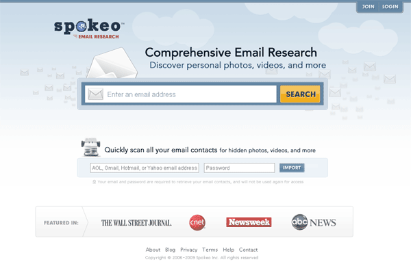
In the above design, Spokeo has just one, singular, all-consuming goal - get your email address so they can show you how their product works. There may be a few secondary links for registered users to login, access to the blog and about pages, and some logos to help improve credibility, but basically, we're looking at remarkably driven intent behind the design.
Five Reasons I Like the Single-Purpose Homepage:
- It Gets the Message Across Quickly
With only a single headline and call to action, visitors quickly parse the critical message you're attempting to push. In longer, more complex pages, designers and marketers constantly have to worry about the percentage of people who are actually exposed (in any meaningful way) to the intended triggers.
_ - It Forces Simplicity in Communication
This singularity of messaging also means that the language, words and images chosen have to communicate simply or risk failure. Simplicity in web design has proven itself over and over again as a driver of success, and simple messages are the easiest to understand and to transmit virally - a marketer's dream.
_ - It Reveals What Matters (and Obscures What Doesn't)
When external forces compel us, we tend to find our greatest strength is all that remains. That principle is in clear effect with these designs, as the unecessary is completely stripped away, leaving only those items (graphics, font, layout, links and messaging) that serve the singular purpose of the page. If you've ever fought over which ten things to put on the homepage, get ready to trade that in for which ten words can express the entirity of your business (not necessarily an enviable trade, but it can be a net positive).
_ - It Sorts the Visitor Wheat from the Chaff
Visitors who reach this page will instantly know whether the product is for them or not. The uninterested are immediately disengaged, leaving only true potential candidates for marketing and targeting. This means every piece of data you can collect and refine about your remaining audience is precious -- but it does remove the "noise" that's often mixed in with an unfocused audience.
_ - It Makes it Easy to Optimize the Funnel
If you're doing lots of A/B and multivariate testing (and if this doesn't convince you that you should, abandon all hope), the simplicity of having only a few input boxes, links and headlines is a miracle. Tests run faster, produce more compelling results and give you the focus you need to improve click-through and conversion rates efficiently. Tiny changes in these percents are frequently responsible for millions of dollars of revenue (which is generally a good thing).
Is It Good for SEO?
It depends... If you have the type of site that's very product focused and single-purpose in nature, this can be an ideal page type. Even if you run a blog, promote articles, or have other types of secondary content, you can always embed links to them in smaller, more background-style fonts and retain crawlability and good information architecture.
The only real trouble may come from the homepage's loss in ability to send traffic to more viral, less product-specific parts of the site (which will then cost links, which will in turn cost SEO opportunity). If this is a danger, it may be a viable reason not to implement this style of design. You also definitely shouldn't be using this style if it doesn't fit with your strategic goals - publishers, blogs, newspapers and most retailers probably don't want to go this direction (though taking cues from it in deeper, more focused pages is probably very wise).
Eight Examples of Single-Purpose Homepages in Action:
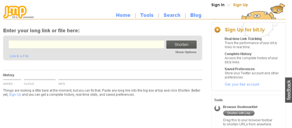
The URL shortening service j.mp (run by Bit.ly) is remarkably focused on helping provide their product with little surrounding clutter. I particularly like the approach of stretching the URL bar so it's always the dominant focus - and once you use j.mp, you'll never go to any other service (part of the reason they can focus so heavily on getting the product used in the first 5 seconds of the first visit).
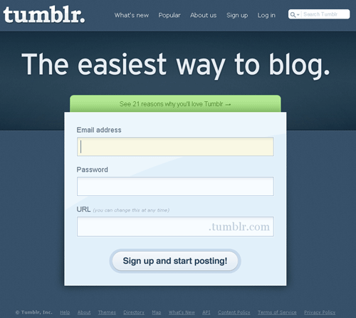
Tumblr's message "the easiest way to blog" is made credible by the fantastically simple signup process. They've also smartly broken the "single purpose" literal interpretation by having a callout in the green box of "21 Reasons Why You'll Love Tumblr." Just for the record - even though I'm an advocate of this style for the right type of site, I do strongly encourage testing often and early. The beautiful part is how easy pages like this are to test (in comparison to their portal-entry-like peers)
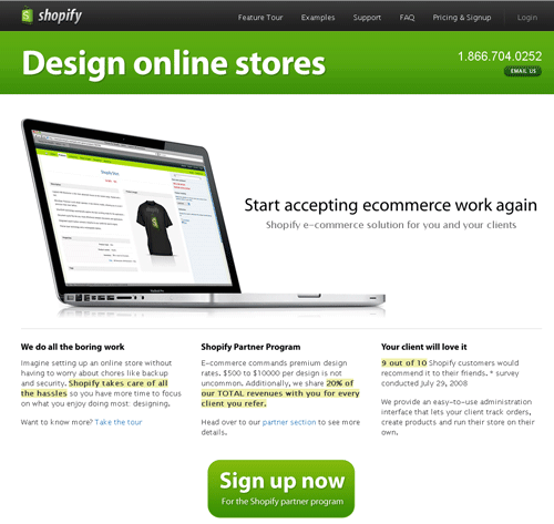
Shopify employs simplicity and text-based callouts to highlight its messaging. I like the layout visually, but I wonder if they've done extensive testing about the impact of the three text boxes.
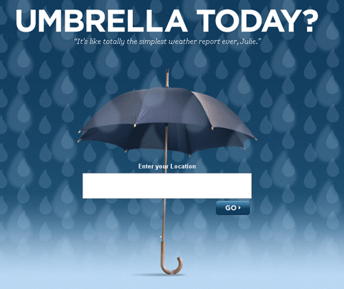
If you've seen the dozens of popular weather sites around the web, you know how horrifyingly cluttered they can be. UmbrellaToday breaks with tradition and provides possibly the dead-simplest method for getting solid weather reports. I'm a fan of the clever name and branding, too - I love personality in startups :-)
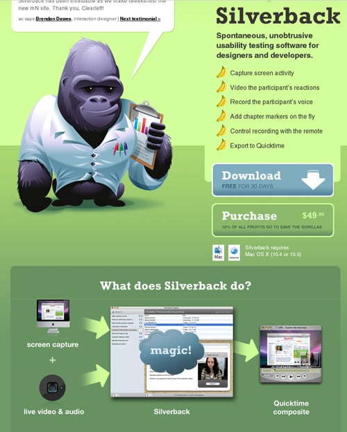
Although Silverback's homepage is a bit long-form vertically, the message is singular - convey what the app does and why you need it, then get a click on that download link. I'm not sure if they have tested it, but I'd love to see a version that puts the "What does Silverback do?" graphic in the text bubble spoken by the Gorilla.
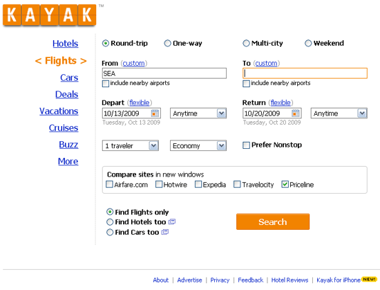
Popular travel site Kayak technically has multiple foci, but the strength of the homepage's conviction that you want to find airline pricing and their ability to stick with it for so many years (and probably through hundreds of rounds of testing) illustrates the single-purpose homepage brilliantly. It's also in sharp contrast to their competitors in the travel market, who insist on promoting specials, deals, partnerships, news, reviews and a thousand other disparate items that distract from the intended goal of both website and visitor.
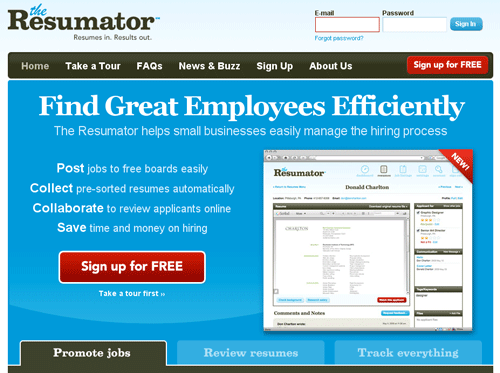
When I first visited Resumator, I wasn't sure it belonged on this list. However, after spending ~9 seconds actually reading the copy on the page, I was impressed. I instantly knew what they did and actually considered sending it over to some folks inside SEOmoz for consideration (since we're going to be on the hunt for new hires soon). Single message - check. Delivered quickly - check. Focused direction to one action - check. All that, and it looks pretty useful :-)
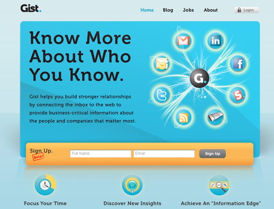
Gist plugs your email in with the web's social features to help give context and content around your inbox and contacts. It's a pretty spiffy piece of software, particularly for those in sales, and the homepage does a good job of conveying the value proposition quickly and simply.
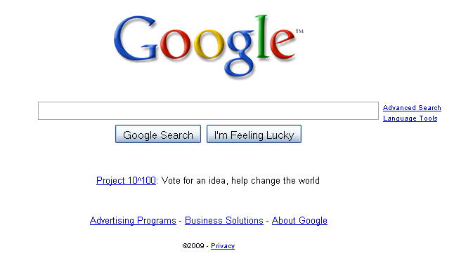
You've probably never heard of this tiny, Mountain View, CA company, but apparently, they do pretty well :-)
Your thoughts?


Comments
Please keep your comments TAGFEE by following the community etiquette
Comments are closed. Got a burning question? Head to our Q&A section to start a new conversation.