
How Newsworthy Are Your Newsletters?
Lately I've been thinking about newsletters because I have no life and this job occupies my time 24/7. Just kidding...kind of. Actually, SEOmoz has been sending out monthly newsletters to PRO members for a few months now, and it's made me start to look differently at the newsletters I receive. What do I pay attention to, and what do I instantly delete, and why? I thought I'd share some newsletters that I've scrounged up from my inbox from the past year and analyze their successes and failures.
1. Make sure you can actually read the newsletter. Monsoon is a Vietnamese fusion-type restaurant that I live near, and they send me a newsletter every so often. This is what it looks like:
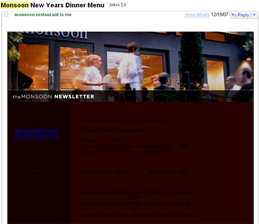
Yeeeeeah...black text on a maroon background isn't exactly readable.
Here's another example. This is a Marriott newsletter I received:
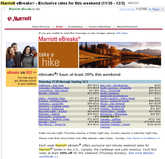
I personally have a problem with the rows of teeny tiny city listings. They're a bit hard to read very clearly because they're so small and they're clumped together. Also, each one of them is a link, and when they're so closely listed it can be hard to click on the deal you're interested in.
2. Don't make your newsletters excruciatingly long.
Landmark Theatres is a movie theater chain that has a lot of locations in Seattle. They regularly send me their newsletters.
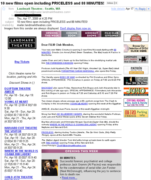
I love the information they display: current releases on the left-hand side, movies opening this week, etc. However, their newsletters are extremely long and require a lot of scrolling. My interest wanes the more I scroll, to the point where I just look at the information at the top and delete the newsletter, missing any vital information that may appear at the bottom.
Try and keep your newsletters to a reasonable length--do you really need all of that information you're displaying? Maybe you need to up it to a twice-monthly newsletter if there's too much information for a once monthly email; or, maybe you're not thinking about the actual, essential, interesting information that your readers will want to hear about.
3. Don't inundate your readers with nothing but text.
Kayak sends me their newsletter, and this is what they typically look like:
.gif)
Not only is their newsletter long, it's tedious and full of text blocks. They essentially list a city and write a big blurb about it, then lather, rinse, repeat. It's pretty boring. Why not just focus on a select number of cities and include an enticing image? I wouldn't mind seeing a lovely pic of Aruba beach. After all, a picture is worth a thousand words.
4. Make your newsletters appear clean and properly formatted.
The SMX newsletter looks a bit cluttered and text-jumbly to me:
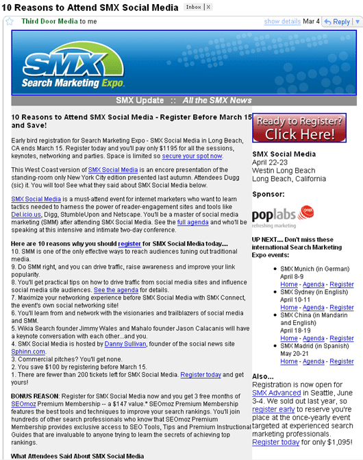
The numbered list looks especially crammed. I think spacing the list out more would have made it look better.
5. Make sure your outbound links work properly before sending your newsletter.
This last example, unfortunately, is from our own newsletter. This week we sent out a newsletter that included a link to my email address, but we accidentally misspelled my name:
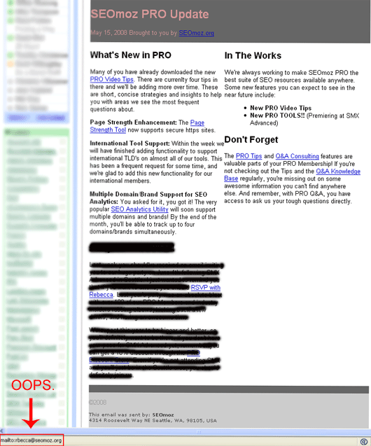
It may be hard to read, but the "RSVP with Rebecca" link pointed at "mailto:[email protected]." I received quite a few emails from our members notifying me of the typo and the delivery failure status they received when they tried to email me with the wrong address.
Okay, I've shared some examples of newsletters that need a bit of tweaking. Now I'll show you some newsletters I do enjoy:
1. IndieFlix
IndieFlix is an independent film site based in Seattle. I signed up for their newsletter one year at the Seattle International Film Festival. (I attend the festival every year--one time I saw 11 movies in one weekend. But I digress.)
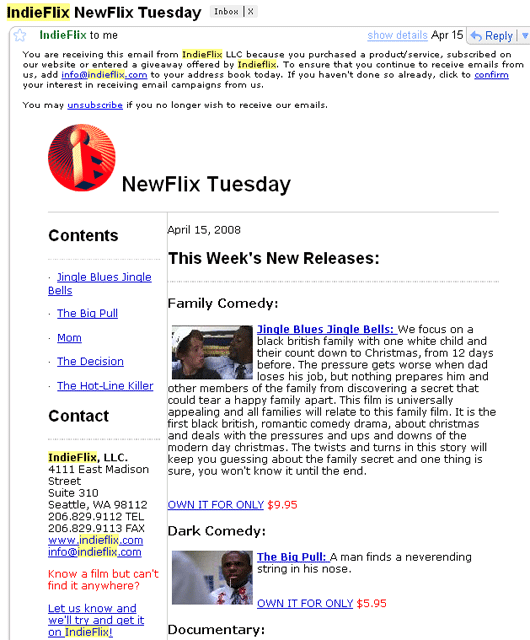
IndieFlix's newsletter is a lot like the Landmark Theatres newsletter I shared earlier on in this post. The reason I like this newsletter better is that it offers the same compelling, interesting information (new releases, movie synopses) but in a much more concise manner. Two thumbs up!
2. Active.com
I participated in some race a year or two back (it was either a half or full marathon, I can't exactly remember), and got automatically signed up for the Active.com newsletter. I've not canceled because their newsletter is one of my favorites:

(Sorry this one's so big--I accidentally saved the screenshot without resizing it, and now when I try to size it down it becomes too hard to read.) Active's newsletter does well what Marriott's newsletter does poorly--shares a list of links. Active's links are easy to read and click on. I also love the information shared in each newsletter--it's interesting and valuable to hear about local race events that I may want to participate in or sign up for.
3. SEMpdx
If SMX's newsletter were as cleanly formatted as SEMpdx's, I'd have no problem reading and absorbing the information they send me:
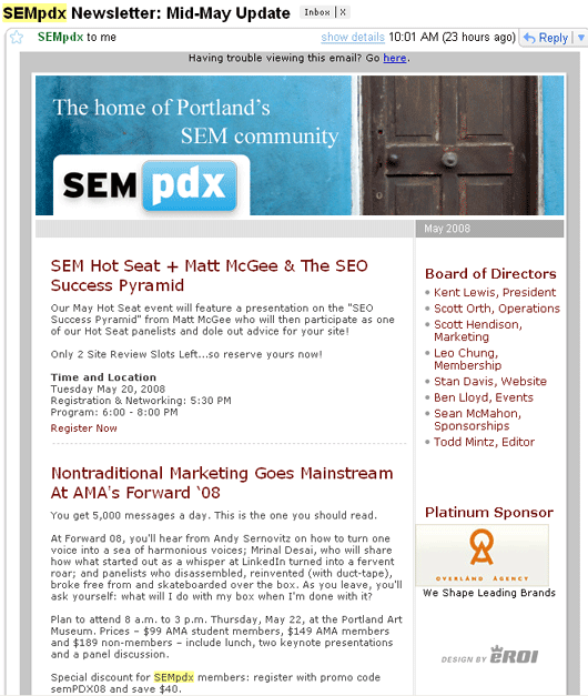
Clean titles, good spacing, blog post snippets that link to the complete piece--I love it!
4. Barack Obama
I'll leave the politics at the door and focus purely on the newsletter. The Obama newsletters rarely get sent out with images, yet they don't feel bogged down with text.
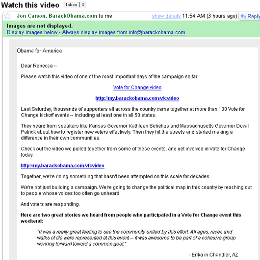
It's a relatively short message, is cleanly formatted, and breaks up the chunks of text with links, bolded sentences, and quotes. I also especially like the titles of their newsletters--I saw "Watch this video" and it immediately caught my eye. If it were titled something like "Barack Obama Campaign Update for May," my interest wouldn't be as piqued and I'd be less inclined to open the newsletter right away.
Speaking of catchy titles, I'm going to talk about my favorite newsletter...
5. Yelp
I love Yelp's newsletters. First of all, their titles are cleverly written and very eye-catching:
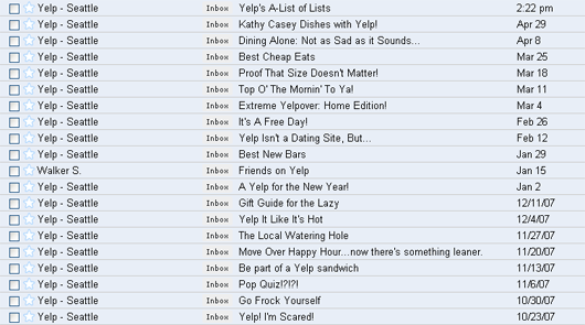
A well written title or email subject means more people are enticed to open the email and read more information.
Secondly, the newsletter does everything right--incorporates images, links out to more information, bolds the perfect amount of sentences and phrases for proper emphasis, and formats their text for easy reading. Here's a newsletter I received about bbq restaurants in Seattle:
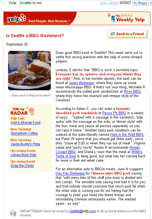
That, my friends, is a gorgeous newsletter. Also, notice the "Send to a Friend" button in the upper-right corner. Yelp's newsletters are so great that Jeff actually sent one to me:
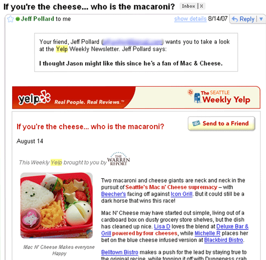
When people actually want to share your newsletter with others, that's a good sign that you're doing something right. (And yes, my boyfriend and I love mac and cheese. Send recipes to rebecca<at>seomoz.org.)
To summarize, I'll share what I've picked up to be newsletter best practices:
- Check your outbound links to make sure they're working properly.
- Break up monotonous blocks of text with images, links, quotes, and bolded phrases to make the content more easily readable.
- Format your newsletters so they have a professional layout.
- Make sure your newsletter design is easy on the eyes--use highly contrasting colors to avoid having the colors blur together.
- Keep your newsletters relatively concise. If they're too long, trim out superfluous information or consider sending more frequent, shorter newsletters.
- Proofread your copy before sending it out to the masses. Typos and grammatical errors look unprofessional and sloppy.
- Play around with catchy email titles/subject lines for a higher open rate. Try to support your compelling title with compelling, interesting content in the body of your email.
- Um, I like macaroni and cheese. And independent films. And running. (Geez, come to think of it, you all have learned quite a bit about me based solely on the newsletters I receive. Hmmm...)
I hope that some of my examples were valuable. I'm not claiming to be an all-knowing newsletter expert (after all, our own newsletter fell under the "Guilty" list)--I just shared some of my personal opinions. If you have any other tips on how to create a compelling newsletter, I'd love to hear them.
The author's views are entirely their own (excluding the unlikely event of hypnosis) and may not always reflect the views of Moz.


Comments
Please keep your comments TAGFEE by following the community etiquette
Comments are closed. Got a burning question? Head to our Q&A section to start a new conversation.