How to Build Links with Infographics
The author's views are entirely their own (excluding the unlikely event of hypnosis) and may not always reflect the views of Moz.
It should be no surprise that infographics aquire links. Although they’ve quickly become a saturated tactic, they still work. I like infographics, because they’re a great intersection between traditional marketing and manual link building. In this post, I’d like to walk through my process of creating and launching a successful infographic. I’m about to tell you exactly how I’ve gotten clients hundreds of thousands of content views, thousands of social shares, and hundreds of links. It's a long post, so grab some coffee.
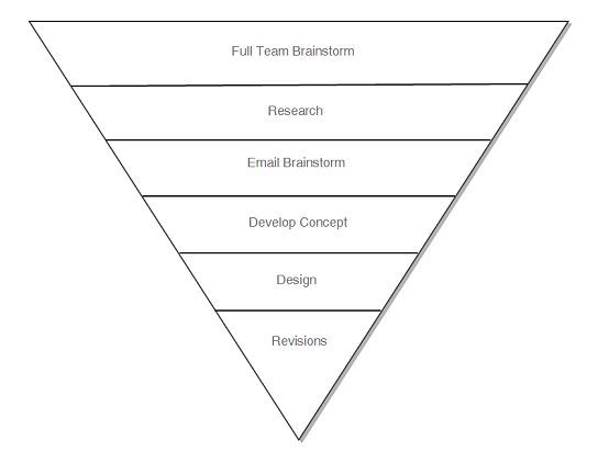
The Development Process
I’d like to cover my “process” for creating an infographic. This might not be for everyone, but it works for me.

#1 Full Team Brainstorm
At this stage, I’ll pull the whole project team together for a brainstorm. I may start with a seed set of ideas, but this is a wide open brainstorm, anything goes. We’re looking for ideas that are: interesting, appeals to the linkerati / socialrati, has real data, and some type of unique hook. An idea may come directly from a specific niche we’re targeting, or may go along with an event, such as a holiday. Try to look for angles that people don’t normally take or to present boring/common info conversely or in a off-colour way. Geoff, here at Distilled, is a beast at coming up with ideas.
#2 Research
I may only walk from the brainstorm with a vague concept and the target audience. From this point, I’ll start to research for data that can be used to form an infographic. I have a few goals for research.
- Find information that can be organized.
- Find information that can be visually represented.
- Data does better than just information.
- Focus on verifiable statistics I can cite.
- Focus on chunkable, tweetable statements.
- Focus on content that triggers an emotional response.
The output here is a Word document of information and URLs to its source.
#3 Email Brainstorm
Unless you’re a creative genius, you’ll find value in crowdsourcing for ideas and selection of data. I will send the results of the research to the entire office and collect input on best stats, how those stats can be represented, or any other cool ideas. My job is collect this input and distill it down.
#4 Develop Concept
Next up, I’ll start developing a concept. This is when you put your creative marketing hat on.
Things to consider:
- How your data can be visually represented
- Color themes (consider you topic and target market)
- How to visually create an emotional response
- Ways to add humor
- Creating “sharable” chunks of info for easy sharing and tweeting
- Media to be added, such as images and graphs
This is a choke point where infographics can fall short. Yes, you have a cool concept, you have the data, and maybe you even nailed your title. But what I’ve seen that works, is really catering to your target market(s) in the content of the infographic. Give them very specific, for lack of a better phrase, “Easter eggs” that will be meaningful for them. This might be a meme or a concept unique to their market. Try to play on a person's ego or emotions, or to build some form of relationship with them. This goes back to marketing and understanding the target market.
#5 Design
I’ll pass over all the information to our designer. I’ll touch on this more in a moment, but I’ve learned to be very clear in this communication. Working with a designer in the UK, in another time zone, whom you’ve never met, creates a unique work relationship. I think our process here though is valuable for any SEO working with a designer.
#6 Revisions
This should be simple, but likely won't be. After getting the first draft of the design, it’ll be passed around the office for feedback. This may include typos, content errors, or design considerations. If you don't fix, then mistakes in your graphic will be caught, and social media can be relentless in pointing them out (especially Reddit). Find the most detailed oriented person in your office and get them involved.
Next, send it off for review from your client (or boss).This is the point where your skills in getting s#!% done can make or break your linkbait. Your job is to know your client (boss) and have built enough trust with them that you can manage any pushback. Getting close to your client can be the difference between a piece of linkbait that “ok” and “awesome”.
Working with Your Designer
Infographic design is a choke point. Concepts can fall apart during the design process if not effectively managed. Tucker Cummings, at Blue Glass, recently wrote about what makes a “good” infographic. She said “if it doesn’t make you say “Wow” when you look at it, it’s probably not attractive enough”. Although an infographic needs to look good, I don't want design requirements to scare you off. As long as the design is good, fun, and interesting - I'm more concerned about the content.
My goal when working with a designer is to get something the client will like, with minimum revisions, and without annoying the designer. This is done by doing one thing.
Communicating well.
To assist in this communication, I send my designer two documents (these are actually the headings used in my last brief).
Infographic brief.docx
Client Information
- Infographic Width
- Target Audience
- Client Expectations
- Deadline
- Hours
Infographic Information
- Overview
- Purpose
- Data
- Title
- Theme
- Images & Files
Infographic content.docx - Just the text in the infographic.
Tips for Working with Designer
- Get them involved early. I send over an email after the first brainstorm. I want them to be a part of the team, not just a tool I leverage to produce the graphic. I want them excited about it and feel a sense of ownership over the project as well.
- Don’t hinder their design. This is their job, it’s what they’re good at, so just step back and let them do it. Trust that they’re an expert at what they do (this means you have to hire a good designer in the first place.)
- Communicate clearly. Most issues can be solved with clear communication. I promise you this is important when the designer comes in while I’m asleep.
- Remember you’re a marketer. Trust your designer, but you know the market. Feel free to provide feedback to your designer if you feel the design won’t engage your audience appropriately. I've had a designer change the color scheme on a graphic, because I didn’t feel it’d engage the target audience in the way I wanted. I think the revision made it a lot more effective at producing an emotional response.
The On-site Stuff
Everyone has their own way of launching an infographics.
The (almost) amazing example

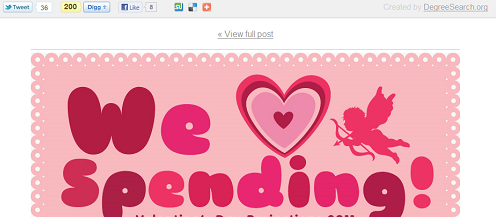
Around Valentine’s day, I saw what I think was an amazing infographic setup, minus one small thing. This infographic was the Valentine’s Day Spending [Infographic] by DegreeSearch.org.
This setup did a lot of things really well. It allowed the graphic to be published on the blog, but allowed them to promote it with a special landing page as well. This landing page removes almost all distractions, except for engaging with the content via social or embedding. It links back to the post and the site’s homepage. There is this wonderful share bar at the top, which allows visitors to easily share the graphic. It even sticks at the top as the user scrolls down the page.
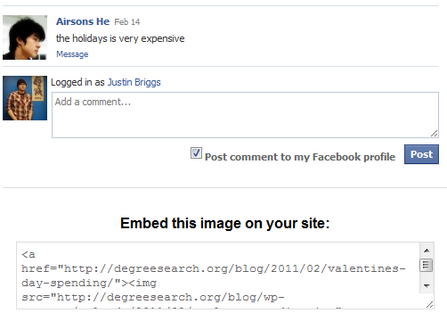
If there is one place this page may have gone wrong, it’s right here:

After the infographic, they’ve embedded Facebook comments, but placed the link embed code below it. Every time someone comments on Facebook, the embed box is pushed further down the page, to the very bottom. Since the Facebook comment box is at the bottom anyways, I would have placed the embed above the Facebook comments (unless of course the graphic's goal was to increase Facebook interactions).
My Setup
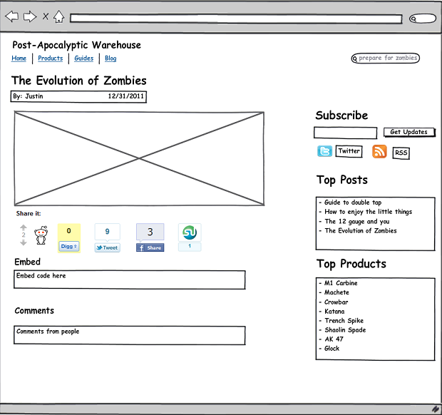
Typically, I’ll publish an infographic as a blog post and use the following setup.

Features:
- Infographic with good file name and alt attribute
- Share buttons (I like the style shown above the most)
- Embed code box, with JavaScrpit to auto select all (will show, one second)
- Embed code with good image name and alt attribute
- Embed code links image to post and has a secondary branded link after the graphic
There are three goals: 1) ease sharing 2) ease embeding 3) make sure the embed code gives good links.
Protip: When making your embed code text area, make it autoselect all the code for easy copying. Like this:
textarea style="font-family: monospace;" onclick="this.select();"
You can see this in action over at eLocal, where my friend Adria works, on their home improvement trends infographic.
Getting Links
Everything so far is preperation for the meat of the campaign, getting the links. Infographics depend on the success of the content's creation, but I won't pretend that good content gains links all by itself.
However, good content is key. Good content, like an infographic, paired with strong outreach, can produce amazing results. But enough with the content talk, let’s get to links.
#1 Advertising
I use social media advertising to help seed infographics. Facebook ads work, but I highly recommend StumbleUpon Ads. These are cheap social oriented eyeballs and you can put yourself in front of a lot of them quickly.
Do not expect much from this traffic. It tends to bounce quickly and doesn’t convert in my experience. However, once in a while, you get in front of just the right person at the right time. On my last infographic, we spent about $500 to help seed, which lead to 10,000 paid views, but we ended receiving about twice as many SU views as that due to free stumbles.
From my experience, SU ads can drive tweets and likes, which I’ve seen from running ads after tweet volume has died off.
#2 Seeding Content: Social Sites
You’ll want to submit to relevant social media sites, but put thought into these submissions. For example, Reddit has a large number of subreddits which may work better for specific types of content. Pay attention to how you tag posts on StumbleUpon. Also you can use accounts at your disposal to seed these submissions with strong early votes where possible. There may be times when you need to call in favors.
#3 Twitter
Just like other social sites, you’ll want to promote through Twitter. Leverage relationships to get tweets from prominent Twitter users.
Find twitter users for outreach, it’s pretty easy:
- Search on FollowerWonk
- Check Twitter directories
- Check niche sites for twitter accounts
- Find most influenced accounts to see who most RTs X person’s content. Use tools like Klout, TweetStats, or the Twitter API.
#4 Manual Outreach
Lastly, you need to do traditional link building outreach.
You need to do outreach.
The type of sites I’m reaching out to will be decided in the first full team brainstorm. I’ve already identified that market, and need to contact them for links. Outreach is an art and a science in its own right, but there have been several posts written on the topic.
- Outreach for Link Building
- How to Use Twitter for Link Building
- Science of Persuasion
- The Do's & Don'ts in Link Request Emails
- 5 Fatal Flaws in a Link Request
- Art of Getting a Link
- The Perfect Link Request
- Link Request Email Template
- How to Write a Link Request based on Tips from OKCupid
Don’t be afraid of outreach. It’s a lot like dating. You have to be willing to put yourself out there. Now, if only I was as good at dating as I am link building.
The secret sauce
At the start of this post, I said I’d tell you exactly how I get links with infographics, but that’s not entirely true. I left out two parts, but that’s because I can’t teach you those, but I can tell you what they are.
Contacts
Good contacts can make or break your content promotion. Do you have a PR team? Do you maintain relationships with major bloggers / journalist that can publish your content? Did you start nurturing relations with niche bloggers prior to pitching? We do.
I can’t emphasis enough the value that a handful of useful contacts, who actually reply to your emails, can have on your promotion.
Hustle
I believe hustle is my most valuable skill, in both SEO and life. Tom talks about the concept of hustle as a meme on Hacker News in his post on OnStartups about Distilled culture. Hustle is something that’s hard, maybe impossible, to teach. It's the willingness to “do whatever it takes” to get what you want.
"Things may come to those who wait, but only the things left by those who hustle"
- Abraham Lincoln
Success often means getting lucky, but I do believe “luck is when preparation meets opportunity”. You have to be out there hustling to find those opportunities. You have to be willing to do the work. The lengths I’ll go in outreach often result in rolled-eyes and chuckles around the office, but I get links. I get lucky with a lot of links, but I'd miss them if I wasn't out there working the process.
If you'd like to talk more about link building, you can find me on Twitter or see me in person at SMX West this week. I'll be speaking on Actionable Metrics and Diagnostics and moderating a Birds of a Feather table on link building (where you can grab lunch with me and chat about links).


Comments
Please keep your comments TAGFEE by following the community etiquette
Comments are closed. Got a burning question? Head to our Q&A section to start a new conversation.