

How to Create Presentations Like Rand
Has anyone else noticed that Rand's presentations are getting better and better recently? Obviously he's been a great presenter for a long time, but I've noticed him upping his game recently particularly in the quality of the decks themselves.
I obviously have a vested interest in watching how Rand does things. I am once again going head to head with him in Boston at our upcoming conference and again in Seattle at Mozcon in July. (Tickets are still available for both and you can read more at the end of this post about why I think you all should join us there!)
When we're prepping for the conference, we do really detailed prep calls with all our speakers. This time around, I've found myself explaining how I want everyone's decks to be a bit more like Rand's. It occurred to me that this wasn't particularly actionable and so I wanted to put together some of the things I've been trying to integrate into my own presentation style in the hope that it'll serve as a good guide for others.
Of course, what's missing from this list is any of the "behind the scenes" methodologies Rand uses to capture and refine ideas - hopefully he'll drop some of those in the comments.
I decided to use one of his recent decks (social media marketing for SEO + links) as the example.
Without further ado, these are the things that make Rand's presentations stand out to me:
1. No bullets. Ever.
This was one of the first things I incorporated into my own presentation style when I started presenting more frequently and needed to up my game. The advice is all over the place, but in the early days you find it incredibly tiring and frustrating to avoid bullet points. The way the software is designed to encourage bullets, coupled with the fact that practically every presentation you have ever seen is full of 'em leads you to believe that it's just "how powerpoint is done". Wrong. Ditch 'em.
However (and this is a mistake I used to make a lot) don't take this advice to mean that your slides shouldn't be explanatory. The odd funny photo is great, but you shouldn't just have a deck of beautiful pictures.
2. Lots of single focus slides
Rather than attempt to replace your complicated bullet-point slide with a single slide that captures the entire zen meaning you were trying to convey in those 200 words, consider using one slide per point. This could even be more than one slide per bullet.
When you come to present this deck, you'll find it easy to flow with your deck rather than pausing and fighting it, because you'll want to advance through the slides at talking pace. People read quicker than you can talk (and they can always check back with the deck later), so while you'll want to slow down for the odd complicated slide, I firmly believe that you should trade fluidity and holding the audience's attention for letting people read and absorb every detail of every slide.
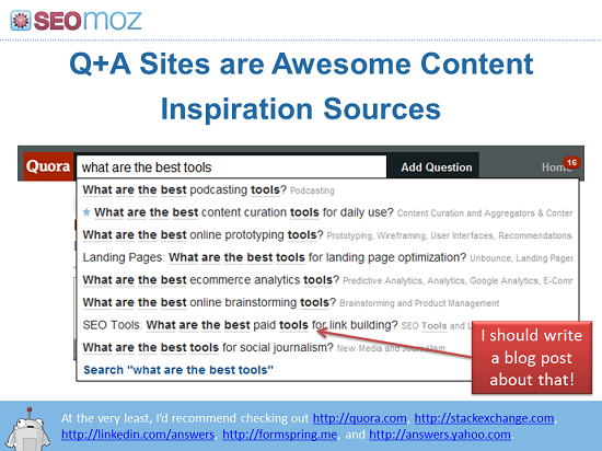
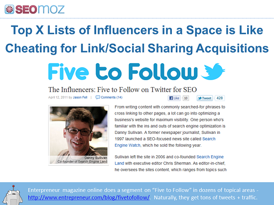
3. A line of explanatory text
You want your deck to be readable and understandable later, when you aren't presenting it. There is huge value to having attendees pore over your advice later and share the deck with co-workers and their boss before we even get onto all the peripheral benefits of online sharing. Re-reading some of my old decks, this is another one I'm guilty of ignoring. It's all well and good making a slide with a massive picture of Matt Cutts (NBED this is my all-time favourite slide from any of my decks). But no-one who wasn't there will have a clue what that means.
Rand has started partially solving this with a single "tweet-length" explanation of the slide at the bottom. On many screens, this isn't even particularly obvious to the physical audience (who don't need it because he's presenting). But it is great for getting the message across to those returning to the deck later or following along from home. He supplements this with:
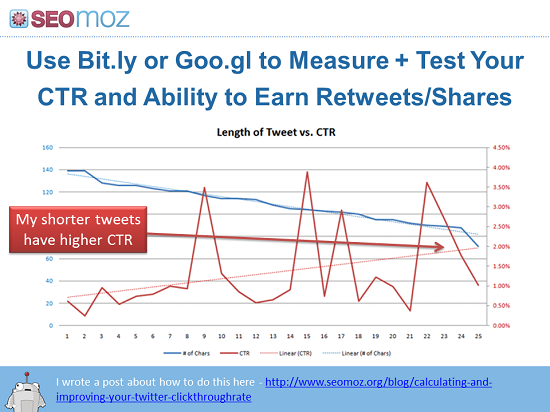
4. Call-out bubbles
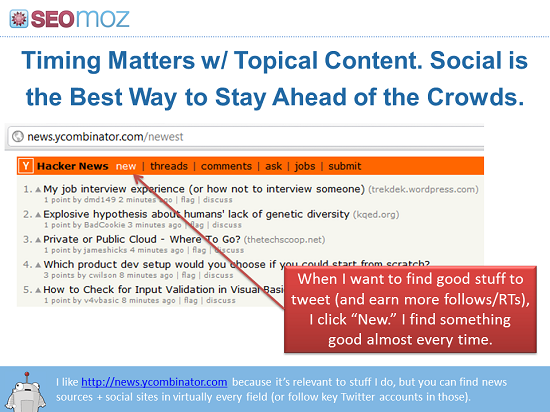
The latest powerpoint makes it super-easy to add nice looking call-outs and Rand makes great use of this to highlight the interesting point on the slide. By removing the need to use a laser pointer (which doesn't work for offline reading anyway) he frees himself up to talk naturally around the data or example without needing to call everyone's attention explicitly to the key points. I think that when I've got this right, I've created some of my best slides - I strongly encourage you to try it on your next data-heavy slide.
5. Cute robot

Not everything in the deck is written in Rand's voice. He has mildly schizophrenic conversations with himself and enables Roger to enhance points or say things he wouldn't necessarily add. Not everyone has an automated mascot to deploy for this purpose, but I actually think it should be part of the plan for more companies. We have noticed how well it works on twitter, for example, to add a human (but non-specific) voice to the @seomoz account. We have felt that Roger enables multiple people to run that account in a much more natural way than we can with @distilled where (because there is no explicit persona) we often feel the need to say who is tweeting at any given time.
If you don't have a cute mascot, you can always consider just having your deck challenge you. If you are a strong and natural presenter, it can work to have your deck "argue" with you and present the counter-argument to the points as you make them verbally. It takes care, you need to avoid confusion and you definitely need to consider those reading the deck later (see above) but it's an advanced technique worth experimenting with.
6. Open and transparent
TAGFEE. The first letter stands for "Transparent". I think I can go so far as to say that Rand wouldn't have reached the heights he's reached without the transparency. He gives away the farm repeatedly. I don't know how he can create so many high-quality decks and consistently find new things to share, but one thing's for sure - I've seen exponential benefits to sharing more than I think I should. Every time I push it further, I get better ratings and good things happen as a result of those presentations.
We coach our guys at Distilled that their default position should be to share it. Occasionally we have to redact client data or something we have been told in confidence or under NDA, but generally, we find that we easily benefit more from the sharing than from keeping things under wraps.
7. Great examples
You shouldn't go looking for examples as you are putting the deck together. I'm sure that, like me, you spend your life on the internet, but when it comes to remembering that one site, you draw a blank. Three tools that I think help (one of which I know Rand uses) are:
- Trunk.ly - indexing links you and your followers share on social media sites - this means you can easily go and find "that thing you were talking about the other day"
- Diigo - social bookmarking with private groups - lets you have a shared swipe file across an office for example. We are trying to get in the habit at Distilled of tagging cool stuff in our private group so that we can all find that great example of faceted navigation when we need it
- Evernote - cross-platform note-taking and clipping tool - my favourite tool for syncronising my search for interesting stuff across my phone and multiple computers. It's so easy to grab something from any platform including voice and image notes that there is really no excuse...
8. Bright and colourful
Rand is lucky to have a natural eye for design so he can make his slides look both bright and engaging. If you don't have these skills yourself, make sure that your template is designed by someone who does so that you can work within the constraints of something that looks great. I have found it much easier to create great designs within the context of a beautiful template even with the design skills of a distracted monkey. Modern presentation software has such great defaults and templating ability that if you have someone who knows what they are doing put together the base from which you work, you will find it almost impossible to create something ugly.
This is probably the area where I struggle the most so it's also the one where I try to make notes of tips I come across. Some recent ones that have helped me a lot:
- The "remove background" / "choose transparent colour" tool is your friend - particularly if you don't have a white background on your slides. It means that you can make logos and charts appear properly embedded in your deck
- The latest powerpoint can grab screenshots straight into your slides so you don't need to go through the tedious two-step process any more
9. Full of diagrams
Much like great blog posts, great presentations require the creation of some new collateral. You can't just expect to dump in a few stock images and screenshots - you're going to have to create some new images. In some cases these may just be charts or graphs, but if you have the design chops, then graphics / illustrations / diagrams speak a thousand words and make it clear just how much effort you have put in for your audience.
10. Presented by a madman
.jpg)
Not strictly (or even slightly) a trick for making a great deck, but a big part of the appeal of a Fishkin presentation is the energy he brings to the stage. All of the tips above come together into a deck that he knows and trusts and so you will see him roaming the stage, gesticulating wildly and getting himself and the audience excited. This is one of the hardest parts to copy - but if you are struggling it's one area where I would recommend doing something Rand doesn't do: practice. Actually run through the whole thing a couple of times. When I presented in London last year and did an ignite-style auto-advancing slidedeck for 25 minutes, my first run through was so bad that my staff actually had their heads in their hands. It nearly killed me, but by the time I came to do it on stage I knew exactly when each transition was coming and what the next slide was. Don't underestimate the power of both these kinds of madness...
Just in case you think this is all too much praise for Rand, I'd just like to remind y'all that I'm currently leading the head-to-head presentation competition 3-1 and so I'm not too deferential in person. One of the big reasons for writing all this was to get to know my enemy better before our big contests.
Come and see it all in person: The conference we are running with the support of SEOmoz in Boston is in less than two weeks and is going to be amazing - I finished prep calls with speakers yesterday and every time I get off the phone I'm blown away by the ideas. It's not too late so you should definitely find out more about why you should come with us to Boston here. Mozcon is a little further away but it sounds like it's going to sell out, so you should definitely head west too.
The author's views are entirely their own (excluding the unlikely event of hypnosis) and may not always reflect the views of Moz.
![Convince Your Boss to Send You to MozCon 2025 [Plus Bonus Letter Template]](https://moz.rankious.com/_moz/images/blog/banners/eee4a4a8-d4aa-457e-80b1-0ffa186b88ff_2025-06-27-174747_coli.png?w=580&h=196&auto=compress%2Cformat&fit=crop&dm=1751046467&s=454333def17ba9d472d3d98b6786741e)
![How To Drive More Conversions With Fewer Clicks [MozCon 2025 Speaker Series]](https://moz.rankious.com/_moz/images/blog/banners/Mozcon2025_SpeakerBlogHeader_1180x400_RebeccaJackson_London.png?w=580&h=196&auto=compress%2Cformat&fit=crop&dm=1750097440&s=296c25041fd58804005c686dfd07b9d1)

Comments
Please keep your comments TAGFEE by following the community etiquette
Comments are closed. Got a burning question? Head to our Q&A section to start a new conversation.