
IMC Stockholm, Swedish Meatballs and New Friends
A couple weeks ago I went to Sweden to speak at IMC Stockholm. I had a really lovely time exploring the beautiful city as well as speaking at IMC and networking with marketers from all over the world. I thought I'd provide a recap of my trip and share some conference coverage with all of you who didn't attend the conference but are curious as to what it entailed. Enjoy!
Stockholm: A Photo Recap
In a nutshell, Stockholm is beautiful, I had a great time exploring the city and I definitely want to go back and visit again. Here are a few photos:
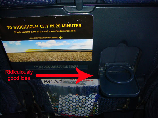
SAS has cup holders that fold down from your tray table, allowing you to use the cup holder without
having the tray down. Such a simple perk that instantly made me mad at every other airline.
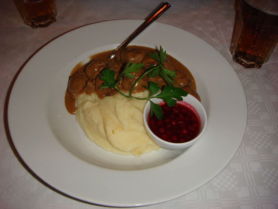
My first meal in Sweden was indeed Swedish meatballs. Maybe I was just exhausted
and starving, but they were crack addiction delicious.

The Vasa, aka the world's only surviving 17th century ship. It's almost as old as Larry King (hey-oooo).
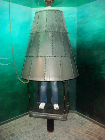
Me standing under a "diving bell" that was used to salvage weapons
and small items from the sunken Vasa ship.
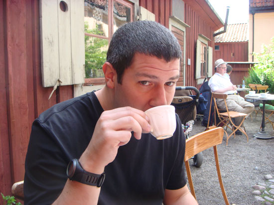
Manstery Guest getting his "fika" on (aka "coffee break"). The Swedes take their coffee very seriously.

Me looking like a vodka-swilling Eskimo at the Absolut Ice Bar.
IMC Stockholm
IMC Stockholm was organized by Lars Nordstrom, Lennart Svanberg and Lars Johansson. It took place over three days, May 26-28. Day 1 was Affiliate Day and was conducted entirely in Swedish so I didn't attend (lest I offend people with my horrible Swedish Chef impression). Day 2 consisted of a single track conference, and Day 3 was devoted to special workshops for attendees. Below is a recap of Day 2's sessions.
Combining the Best of the Web: Maria Ziv and Tommy Sollén from VisitSweden
Their goal: to build Sweden's brand to other countries in order to increase the country's attractiveness. A country is like a brand; if there's an affinity for the brand, people will use it (or in this case, travel to it).
What they did:
Biggest takeaways:
Some other guy was supposed to do the Top 12 SEO Tips panel but he was a no-show (how rude!), so Mitch Joel took over the panel at the last minute (and even hastily prepared a slide deck for the session). He also gave a very entertaining keynote that incorporated Journey videos, so I of course was an instant fan. (Interesting aside: the keynote was given after lunch, which I think is a good idea because if it's boring then everyone will just sit in a post-lunch sleepy coma anyway, and if it's a good keynote then everyone will perk up and have a good time. Either way, it's better than subjecting three panelists to the dreaded Post-Lunch Slot.)
How to Use the 6 Conversion Rate Factors to Lift Your ROI: Chris Goward, WiderFunnel
Chris gave my favorite presentation. He specializes in conversion rate optimization and had a really awesome presentation full of case studies and great examples. He also hosted a conversion rate workshop that was very well attended. I'll likely interview him for our blog in the coming weeks, so check back to learn more about Chris and his business.
The Conversion Rate LIFT Model:
Clarity:
Mihkel gave an overview of eye tracking and how it works. When conducting eye tracking, it's important to have a sufficient sample size (reliable results start with samples of 30-50 people). He shared some test results with us that were really interesting. It seemed that of the following sites' ads, Ebay's were the "catchiest" to visitors. He also shared some banner ad variations and showed us which ones performed better based on eye tracking results. It was a neat presentation that gave a nice drill down of eye tracking and page layout.
Truly Understanding Visitor Behavior: Ewald Hoppen, wehkamp.nl
Ewald took us through some visitor behavior examples. I don't have many notes from his presentation, so I apologize for that (maybe you can bug him for his slide deck if you're super duper interested).
Websites Gone Bad: When Small Design Flaws Cost Big Money: Tom Calahan, Lost Ferret
Tom and I immediately hit it off over our mutual love of movies and general snarkiness. He owns a web conversion company in southern England. Below are highlights from his presentation:
Overall, I had a really nice time at IMC Stockholm. It's a small but fun conference series, and I met a lot of great people from the US, Canada and Europe. There's an IMC Vancouver coming up in the fall, so hopefully you'll be able to make it out to that one (and I may be speaking, so come out and support your favorite mozzer).
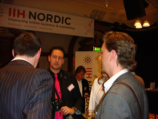
Networking at IMC Stockholm
Stockholm: A Photo Recap
In a nutshell, Stockholm is beautiful, I had a great time exploring the city and I definitely want to go back and visit again. Here are a few photos:

SAS has cup holders that fold down from your tray table, allowing you to use the cup holder without
having the tray down. Such a simple perk that instantly made me mad at every other airline.

My first meal in Sweden was indeed Swedish meatballs. Maybe I was just exhausted
and starving, but they were crack addiction delicious.

The Vasa, aka the world's only surviving 17th century ship. It's almost as old as Larry King (hey-oooo).

Me standing under a "diving bell" that was used to salvage weapons
and small items from the sunken Vasa ship.

Manstery Guest getting his "fika" on (aka "coffee break"). The Swedes take their coffee very seriously.

Me looking like a vodka-swilling Eskimo at the Absolut Ice Bar.
IMC Stockholm
IMC Stockholm was organized by Lars Nordstrom, Lennart Svanberg and Lars Johansson. It took place over three days, May 26-28. Day 1 was Affiliate Day and was conducted entirely in Swedish so I didn't attend (lest I offend people with my horrible Swedish Chef impression). Day 2 consisted of a single track conference, and Day 3 was devoted to special workshops for attendees. Below is a recap of Day 2's sessions.
Combining the Best of the Web: Maria Ziv and Tommy Sollén from VisitSweden
Their goal: to build Sweden's brand to other countries in order to increase the country's attractiveness. A country is like a brand; if there's an affinity for the brand, people will use it (or in this case, travel to it).
What they did:
- Defined some core values that are specific to Sweden as part of their brand platform
- Worked on improving their interactive communication
- Analyzed the site's current needs and new trends and established a new vision for the website
- Wanted more efficient use of resources, interactive communication, modern navigation and SEO friendliness
- New site has more images, maps, better interactivity (can plan a trip, watch videos, book hotels, etc.)
- Was awarded Sweden's Best Website by Internetworld in 2008
- Set up the CommunityofSweden.com blog to be transparent with their readers and let them know what they were doing with the site and to ask for feedback. It was a great way to build an initial group of users and attract page views and buzz.
- Won the Best Online Social Community Episerver Award in 2009
- They utilize Twitter, Facebook, YouTube, and "Add This" buttons to share/spread content and engage with their fans and community members
Biggest takeaways:
- Social media is not just a set of tools, it's a community. It's not just observation, it's relationships, connections, sharing, collaboration, and creation.
- Social media isn't a new idea; it's simply a variation of one of the oldest human activities: communication.
- The biggest hurdle to overcome with social media marketing is getting over the "I'm not social!" hump. Companies need to find their own humanity, and it's important to identify and capture your corporation/person. Share your essence and figure out an appropriate corporate voice, and dare to make mistakes.
Some other guy was supposed to do the Top 12 SEO Tips panel but he was a no-show (how rude!), so Mitch Joel took over the panel at the last minute (and even hastily prepared a slide deck for the session). He also gave a very entertaining keynote that incorporated Journey videos, so I of course was an instant fan. (Interesting aside: the keynote was given after lunch, which I think is a good idea because if it's boring then everyone will just sit in a post-lunch sleepy coma anyway, and if it's a good keynote then everyone will perk up and have a good time. Either way, it's better than subjecting three panelists to the dreaded Post-Lunch Slot.)
How to Use the 6 Conversion Rate Factors to Lift Your ROI: Chris Goward, WiderFunnel
Chris gave my favorite presentation. He specializes in conversion rate optimization and had a really awesome presentation full of case studies and great examples. He also hosted a conversion rate workshop that was very well attended. I'll likely interview him for our blog in the coming weeks, so check back to learn more about Chris and his business.
The Conversion Rate LIFT Model:
- Value proposition
- Relevance
- Clarity
- Anxiety
- Distraction
- Urgency
Clarity:
- The tagline doesn't include a benefit
- "Learn More" is more prominent than "Join Now"
- Subheaders contain no features or benefits
- The "Join Now" button is below the fold
- It takes many clicks to get to individual products
- Uneven images disturbs eye flow
- Inconsistent mix of link treatment adds to confusion
- Headlines don't match search keywords
- Animation reduces user control (generally, flash animation will depress conversions, so remove any flash animation that hasn't been test and proven to work)
- Many links redirect attention
- The screenshots aren't tied to the benefits
- The feature image is unclickable
- The headline contains no value proposition
- The page is missing reasons why you should shop here
- Users are worried about giving up personal information with no explanation or assurance of what it's being used for
- Page is missing/under-emphasizing urgent keywords/phrasing (e.g., "Join Now!")
- Don't automatically believe best practices. Be sure to test for yourself to see what works for you. For example, one of Chris's clients found that having the McAfee secure shopping logo in his shopping cart somehow decreased conversion rates by 1.1%.
- Start with A/B/n testing before multivariate.
- Get the process right--follow it and be rigorous about changes. You may have to tweak your conversion rate process several times in order to get results, but be diligent instead of focusing too much on initial results.
Mihkel gave an overview of eye tracking and how it works. When conducting eye tracking, it's important to have a sufficient sample size (reliable results start with samples of 30-50 people). He shared some test results with us that were really interesting. It seemed that of the following sites' ads, Ebay's were the "catchiest" to visitors. He also shared some banner ad variations and showed us which ones performed better based on eye tracking results. It was a neat presentation that gave a nice drill down of eye tracking and page layout.
Truly Understanding Visitor Behavior: Ewald Hoppen, wehkamp.nl
Ewald took us through some visitor behavior examples. I don't have many notes from his presentation, so I apologize for that (maybe you can bug him for his slide deck if you're super duper interested).
Websites Gone Bad: When Small Design Flaws Cost Big Money: Tom Calahan, Lost Ferret
Tom and I immediately hit it off over our mutual love of movies and general snarkiness. He owns a web conversion company in southern England. Below are highlights from his presentation:
- A lot of companies still believe in acquiring traffic ahead of improving their website. They overload their websites with too much data and information, resulting in information overload and not knowing what to look for.
- He focused a lot of his presentation on basket and checkout abandonment and highlighted some great examples:
- Busy landing page
- Hard to read/find the shopping cart
- Lacking a clear call to action
- Key information was hidden
- Missing a clear/easily readable phone number
- Basket is too low on the page
- Security information is hidden
- Weak call to action
- Limited payment options
- No progress indicator
- Customer concerns to keep in mind:
- When will it arrive?
- What if I want to return it?
- Is it secure?
- What are your credentials?
- Have I ordered the right item?
- What payment options do you offer?
- Can I speak to someone about my order?
- Who else has bought from you?
- Do I need to register?
- Key points of basket completion:
- Will it work in every browser?
- Is the product information clear/easily labeled?
- Make error messages readable and human-sounding
- Offer assurances (e.g., "Shop with Confidence," "Safe and Easy Shopping")
- Keep selling even throughout basket completion (there are still customers who will need a bit of persuasion)
- Be careful in how you handle coupons. Display them carefully, because a lot of people may think they can get a product cheaper elsewhere and will leave to find out.
- Be aware of the cons of one page checkouts (you can't see who's abandoned without additional development or software)
- Don't force anyone to register (low registration rates)
Overall, I had a really nice time at IMC Stockholm. It's a small but fun conference series, and I met a lot of great people from the US, Canada and Europe. There's an IMC Vancouver coming up in the fall, so hopefully you'll be able to make it out to that one (and I may be speaking, so come out and support your favorite mozzer).

Networking at IMC Stockholm
Lennart the Hospitable Swede
After the conference was over, later that week after inadvertently crashing a yacht club party (totally true--we got free burgers but had to sit through an hour-long slideshow presentation about Swedish boat races), Lennart invited me, Manstery Guest and Patrick to his house for a homemade Thai lunch courtesy of his wife, Sandra. Not one to pass up an opportunity to eat, I graciously accepted.
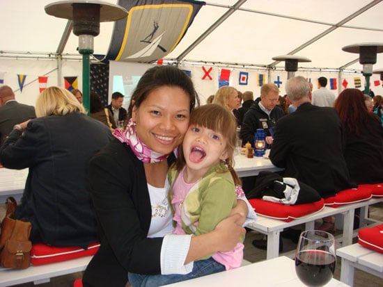
Lennart's wife and daughter, Sonja, at the yacht club party (1/2 Swedish + 1/2 Thai = 100% adorable)
After the conference was over, later that week after inadvertently crashing a yacht club party (totally true--we got free burgers but had to sit through an hour-long slideshow presentation about Swedish boat races), Lennart invited me, Manstery Guest and Patrick to his house for a homemade Thai lunch courtesy of his wife, Sandra. Not one to pass up an opportunity to eat, I graciously accepted.

Lennart's wife and daughter, Sonja, at the yacht club party (1/2 Swedish + 1/2 Thai = 100% adorable)
We had a ridiculously lavish and delicious meal that I've documented below to make you all jealous:
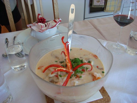
Thai soup that contained prawns and some sort of magically delicious broth
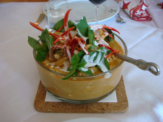
Chicken curry
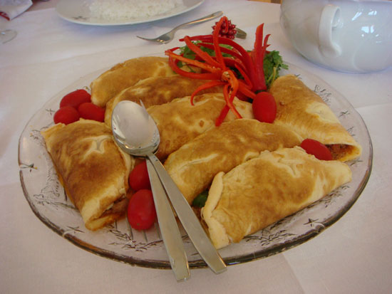
Ridiculously tasty omelet thingies that were filled with spicy-sweet pork and other fixins
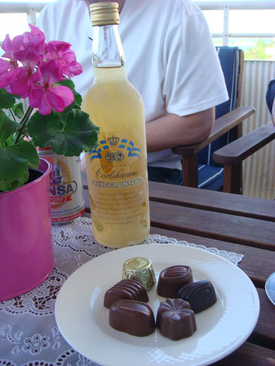
Dessert #1: Chocolates and Liqueur
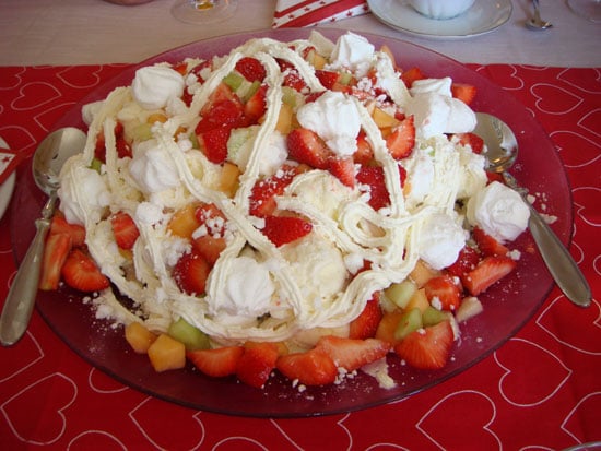
Dessert #2: A concoction of Willy Wonka proportions

Thai soup that contained prawns and some sort of magically delicious broth

Chicken curry

Ridiculously tasty omelet thingies that were filled with spicy-sweet pork and other fixins

Dessert #1: Chocolates and Liqueur

Dessert #2: A concoction of Willy Wonka proportions
We got stuffed so full of Thai food and alcohol that I feared we were getting plumped up for some cruel Swedish version of foi gras. Patrick threw in the towel and succumbed to his food coma:
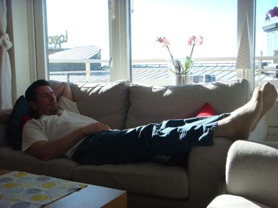
Dreaming of ABBA, no doubt

Dreaming of ABBA, no doubt
I had a fantastic time with Lennart and his family. Huge thanks to them for being gracious and wonderful hosts. And thanks to the IMC organizers, especially Lars Johansson, for inviting me to speak at IMC Stockholm. It was a fabulous experience and I really appreciate the opportunity. Hopefully I can bring you more IMC conference coverage in the future!
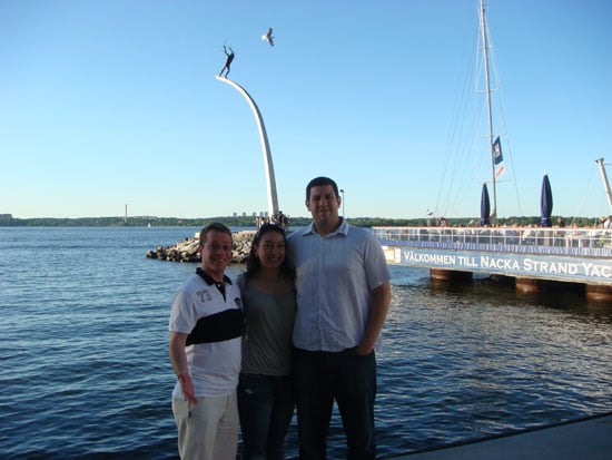
Lennart, me with a statue sprouting from my head, and Manstery Guest

Lennart, me with a statue sprouting from my head, and Manstery Guest
The author's views are entirely their own (excluding the unlikely event of hypnosis) and may not always reflect the views of Moz.

![Convince Your Boss to Send You to MozCon 2025 [Plus Bonus Letter Template]](https://moz.rankious.com/_moz/images/blog/banners/eee4a4a8-d4aa-457e-80b1-0ffa186b88ff_2025-06-27-174747_coli.png?w=580&h=196&auto=compress%2Cformat&fit=crop&dm=1751046467&s=454333def17ba9d472d3d98b6786741e)
![How To Drive More Conversions With Fewer Clicks [MozCon 2025 Speaker Series]](https://moz.rankious.com/_moz/images/blog/banners/Mozcon2025_SpeakerBlogHeader_1180x400_RebeccaJackson_London.png?w=580&h=196&auto=compress%2Cformat&fit=crop&dm=1750097440&s=296c25041fd58804005c686dfd07b9d1)

Comments
Please keep your comments TAGFEE by following the community etiquette
Comments are closed. Got a burning question? Head to our Q&A section to start a new conversation.