The Page Bloat Disease & Why You Should Eliminate Extraneous Pages
The author's views are entirely their own (excluding the unlikely event of hypnosis) and may not always reflect the views of Moz.
Many of the large content and e-commerce sites we've worked with experience a disease I like to call "page bloat." Symptoms include pagination of content pages, creation of new pages that simply provide alternate navigation methods and site architecture design that follows the little-known usability rule from well-known guru, Wrongy McLovestoClick - "more pages are always better than fewer pages."
I'm firmly in the camp against Mr. McLovestoClick - my idea of the perfect user experience is to deliver the content a user wants in the fewest possible clicks from the page they arrive on. This means making navigation simple, direct and obvious. It doesn't mean creating thousands of paths for a user to follow. Another rarely invoked usability rule that I do agree with:
More Choices with Exactly What the User Wants < Fewer Choices with a Reasonably Decent Selection
What? The user would rather settle for something imperfect then have to wade through dozens of sidebar navigation units to find their exact match? Yep. Ever wonder why those top 3 results at the search engines received 70% of clicks, even when search results used to suck - it's because users are happier compromising now than spending time getting it perfect.
Most folks agree on these basic truths about web surfing, but I know some of you out there are still saying, "But Rand, my business model is based on page views - I need to maximize the number of clicks to get the most revenue from my traffic." I still say eliminating unneccessary pages, killing paginated articles and removing extraneous navigation will help. A better user experience means more repeat visits, more links, more viral sharing and ultimately, more page views. In the long run, who's going to win the traffic game? The site that delivers what users want, or the site that makes you click 12 times to get what you could have found elsewhere with 2 clicks?
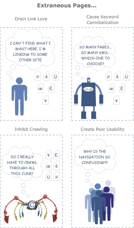
That's not all the problems with page bloat - they're bad for search engine indexing and ranking, too. Just have a look:

I invite you to review your own sites and ask if you need to provide 3 or 4 navigation systems when 2 are used by 95% of visitors. Do some testing to see if those content pages earn more links and more traffic when they're paginated or when they provide all the content at once (not - pagination can be OK, but a lot of sites overdo it). Look at the click-paths of your visitors through analytics and ask yourself - could I have gotten them there faster?
And think of the poor spiders! They have so many billions of pages to crawl already - do you really need to add to that burden?


Comments
Please keep your comments TAGFEE by following the community etiquette
Comments are closed. Got a burning question? Head to our Q&A section to start a new conversation.