

Link Profiling with Open Site Explorer
We all know that links are good for SEO and good links are even better, but what does a “good” link profile really look like? It’s easy for even an average website to have hundreds of back-links, and sorting through them to get a sense of the overall quality is often more art than science. It’s also easy to get caught up in the outliers. Will 1 great link or 1 spammy link tip the balance? Probably not, but it’s easy to get distracted by those exceptions when you're filtering through hundreds or thousands of links.
Here on SEOmoz, we've tried to distill (and by "we" I mean a bunch of other people who are smarter than me) the idea of link profile quality into metrics like Domain Authority and Page Authority. These are incredibly useful concepts, but now we're on the opposite extreme – just one number to represent something very complex. The problem is, we really don't have much in between, a way to understand the quality of our link profile at a glance.
Link Profiling: The Experiment
This blog post really began when I wondered whether it would be possible to take our existing Moz metrics and chart what a link profile looks like. I went through a number of variations (subjecting Ben and Nick to harrowing emails loaded with dozens of graphs), until I finally landed on a process using Open Site Explorer. I'm going to outline that process, give a few examples, and then provide you a link to an Excel spreadsheet to download, so that you can play around with the idea yourself.
The basic process looks something like this:
- Enter a site into Open Site Explorer (OSE)
- Select “Show [Followed + 301]”
- Select “from [External Pages Only]”
- Select “to [All Pages on the Root Domain]”
- Export results to CSV/Excel
- Calculate the max Page Authority (PA) for each domain
- Sort max PA into buckets: 1-10, 11-20, etc.
- Graph the buckets
The result is a distribution of all of your linking domains by the highest-authority pages in those domains. This sounds a lot more complicated than it really is, so let’s see it in action.
Profile 1: High Quality
Let's start with what a high quality domain might look like – I'll make it easy and pick on SEOmoz. Using the process above, here's one way you might graph the SEOmoz link profile. Since Open Site Explorer exports a maximum of 10,000 links, I've restricted this profile to just the home-page:
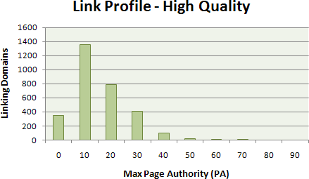
You may be surprised to realize that, even for a high-authority site, most of the Page Authority is still on the lower-half of the spectrum. The simple reality is that even on a strong site, most of the actual pages that link to it are much weaker than their parent domains. Most of the back-linked Moz pages land in the second bucket, with a gradual drop-off as PA increases.
Profile 2: Medium Quality
Now, let's compare that with a solid but less authoritative site, my own blog. I've got solid back-links from some pretty good sources, but nothing like the Moz does. Here's what my PA profile looks like (this is also the data used in the spreadsheet below):
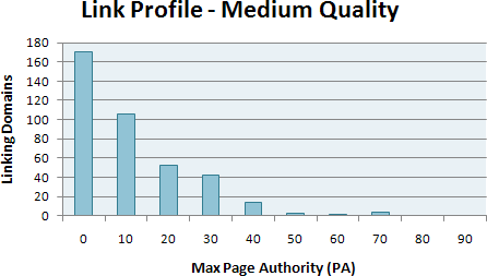
Here, you see that most of my back-linking pages are sitting in the 0-10 bucket, a clear sign of my inferiority (sniff, sniff), but the curve still levels off gradually and I've got some solid representation up the PA chain.
Profile 3: Low Quality
Finally, let’s pick on a site that came to us in Q&A with some trouble (we’ll keep it anonymous, of course). This isn’t a site that was heinously blackhat, just one that suffered from enough low-quality links that we suspected a problem:
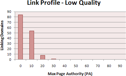
Look closely, and you'll see a pronounced 0-10 bucket followed by a rapid drop-off, with little or no high-quality pages to take up the slack. It may seem like a subtle distinction at first, but look in the PA range of 20-70, and you'll see the difference.
The Excel Spreadsheet
You can download the spreadsheet (1.9 MB) and try it for yourself. Just export your own data from Open Site Explorer (as described above) and paste it into the first worksheet ("OSE Data"). The second sheet ("Domains") will automatically strip out the subdomains, and the third sheet ("Max PA") is a pivot table that calculates the maximum Page Authority for each subdomain and then collapses that into the 10 buckets.
One trick: You'll need to refresh the Pivot Table (how to do this varies a bit with your version of Excel). The other pages and the final graph should refresh themselves automatically. I haven't tested this on a Mac, so feel free to comment with helpful corrections.
This technique is a work in progress, and more of a way to explore your link profile than a hard analytical tactic at this point. If you try this out and find something interesting, please let us know in the comments. We're always looking for useful ways to enhance the data visualizations on the SEOmoz tools.
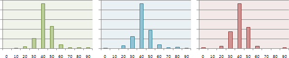
Update - DA Profiles
A few people asked in the comments about what the Domain Authority (DA) profiles looked like. Since the SEOmoz team re-normalized some of the DA data last week, these curves are very similar in shape, but I'm including them below (I've matched them on height of the top bar):


Comments
Please keep your comments TAGFEE by following the community etiquette
Comments are closed. Got a burning question? Head to our Q&A section to start a new conversation.