Search and Social Media FAILs by California Gubernatorial Candidates Meg Whitman and Jerry Brown
The author's views are entirely their own (excluding the unlikely event of hypnosis) and may not always reflect the views of Moz.
The race for governor positions across the U.S. is on, and in California it has been a hotly debated race between Republican ex-eBay CEO Meg Whitman and Democratic mediocre-record-producing Jerry Brown. I'm going to vote for a California governor this Tuesday, and while I was doing my research on the candidates, I can't help but to notice how they're doing in search & social. So I poked around in some data, and here's what I've found about what people want to know about our California candidates and how well they're addressing their audiences through search & social channels online.
PEOPLE LOVE MEG 2X MORE ON FACEBOOK AND JERRY 4X MORE ON TWITTER
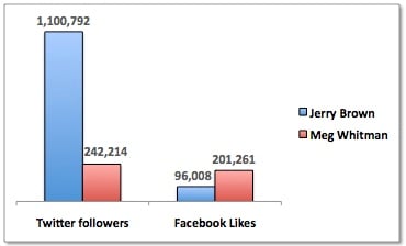 While Meg Whitman has a little more than double the number of Facebook Likes than Jerry Brown (201K to 96K respectively), Brown's Twitter following is enormous, more than 4x more than Whitman's.
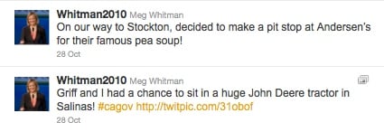
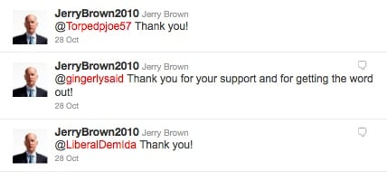
But why? Looking at the Twitter streams from both candidates, both tweet a lot about the event they're at or going to and both congratulate the Giants on their first World Series game wins (Go Giants!). Both have under 1,000 tweets.
But one thing I did notice is that they both humanize differently. Meg Whitman talks about the pumpkin patch she visited or about stopping at Andersen's for their famous pea soup. Brown sends out personal thank you's in droves. The big difference in the humanization of these tweet styles is that talking about what you did (visiting pumpkin patches & restaurants) is talking about yourself, while sending personal thank you's is more along the lines of talking about your audience. People like that. But could that be what makes the difference between a quarter million and over a million followers? Is there more to learn from the content that Jerry Brown tweets that gets him more followers? Is his audience just more Twitter friendly (but not really on Facebook)? And/or are these thank you's really doing the trick?
Both Whitman and Brown promote their Twitter pages from their Facebook pages (Brown also promotes his Facebook page from his Twitter page). There are just as many searches for Whitman's Twitter account as Brown's and Brown's Facebook account as Whitman's, so Whitman's double Facebook Likes and Brown's quadruple Twitter followers are not a result of demand.

So then there's this: According to this 2009 Brand study by Razorfish (pdf), the top reason people follow a brand on Facebook or Twitter, after exclusive deals or offers (the number one reason), is because they're already an advocate. Which seems to be appropriate for this example. So how do current Whitman or Brown advocates find their candidates' Facebook pages? Usually from their own promotional materials, including their websites.
Let's look at the websites. Whitman's site has social sharing buttons on the home page, while Brown's site highlights signing in through a social network for myjerrybrown.org instead. There's no social sharing icons other than his Facebook Like button lower on the page. But he's somehow killing it with Twitter followers.
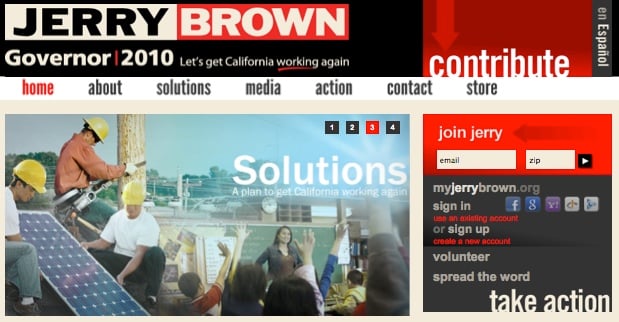
Whitman, who hardly has the followers Brown has, does have all of the social share buttons on the home page (including text message sand RSS feeds). Both sites have the same Facebook Like module in the right rail of the site. Both sites have social sharing buttons for Facebook (and others) at the bottom of pages on the site.
Here's the biggest difference I see in the social aspects of the two sites though:
1. Whitman's social sharing module is not only on the home page, it's on every page of the site (as a sidebar). It's not something you can miss.
2. Whitman also has social sharing buttons on every video and photo. Brown's videos either play inline or are hosted all on one page with Facebook Like & Twitter share buttons at the bottom (for all videos on the page), and his photos are hosted on Flickr. This inhibits opportunities for sharing some of this content.
Can that make the difference between 96,000 and 200,000 likes on Facebook? It certainly isn't hurting. What I dont know for this study is how the candidates have been promoting their social networks through other mediums like print, radio, TV, etc. This may hold a key to why Brown's Twitter or Whitman's Facebook pages are so successful.
WHITMAN & BROWN BOTH SUCK AT CROSS CHANNEL OPTIMIZATION
On YouTube, both Whitman and Brown run channels (Whitman with 404K upload views and Brown with 1.1M upload views), and have plenty of videos promoting their causes and their public appearances and smearing their opponents (although it seems Whitman is doing more smearing of Brown, and the public or other political groups are doing more smearing of Whitman).
These videos have a lot of views, and just by sitting there, will get more. They're being shared, they're bing promoted on the site, and they're (potentially) coming up in search results. Here's the problem.
- Out of the top 5 viewed commercials and top (1) promotional videos for each candidate, only one of the videos promotes their Facebook or Twitter accounts - a Whitman commercial shows it in very small type for about a half second at the end of an ad (I had to rewind it twice to see what it was).
- Seven out of the twelve videos give viewers a website URL. From a "views" standpoint, the 5 videos that didnt promote any websites missed an engagement opportunity of sending 89,381 viewers (on 3 videos) to Whitman's website, and 242,179 viewers (on 2 videos) to Brown's website. Except that Jerry Brown has URLs listed underneath each of his videos, so viewers of the Jerry Brown videos are encouraged to engage, even though URLs aren't always in the videos themselves.
But 10 out of these 12 videos that I looked at are originally TV commercials. According to the latest Nielsen stats, 60% of people watch TV while on the computer. This is a huge cross-channel marketing loss for both candidates. This is California *and* both candidates are in the Bay Area. No Twitter handles on your TV ads? Who do you guys think you're advertising to?
What's just as distressing to an SEO like me, is that both candidates have absolutely horrible YouTube video titles. YouTube videos are indexed and can (and do) often appear on the first page search results, compelling clickthrough because of the eye-catching video icon that appears among a sea of text in search results. So titling your YouTube videos with the proper keywords is very important - for context, ranking and clickthrough. Here are the titles of the top 5 viewed commercials on each candidate's YouTube pages.
Meg Whitman's top-viewed commercials on YouTube:
- Again
- Jerry Brown vs. The Truth
- I'm Ready
- Meg Whitman - Tough Business
- Meg Whitman - Different Kind
Jerry Brown's top-viewed commercials on YouTube:
- Whitman: "Why I Came to California"
- Echo
- Sarah Palin Attacks!
- Twins
- JB401
Some of Whitman's video titles aren't too terrible, like "Jerry Brown vs. The Truth". That title actually includes the candidate keyword and another relevant keyword "truth". The titles with her name in it at least have her name. But let's look at the glaringly awful one in Brown's list: JB401. I went to the keyword research tool to make sure there isn't something I'm missing - that "JB401" isnt actually a popular search term for something in Jerry Brown's campaign that I'm not privy to. There are 12 searches last month on JB401 - so that kills that idea. Here's the video:
The video is about cutting waste, tax cuts, schools, jobs, bringing power to the local level... It addresses what people are searching for (in the next section), but no one would know from this video title. No one would care about clicking on JB401 when they're looking for what Brown would do about taxes. Huge video optimization failure.
WHAT CALIFORNIANS REALLY WANT TO KNOW ABOUT THEIR CANDIDATES: HOUSEKEEPERS, MOONBEAMS AND LINDA RONDSTAT
When I look at specific search terms that are popular for each of the candidates using Google's keyword tool, I can see that there are more searches for Whitman than Brown (also shown with trends in Google Insights): For the last month of data, Meg Whitman was included in 60,500 Google searches, while Jerry Brown was included in 40,500 searches.
Sifting deeper through the data, here are the top political issues that people are searching around each candidate individually, and the approximate number of searches there were last month for their name + the issue:
Meg Whitman:
- immigration (590)
- abortion (590)
- prop 8 (260)
- education (210)
- gun control (93)
Jerry Brown
- immigration (480)
- taxes (210)
- education (170)
- marijuana (170)
- prop 8 (140)
What's most surprising (and disappointing) to me is the low search volumes. Other than that, California searchers want to know about their views on immigration, education and prop 8. Specifically for Brown they want to know about taxes and marijuana, and specifically for Whitman they want to know about abortion and gun control. Interesting indeed...
Stepping outside of the political issues, here's the other juicy stuff people are searching for around the two candidates (with higher search volumes than the political issues in most cases):
Meg Whitman:
- ebay (1,600)
- housekeeper (880)
- poizner (880)
- voting (720)
- marriage (480)
Whitman is the former CEO of eBay, she was recently in a bit of a firestorm for firing her undocumented housekeeper, Poizner was Whitman's GOP opponent who lost to her and now tepidly endorses her, she has a sparse and spotty voting record, and people either want to know if she's married or what she thinks about gay marriage.
Some other searches include: net worth, mormon, leadership, sons, goldman sachs, and spending.
Jerry Brown:
- attorney general (1,000)
- clinton (260)
- marriage (260)
- linda rondstat (210)
- moonbeam (170)
Brown is currently attorney general, he has had on-again off-again disputes with Bill Clinton for decades, people either want to know if Brown is married or where he stands on gay marriage, he once dated Linda Rondstat, and he was given the nickname "Moonbeam" by a Chicago columnist in '76 for the young, nontraditional crowd he attracted.
Some other searches include: record, acorn, unions, calpers and leon black.
WHO'S WINNING THE SEARCH RANKINGS RACE?
Well, let's look at who's actually ranking in search results for the terms that people are searching on. .jpg)
Whitman has more first page rankings for searches around her name than Brown with two #1 spots, two #2 spots and six first page spots altogether for these terms. Brown has only one #1 spot and four first page rankings for popular searches around his name.
Both candidates highest rankings on these lists are mostly for the political issues like education (for which they both rank #1), marijuana and gun control. Whitman is missing the boat by not ranking for the scandal around the housekeeper. Her site does not show up in rankings, and most of the news stores that do show up are negative, many of which are the voice of the housekeeper accusing Whitman. Where Whitman's site doesn't rank at all for that search, Jerry Brown's site ranks #22.
Brown's big misstep isn't quite as bad. The moonbeam nickname may be good or bad for Brown, depending on how you look at it. For those who are searching for the the origination or meaning of Brown's nickname, Brown is in the 150th position in SERPS (search results pages). Brown could take control of this message and do a better job of explaining the moonbeam nickname on his own site, rather than letting searchers take the viewpoint of whatever site or article they may come across in SERPS that may sway them to like Brown more or to consider him a loopy hippy. Whitman's site ranks higher for that phrase but only slightly at #122. Additionally, Brown could do a better job getting on the first page of search results for more political issues that matter to people like prop 8 and immigration.
But let's take this one step further, to the meat and potatoes. So what if Meg and Jerry are ranking in the #1 spot for searches for their name and education? That doesnt meant they're getting campaign contributions or votes. The real question is: Are they able to draw these searchers in and convert them? I dont have access to their analytics to be able to dig into their conversions, but we can look at what the searcher persona workflow might look like: Does the page in search results address the searcher need? Does it look compelling? Does the landing page answer the question or confuse the searcher? Are there calls to action above the fold?
Well, let's see.
Here's that top-ranked search result for [meg whitman education].
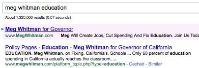 Now keep in mind what the searcher is looking for (likely Meg Whitman's stance on education & what she'd do about the problem here in California). The title does contain the word "Education", but it's mixed into a long title that, when skimming a page full of search results, could easily be overlooked. As a rule, titles should start with the primary topic and not be diluted with a bunch of other text - they should be direct, to-the-point, and easy to read/skim.
If the searcher reads the summary, it may be compelling. It cites a stat rather than hinting that there is content on this page regarding Whitman's stance or plan though, which would be the most compelling text to have here. The URL is somewhat long and arduous to skim, but does indicate that this is indeed a page on education on Whitman's site. Overall the search result display gets an "eh".
So let's say the searcher clicks through. Here's what they find above the fold:
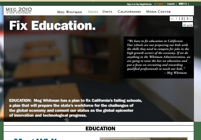
There is no doubt this page is about education and Meg wants to fix it. This does address what the searcher was looking for and what they might expect to find from clicking through on that search result. The italic text on the right is hard to read even at 100% screen size, and none of the paragraph text in this screenshot is indexable - it's all image text. Most of the content is below the fold, if anyone realizes to go there. The only above-the-fold call to action is to print the page, which, at this point doesn't seem like what most people are going to want to do.
The rest of the page below the fold has two paragraphs of text, but the entire thing is in Flash. So here we have a landing page for one of the top political issues that people want to know more info from Meg Whitman, and it's a half image, half Flash page. If you're an SEO, you may be feeling ill right now (unless you're a Brown supporter, but hold your horses, he's up next). Google actually is indexing the text in the Flash content, so there is some contextual content on this page for a search engine to "see". But most importantly, where is the call to action? Maybe I'm pumped up! Maybe I want what Meg wants! Maybe I want to learn more, maybe I want to join her parade, maybe I want to donate. Maybe I want to know how she feels about prop 8, immigration, or other top issues. How do I get there and why am I not led by a link right now, in the right place, at the right time? There are no front-and-center calls to action. What's even less noticeable is that there are three pages to this education subject, indicated by a small 1 | 2 | 3 in the top right above the print icon. The page navigation isn't at the bottom, in fact I hadn't realized this was page navigation until my third visit to this page. The paginated pages do have unique URLs but with no title, meta or canonical tag optimization (which means the education topic now has three landing pages on the site), and are also in Flash with no calls to action. The social sharing buttons are on the side of every page, which could potentially be considered a call to action, sort of, kind of untargeted and vague. Overall Whitman is missing the boat.
So is Jerry Brown doing any better?
Here is that top-ranked page for searches for [jerry brown education]
 This is a much cleaner and more direct title. It says exactly what the searcher was looking for, is easier to skim, and isn't bogged down with too much to read or anything that the searcher wasn't particularly looking for. The snippet underneath speaks directly to what we assume is the intent of the searcher - what is stance or his plan? And the URL couldn't be more simple. We know we're going to the Jerry Brown site's education page, and there's not a lot of extra mumble-jumble in the URL that makes us work to make that determination. This search result display gets a high mark.
This page will likely get the click. So let's see what happens once we're inside. Will our searcher find what they want? What they expect? Will they have a chance to convert? Here is the landing page:
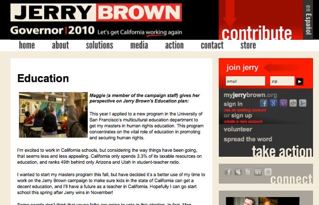
The first impression is that the page is a bit text heavy. Where are the education subtopics that I can skim to? But the title is clear - the searcher is in the right place and this page is what the searcher is expecting to find. There is an important call to action right at the top of the page in the right rail, asking the visitor to join Jerry (submit email), followed by social sign in buttons for myjerrybrown.org, a volunteer link and a spread the word link. All of this followed by social sharing buttons, and we're still above the fold.
Further down the page is better sectioned content, along with several links to download a pdf of Brown's education plan. The entire plan is also on the page, and the end of the page prompts visitors to Like on Facebook, share on Twitter, or translate.
This is mostly well done, although calls to action could be more prevalent again at the bottom of the page. If they've already read that far they're likely passionate about it. Grab them before they go somewhere else. Like Whitman's page, there are also no prominent pushes to learn more about the other political issues like prop 8, immigration, etc. Although this information can be found in the top nav dropdowns in both sites, it is good practice to prompt people to click to those to relevant areas of the site from where they're at, not make them look for it in the navigation (oftentimes they may not have intent to click further into the site unless you put that option right in front of them).
SO WHO IS WINNING THIS RACE?
Overall, my humble assessment is that both of these candidates could use a good search & social cleanup.
But Brown does a good job tweeting and a decent job at cross-channel promotion. His personalized touch in his tweets is a win for his followers and good Twitter etiquette. Having links between his Twitter site, Facebook site, website, in 4 out of 6 of the videos I reviewed and links underneath the videos on YouTube is good thinking ahead by the Brown camp, and great practice for engagement.
Whitman does a decent job in attempting to control some of the messaging around Jerry Borwn. Her YouTube ads addressing Brown, her JerryFails.com site, and her PPC ads for Jerry Brown searches like [jerry brown] and [jerry brown record] show that she is not out for visibility just on her own name, but to steal some of the spotlight from her opponent when possible as well.
BROWN WINS, I GUESS.
But both do a mediocre job overall. It seems their internet offerings aren't much more impressive than their gubernatorial offerings. So if I *had* to pick a winner in this online visibility for governor race, I'd probably pick Brown by a hair, since he's gotten more Twitter followers, more YouTube channel views, and has done a decent job of cross-channel promotion. I wonder if 1.1 million Twitter followers is indicative of the outcome of the vote on Tuesday too?


Comments
Please keep your comments TAGFEE by following the community etiquette
Comments are closed. Got a burning question? Head to our Q&A section to start a new conversation.