The SEO of Responsive Web Design
The author's views are entirely their own (excluding the unlikely event of hypnosis) and may not always reflect the views of Moz.
Will Critchlow announced back in November that Distilled's blog was updated with a new responsive design, but it occurred to me recently that we never went into the specifics of why responsive web design is so great. Responsive design has been a hot topic in online marketing for the past few months, but is it really going to become an industry standard?
Short answer: yep.
Responsive web design means that you don't have separate mobile, tablet, and PC versions of your site: the site adapts to whatever size screen it's being displayed on. Regardless of what device a visitor is using to access your site, they'll see all of the content you have to offer (no more partial-content mobile versions of sites) and they'll see it in readable way.
With a 55% increase in smartphone subscriptions in 2012 alone, responsive web design is the future of online marketing.
How does it work?
Sounds too good to be true, doesn't it? It all started with a fairly simple theory from Ethan Marcotte in a 2010 article titled "Responsive Web Design." Rather than creating a single webpage that is 800px across and centers itself on the screen, responsive webpages are composed of elements that size, shape, and place themselves based on the width of the browser screen. Elements determine the screen size using CSS media queries.
Let's start with a simple example on a grid, using 9 rectangular elements labeled A–I. On a small screen, like a tablet or an older computer with fewer pixels, the elements would display themselves in a 3 x 3 grid:
When the screen is wider, those elements can spread out:
When it’s narrower, they can stack:
Now, here’s a real life, complex, and, might I say, ingenious example. Microsoft’s website uses these sections:
When the screen gets smaller, elements stack differently:

For a more interactive example, go to www.microsoft.com and have some fun changing the browser screen.
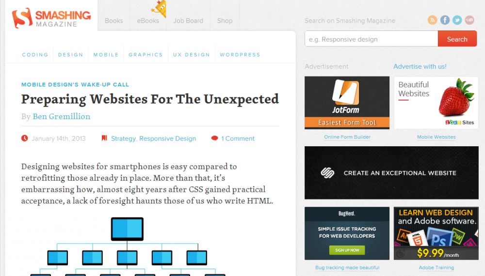
In their design, Microsoft keeps all of the elements from the desktop version of the page to view on other devices. But one of the biggest differences between desktop sites and mobile sites is that mobile sites just don’t have room or the browser memory to have so much content on one page. For example, Smashing magazine gets rid of the extra stuff as your screen size gets smaller:
Here is their desktop view:

The full-sized page has two levels of navigation on the left, the main content in the middle, and search and ads on the right. It centers the main content in the middle, where you’ll be looking, but makes use of the ample width of the desktop screen.
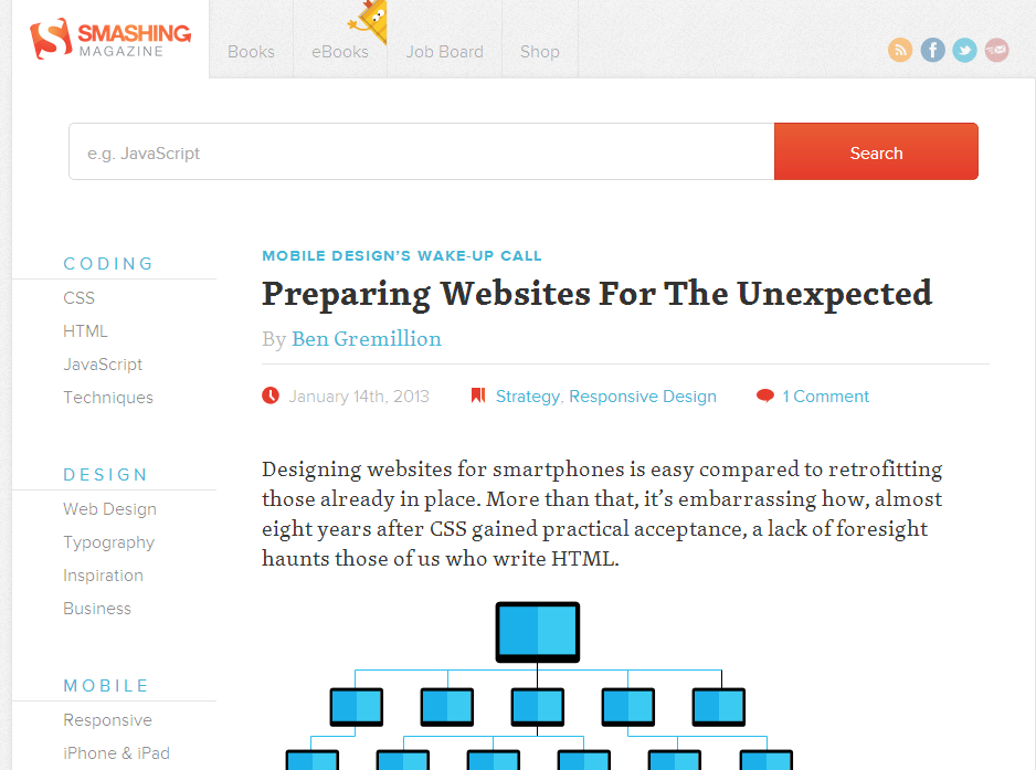
Moving on to the iPad-sized tablet view:

When the screen doesn’t have as much room on either side, Smashing Magazine keeps the ads and search on the right, but it moves the navigation to the top in a clever way that is noticeable, but doesn’t take up too much space.
Here's their Kindle Fire-sized tablet view:

The ads were sacrificed as screen space became too valuable. Search was moved to the top, so that second tier of navigation was moved to the side to make sure the main content didn’t start too low on the page.
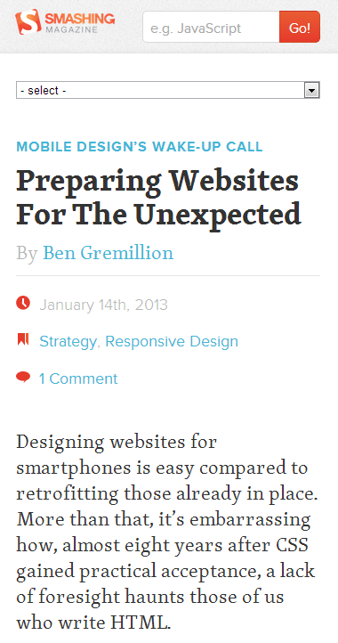
And now, onto mobile:

On the mobile view, the ads are still gone, along with the share buttons. The navigation has changed from a constant element on the page to a small drop down at the top. The search bar was put in the space available once the top navigation was gone.
As you can see, responsive web design gives you an amazing amount of control. With some creativity, a responsive web design can convert almost anything from PC-optimized to mobile-optimized, to anything in between.
Why responsive design is good for SEO
So now you know that responsive design is a clever idea that, with the right set up, will cut down on web maintenance and content creation. But how does that help SEO?
Usability
Google wants to send visitors to the sites that they want to see. When searchers navigate to your site and immediately return to search engine results pages, Google makes a note that your site might not be the best choice for that search term.
If you have a mobile site that has less content or looks significantly different than your regular site, you’ll frustrate return visitors who are looking for something they found on the desktop version. If you don’t have a mobile site at all, 61% of visitors will return to Google to find a site that is easily readable. Either way, your bounce rate will rise and your rankings will drop. With a responsive web design, visitors will get all the content they want, in a format they can read.
Duplicate content
Don’t worry, a mobile site with the same content as the main site won’t be hit by Panda. But you’ll still have the same content on two places on the web, which is bothersome for you and could bring visitors to the wrong version of your site. A responsively-designed website means that content is only in one place on the Internet.
Ranking for mobile searches
Google has said that it ranks sites optimized for mobile higher in mobile searches. Google recommends responsive web design, meaning your responsive designed site will rank as well on mobile search as a site designed specifically for mobile. That’s especially useful for...
Link building
With a responsive web design, a link to your main site is a link to your mobile site as well. Mobile sites are still new, so your competition in mobile search is going to have significantly fewer backlinks. A responsively-designed website will have the backlinks of your original site, even while competing for mobile visitors. It’ll give you an instant edge over there. And, as mobile usage rises and webmasters start linking to mobile sites, your backlinks from both mobile and desktop sites will combine for a stronger backlink profile.
Early adopter recognition
Making your site responsive now, when the topic is hot but largely unused, will get you noticed. Here are a few great examples:
- http://blogs.adobe.com/digitalmarketing/digital-marketing/mobile/responsive-web-design-and-web-analytics/
- http://inspirationfeed.com/inspiration/websites-inspiration/60-examples-of-responsive-website-design/
- http://www.clicknewz.com/5984/benefits-of-responsive-web-design-examples/
- And, of course, Microsoft and Smashing Magazine from this post.
Results
As you can probably guess, if your site was previously unoptimized for tablet and/or mobile, you’ll see a decreased bounce rate from those devices. We’ve seen the positive effects spread into the main site as well. On a fellow Distiller’s site, implementing responsive web design increased visits by over 400% in a month:

That’s an extreme example; the switch to responsive web design on Distilled’s blog didn’t have the same effect. However, results like this show that, in the right situation, responsive web design could bring amazing results.
The cons
Responsive web design isn’t the Holy Grail of online marketing, though; there are some disadvantages you’ll want to mull over before you decide to take the plunge.
Set up time
Moving to a responsive web design will take a significant amount of time from both your design team and your development team. It’ll probably take longer than most redesigns you’ve been through since both teams will have to learn a completely new concept before they can implement it. On the plus side, when other sites start upgrading to responsive web design, you’ll be ahead of the curve.
Large pages
If you have a lot of content on your desktop pages, responsive design means that all of that content has to be loaded on mobile pages. Can you imagine a poor phone trying to load all of this?

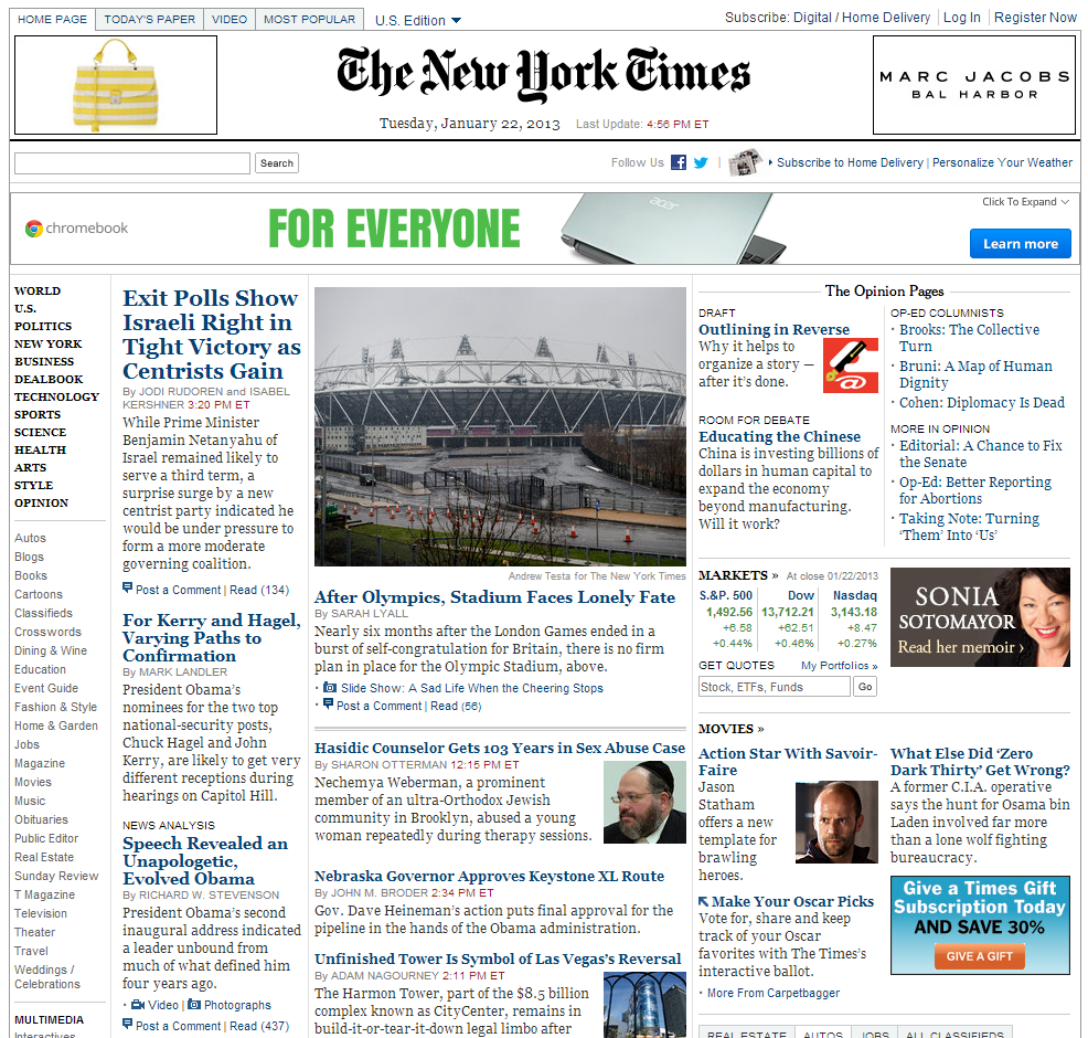
That’s why sites like NYTimes.com and CNN.com have separate mobile versions that only display a small portion of all the articles and links they have on their desktop versions. If you have a site that’s huge like that – and is meant to be huge like that – stick with separate mobile and desktop versions.
Mobile user experience
Since responsive web design confines you to the same pages and content on the mobile and desktop versions, it could limit your options for enhancing user experience. While I pointed out earlier that mobile users want the same content as desktop users, they’re searching on a tiny screen with their fingers rather than a large screen with a mouse and keyboard, so their journey to that same content will feel completely different. If you have a really interactive or complicated site that needs to have different pathways to content, like Facebook, you might want to keep that mobile version of your site so you can have that control.
So, is responsive web design right for your site?
If your site is too large or too complicated and needs a mobile site, you’re probably aware of it (and probably already have an amazing mobile site that shouldn’t be messed with). But, what if you don’t have a mobile site, or have a simple one and don’t know if the switch to a responsive web design is worth it? You’re going to do a little Google Analytics research:
Do I even need a mobile site?
Start by going to the Mobile Overview report, which is a Standard Report in the Audience section under the Mobile drop down. If the number of mobile and tablet visits is under 5% of your total traffic, you probably don’t need to worry about creating a mobile-specific site (yet: this number is only going to grow).
If it’s more than that, click on the Goal Set or Ecommerce metrics set – whichever you use to track conversions – at the top of the page, under the Explorer tab:
Are your desktop visits converting significantly more than mobile visits? If mobile conversion rate is less than half of desktop conversion rate, your site is performing below industry standard, and you need to optimize for mobile visitors.
How does my mobile site look on their screens?
Go to the Standard Reports > Audience > Mobile > Devices and change the primary dimension to “Screen Resolution.” You can change that right above the table, by clicking the Other drop down to the right of the line of other primary dimensions you could use. Try out the 10 most common screen resolutions that are used by your visitors. How does your mobile site look on them? Use Screenfly to see your site on different devices. You might be surprised by how many tablets or large phones are seeing an overly simplified site that isn’t very compelling. Even if you have a mobile site that looks great on 50% of mobile visits, if it looks bad on the other 50%, you should consider responsive web design.
Does my mobile site give visitors what they want?
Look at the mobile bounce rate under Standard Reports > Mobile > Overview. When visitors land on your mobile site, is something making them leave more quickly than on a desktop? Mobile visitors should have roughly the same bounce rate as desktop visitors.
If you have the time, do a full mobile SEO audit to really identify what the mobile version of your site needs to look like. Aleyda Solis wrote up a great mobile audit guide on State of Search.
Your best option: move towards responsive web design slowly
If you’d like to move towards responsive web design slowly or already have a pretty good mobile site out there, consider making your site responsive so that it’s optimized for desktop and tablet, but not mobile just yet. The design will be easier, but you’ll get a first taste of the technical side, and you’ll get better conversions for tablet users (which you probably haven’t optimized for yet).
Ethan Marcotte explains how the coding works in his original article and developers have been creating themes for popular CMSs (for WordPress, for Drupal, and for Joomla).
Be aware that the technical implementation is fairly advanced, and there are a number of small mistakes you should watch out to avoid:
1. Use compressed images
You might have some gorgeous photos that load fine on the desktop version of your site, but those are going to have to be loaded on mobile versions as well. 74% of mobile users will leave after 5 seconds waiting for a page to load, so make sure that you compress your images as much as possible, and use them somewhat sparingly. Smush.it is a great tool for compressing images.
2. Design for all screen sizes
A lot of designers will want to design for one mobile size, one tablet size, and one desktop size, and just make a “responsive” design that snaps the site into a different layout for those standard sizes. But we have large and small cell phones, tablets the size of Kindle Fires to 10” Samsung Galaxy Tabs, and desktop monitors as big as 30”. A responsive design is more about resizing the elements on a page as you have more pixels than it is about snapping one design into another. As designer Stephen Hay says, “Start with the screen small first, then expand until it looks like sh*t. Time to insert a breakpoint!”
3. Always show all content
It might feel overwhelming to find a way to fit all of the content from the desktop version of a page onto a mobile version of a page, but that’s the point of responsive web designs. In the examples described above, the only content that goes away is ads (which users probably didn’t want in the first place) and some navigation (which is replaced by a simpler version of navigation). No actual content is hidden. Mobile visitors want just as much information and just as many options as desktop users do, so don’t deprive them.
4. Optimize for touch
You probably won’t accidentally include an onmouseover JavaScript event on the mobile size of your site, but be aware that tablets can’t hover with their mouse either, and someone on a desktop might be using Windows 8 and want to use touch. Best practice is to make your site completely accessible with touch-only, regardless of the screen size.
5. Test on all browsers
Remember the good old days, when you complained about having to test your website on IE and Firefox? Now you’ve got:
Desktop:
- IE9 for Windows 7
- IE10 for Windows 8 (which doesn’t run Flash)
- Firefox
- Chrome
- Safari
Tablet/Mobile
- Safari
- Default Android browser
- Chrome beta
- Dolphin
- Opera
- Firefox
And those are only the most popular ones. You’ll have to test on all of those, at different screen resolutions, too.
But it’s worth it
Switching over to a responsive web design will be a big challenge, but with the way the industry is moving, it’ll prepare you for the future, and put you a step ahead of your competitors.
Have any of you made the switch? Any advice for those who haven’t?


Comments
Please keep your comments TAGFEE by following the community etiquette
Comments are closed. Got a burning question? Head to our Q&A section to start a new conversation.