
SEOmoz Website Update - Making it Easier to Get From Here to There
As part of a series of SEOmoz self-improvement efforts, we are happy to announce another update to the site! As you've probably already noticed, we just launched a brand new SEOmoz header, footer, and, with these, a distinctly new navigation. Changing navigation can be a tricky business, and if done poorly, can lead to more harm than benefit. We considered this risk when starting this project, but agreed that limitations in the existing navigation were worth addressing:
- Our old navigation tried to support both PRO and non-PRO usage scenarios, and in doing so, didn't do either that well.
- Our existing navigation continued to get squeezed as we added new features. We needed a navigation style that would grow with us.
- We have a whole lot of important features that were buried, and deserved a chance to see the light of day.
- Our designers had some great ideas and wanted a chance make them happen.
Given all of that, we made some important choices.
- Create completely different navigations and styles for PRO vs. non-PRO users, targeting each to key activities
- Support sub-menus in our navigation so more items could be accessible quickly
- Rethink the ordering and organization of the existing elements in the navigation (without messing up the things that already worked well)
We think that the resulting update does a pretty good job of meeting our goals. I'll use the rest of this post to walk through the changes.
For non-PRO or logged-out visitors we created a full width blue and gold navigation. This nav is much more representative of a SAAS site, and supports the types of activities most common to first-time visitors or seekers of free content or tools.
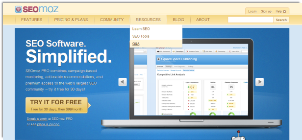
The footer was also redesigned to be better organized and serves to expose some deeper areas of the site as well, while still maintianing space for our key marketing message:

To transition to PRO, we also updated our login page, simplifying it, and adding a bit more Roger:
.png)
Careful when entering your login info--Roger feels your pain when you misremember your password. D'oh!:
.png)
Once logged in, PRO members have a very different experience. The blue and gold header is replaced with a PRO-centric menu bar to offer quick access to the sorts of features PRO members use most. Top-level items include the PRO Dashboard, Campaigns, Research Tools, Community, and Learn SEO. In the Community and Learn SEO submenus, we have surfaced many of the frustratingly hard-to-find items like webinars, events, and videos (we get people writing in frequently asking where to find these).
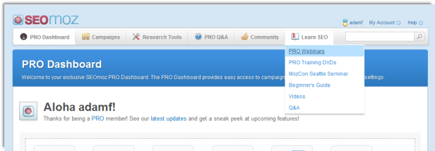
The footer for PRO members is much simplified, so as not to be a distraction when focusing on key tasks.

Along with the new navigation, we have added some supporting pages. Clicking on Community from the PRO navigation takes you to a new Community Page, with a summary of recent activity easy access to key areas of the SEOmoz community:
.png)
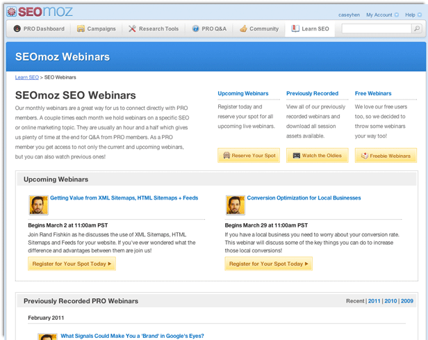
Also, our old clunky webinars page has been replaced with a more usable Webinar area. Yay!
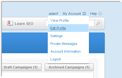
One last area I wanted to call out is a little section at the top right of each page. Using the 'magic' of dropdown menus, we have made account and help options much more accessible! For instance, it is now easy to track down and edit your user profile:
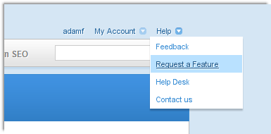
And when you find a bug or think of that killer feature that you just need to share, you can send feedback or access our feature request forum from the help dropdown:
OK, that's about it. Thanks for reading through, and please send along your feedback so we can keep making this better!
P.S. We faced some interesting challenges in making our new navigation work centrally across the multiple applications, languages, and frameworks that we still maintain for some of our tools and features. Check out Myron's post on our dev blog to learn about the technical decisions we made to centralize the code, make it easy to update, and ensure a seamless experience between applications.
The author's views are entirely their own (excluding the unlikely event of hypnosis) and may not always reflect the views of Moz.


Comments
Please keep your comments TAGFEE by following the community etiquette
Comments are closed. Got a burning question? Head to our Q&A section to start a new conversation.