T
The SEO Failings of Major UK Highstreet Retailers
The author's views are entirely their own (excluding the unlikely event of hypnosis) and may not always reflect the views of Moz.
I recently read a couple of posts on e-consultancy about the state of play with major UK retail brands and how they perform online. First was 10 things ASDA could do better online, which, while I enjoyed the post, didn't touch on any of the SEO failings of these companies. Kevin's supermarkets ignoring SEO for major keywords post touched more on SEO which was nice but I wanted to go into a few more meaty things, so here's my review of the state of play with SEO for major UK highstreet retailers.
While the point of this post is to highlight common mistakes and not to call out individual brands, inevitably I've mentioned specific names as examples. This isn't an attempt to cause offence and I appreciate that even if you know what the right answer is, it can be difficult to implement using legacy systems.
Keyphrase Targeting
Who said keyphrases were important? Sometimes you're just too cool for school. Don't listen to all those other guys telling you how important keyphrases are - surely it can't be that important, can it?
Ignoring the fact that you can't find the Boots website on the first page of Google.co.uk for a [boots] search, take a look at their make-up page. Their title tag reads, and I quote:

Well, I could think of a few improvements there.... The most amusing/crushingly depressing (delete as appropriate) thing about this is that many of these brands are paying a lot of money for PPC campaigns while at the same time ignoring organic traffic. Waterstones, for example, bids on the term [cookery books]:

And they have a perfect landing page for a cookery books search. The only problem is that their title tag for the page (and in fact every page on their site) is as follows:

Ah. I see. Not interested in the free traffic then. Those pesky raggamuffin organic visitors are always screwing up my analytics by BUYING THINGS and what not. Such a pain in the neck.
Homepage Redirects
This problem happens an unbelievable amount of times. Take a look at the following pages:
Want a quick and easy way of reaching those URLs? Try clicking on these links:
Yep - that's right, all those nasty URLs are the default URLs you get redirected to when you visit the domain. Sheesh. Sometimes this redirect is a 301, but it's not uncommon to see redirects through a 302, meta-refresh, or javascript!
Note that a clean, user-friendly homepage URL helps users AND search engines. You can bet that this is causing more than a few indexing issues for some of these sites.
URLs, URLs, URLs
Along the same lines as the above point are nasty URLs abound on these websites. Take a look at a few of these non-semantic, non-keyphrase-rich, un-usable URLs:
And my personal favourite - the Currys "washing machines" page:
http://www.currys.co.uk/martprd/store/cur_page.jsp?BV_SessionID=@@@@0738042494.1222078553@@@@&BV_EngineID=ccekadefejmhgddcflgceggdhhmdgmi.0&page=ProductList&category_oid=-30549&fm=4&sm=0&tm=0&show_all=true
Compare this to Comet's page for washing machines:
http://www.comet.co.uk/shopcomet/category/49/Washing-Machines
Now, take a wild guess as to which one ranks top 5 in Google for a [washing machines] search.... Hint: it's not Currys (though Currys does pay for PPC on the term washing machines).
Duplicate Content
Duplicate content can crop up in many different guises, from URL parameters to having more than one domain resolving to the content. Mostly this won't hurt you too much, unless of course you happen to pass internal link juice to both versions - then you're in trouble. For example, look at the following two product pages, both of which have internal links pointing to them. It's the same page (almost), only the breadcrumb is different since the product is contained in multiple categories:
Information Architecture
If you get the information architecture wrong on a site then there's often more implications than simply SEO, as it often impacts your usability too. Consider the following situation:
http://search.next.co.uk/nav3/cat/02men/sub/ttoshirts/0
Now, ignoring the fact that we've somehow ended up on a sub-domain away from the main site, this is as far as you can drill down on the site when looking at men's t-shirts. If you wanted to browse the t-shirts you can sort by price but that's it. There's no option to sort by 'designer' or 'polo shirt', etc. By leaving these sub-sub-category pages off their site, they make it difficult to browse t-shirts as well as not having a page which is capable of ranking for 'polo shirt' (assuming, of course, that the rest of their site was well optimised).
Because Sometimes One URL Just Isn't Enough
Since all of the brands I'm talking about are recognised by any UK citizen, they obviously need to own all the different variations of their domain names. Once you own them, however, you should always look to redirect them into the site. If you don't then you can end up with duplicate content issues. For example, www.thecarphonewarehouse.com and www.carphonewarehouse.com both resolve to the same site.
Sometimes, however, this is taken one step further and there are two separate sites on multiple domains serving the same content. Check out the difference between these two pages: littlewoods, littlewoods direct. It's a good bet that if a user isn't sure which version is more authoritative that the search engines will be struggling, too.
And then finally we come to some situations which are presumably just mistakes, though that doesn't make them any less critical. Try visiting http://www.bodyshop.com. Ideally you'd end up at http://www.thebodyshop.co.uk/, but not so!
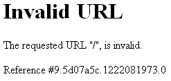
While you might think that it's no big deal, that domain has over 2000 links, so you can be sure that they'll be missing out on search engine rankings and visitors because of it!
Conversion Rate Optimisation
I'm not going to talk in too much depth here as E-Consultancy has already done this quite a bit, but seriously guys - what were you thinking? A call to action to abandon my order? Are you insane?!

That's ignoring the fact that I ended up with 7 pairs of jeans in my basket before I figured out how to actually get to the checkout. Other common mistakes include:
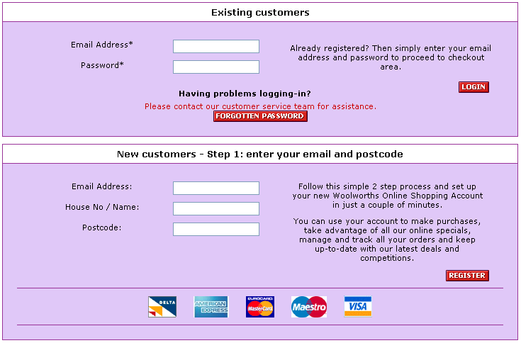
The below is a screenshot which fails both of these criteria - forcing you to sign up AND calling their buy-now button 'register':
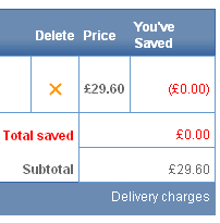
What about adding bright red text to the checkout pages which tells you how much you HAVEN'T saved with this purchase? Gee, thanks guys! They even tell you twice in red font that you've saved nothing:
Outstanding Award For Lack Of Interest In the Internet
And finally we come to some sites which just seem designed to confuse. There really is no explanation for this. Clarks, a major shoe retailer in the UK, has one of the most bizarre and baffling websites I've ever come across from such a large brand. Even a list of 100 or so online high street retailers went so far as to give Clarks the label of "difficult site."
Entirely in flash, it took me one blocked pop-up, 10 clicks and a good few minutes waiting for various pages of the site to load before I found a shoe page (any shoe page!) which has a picture of a shoe and a price next to it. Great. Except that page has zero calls to action. There's not even a link to find your nearest offline shop, let alone a phone number to use their telephone ordering (which they have btw - there's a call to action for telephone ordering from their homepage). Why spend so much money on a "nice" flash website which serves absolutely no purpose?
Honourable mention for this award of course goes to Tie Rack, whose website is 5 pages big and they have a call to action to email them to find out where your nearest offline shop is. EMAIL them?! Because sometimes searchable lists just don't quite cut it:

Conclusion
I've learned from this post that huge UK brands are leaving money on the table with their online marketing and SEO efforts. Even though many of these companies will have paid hundreds of thousands of pounds for their site, they still won't be getting much organic traffic. The ones that ARE getting large amounts of organic traffic will be getting it almost entirely from branded search. Instead of going after non-branded organic traffic, many of these companies are allocating serious PPC budgets to drive traffic to their sites.
So where does the organic traffic end up? Well, for most category searches such as "washing machines" or "men's jeans" there's a combination of brands who do enjoy some organic rankings (e.g., john lewis, tesco, comet) combined with online retailers (e.g., amazon) and online shopping portals (e.g., ciao, pricerunner).
At a conservative estimate, I'd say that the UK highstreet is missing out on at least £100 million / year.
While this is obviously UK-focused, I'd love to hear a round-up of the US market - is it more advanced? Do they generallly get it 'right' more? Maybe Jane or Rebecca could fill in?
If you are reading this post and work for one of the brands mentioned in this post and are unsure about your SEO strategy, I STRONGLY recommend that you get some SEO advice. SEOmoz's UK-based global associates or recommended partners would be a good place to start.
Update (after I'd written the post but before it was put live): Ciaran has written about how the Gap fails in the UK online, which I thought was pretty timely and relevant.
While the point of this post is to highlight common mistakes and not to call out individual brands, inevitably I've mentioned specific names as examples. This isn't an attempt to cause offence and I appreciate that even if you know what the right answer is, it can be difficult to implement using legacy systems.
Keyphrase Targeting
Who said keyphrases were important? Sometimes you're just too cool for school. Don't listen to all those other guys telling you how important keyphrases are - surely it can't be that important, can it?
Ignoring the fact that you can't find the Boots website on the first page of Google.co.uk for a [boots] search, take a look at their make-up page. Their title tag reads, and I quote:
Well, I could think of a few improvements there.... The most amusing/crushingly depressing (delete as appropriate) thing about this is that many of these brands are paying a lot of money for PPC campaigns while at the same time ignoring organic traffic. Waterstones, for example, bids on the term [cookery books]:

And they have a perfect landing page for a cookery books search. The only problem is that their title tag for the page (and in fact every page on their site) is as follows:
Ah. I see. Not interested in the free traffic then. Those pesky raggamuffin organic visitors are always screwing up my analytics by BUYING THINGS and what not. Such a pain in the neck.
Homepage Redirects
This problem happens an unbelievable amount of times. Take a look at the following pages:
- http://www.halfords.com/webapp/wcs/stores/servlet/TopCategoriesDisplay?langId=-1&storeId=10001&catalogId=10151
- http://www.missselfridge.com/webapp/wcs/stores/servlet/TopCategoriesDisplay?storeId=12554&catalogId=20555
- http://www.topshop.com/webapp/wcs/stores/servlet/TopCategoriesDisplay?storeId=12556&catalogId=19551
Want a quick and easy way of reaching those URLs? Try clicking on these links:
Yep - that's right, all those nasty URLs are the default URLs you get redirected to when you visit the domain. Sheesh. Sometimes this redirect is a 301, but it's not uncommon to see redirects through a 302, meta-refresh, or javascript!
Note that a clean, user-friendly homepage URL helps users AND search engines. You can bet that this is causing more than a few indexing issues for some of these sites.
URLs, URLs, URLs
Along the same lines as the above point are nasty URLs abound on these websites. Take a look at a few of these non-semantic, non-keyphrase-rich, un-usable URLs:
- http://www.homebase.co.uk/webapp/wcs/stores/servlet/ProductDisplay?langId=-1&storeId=20001&partNumber=1601776&c_2=2|cat_10307968|Bath+suites|10481051&c_1=1|category_root|Bathroom|10307968 (Homebase bath product page)
- http://online.vodafone.co.uk/dispatch/Portal/appmanager/vodafone/wrp?_nfpb=true&_pageLabel=templateBlank&pageID=VIRTUAL_HOME (Vodafone homepage)
- http://www.burton.co.uk/webapp/wcs/stores/servlet/ProductDisplay?beginIndex=0&viewAllFlag=&catalogId=20553&storeId=12551&categoryId=113901&parent_category_rn=&productId=720470&langId=-1 (Burton cardigan page - just for you, Ciaran)
- http://www.argos.co.uk/static/Product/partNumber/4061423/c_1/1|category_root|Kitchen+and+laundry|10198386/c_2/2|cat_10198386|Vacuum+cleaners|10198408.htm (Argos vacuum cleaner page)
And my personal favourite - the Currys "washing machines" page:
http://www.currys.co.uk/martprd/store/cur_page.jsp?BV_SessionID=@@@@0738042494.1222078553@@@@&BV_EngineID=ccekadefejmhgddcflgceggdhhmdgmi.0&page=ProductList&category_oid=-30549&fm=4&sm=0&tm=0&show_all=true
Compare this to Comet's page for washing machines:
http://www.comet.co.uk/shopcomet/category/49/Washing-Machines
Now, take a wild guess as to which one ranks top 5 in Google for a [washing machines] search.... Hint: it's not Currys (though Currys does pay for PPC on the term washing machines).
Duplicate Content
Duplicate content can crop up in many different guises, from URL parameters to having more than one domain resolving to the content. Mostly this won't hurt you too much, unless of course you happen to pass internal link juice to both versions - then you're in trouble. For example, look at the following two product pages, both of which have internal links pointing to them. It's the same page (almost), only the breadcrumb is different since the product is contained in multiple categories:
- http://www.debenhams.com/webapp/wcs/stores/servlet/product_10001_10001_64439_428661_-1
- http://www.debenhams.com/webapp/wcs/stores/servlet/product_10001_10001_63165_428661_-1
Information Architecture
If you get the information architecture wrong on a site then there's often more implications than simply SEO, as it often impacts your usability too. Consider the following situation:
http://search.next.co.uk/nav3/cat/02men/sub/ttoshirts/0
Now, ignoring the fact that we've somehow ended up on a sub-domain away from the main site, this is as far as you can drill down on the site when looking at men's t-shirts. If you wanted to browse the t-shirts you can sort by price but that's it. There's no option to sort by 'designer' or 'polo shirt', etc. By leaving these sub-sub-category pages off their site, they make it difficult to browse t-shirts as well as not having a page which is capable of ranking for 'polo shirt' (assuming, of course, that the rest of their site was well optimised).
Because Sometimes One URL Just Isn't Enough
Since all of the brands I'm talking about are recognised by any UK citizen, they obviously need to own all the different variations of their domain names. Once you own them, however, you should always look to redirect them into the site. If you don't then you can end up with duplicate content issues. For example, www.thecarphonewarehouse.com and www.carphonewarehouse.com both resolve to the same site.
Sometimes, however, this is taken one step further and there are two separate sites on multiple domains serving the same content. Check out the difference between these two pages: littlewoods, littlewoods direct. It's a good bet that if a user isn't sure which version is more authoritative that the search engines will be struggling, too.
And then finally we come to some situations which are presumably just mistakes, though that doesn't make them any less critical. Try visiting http://www.bodyshop.com. Ideally you'd end up at http://www.thebodyshop.co.uk/, but not so!

While you might think that it's no big deal, that domain has over 2000 links, so you can be sure that they'll be missing out on search engine rankings and visitors because of it!
Conversion Rate Optimisation
I'm not going to talk in too much depth here as E-Consultancy has already done this quite a bit, but seriously guys - what were you thinking? A call to action to abandon my order? Are you insane?!

That's ignoring the fact that I ended up with 7 pairs of jeans in my basket before I figured out how to actually get to the checkout. Other common mistakes include:
- Not taking you straight to the basket when you add a product to your cart. Sure, it gets annoying every now and again but it's a lot LESS annoying than spending 5 minutes trying to find your basket...
- Forcing users to sign-up before they buy. The more forms the better. Fact.
- Making the 'buy-now' button say something obscure like 'register'. Because 'buy-now' just seemed a little too, oh I don't know, effective?!
The below is a screenshot which fails both of these criteria - forcing you to sign up AND calling their buy-now button 'register':

What about adding bright red text to the checkout pages which tells you how much you HAVEN'T saved with this purchase? Gee, thanks guys! They even tell you twice in red font that you've saved nothing:

Outstanding Award For Lack Of Interest In the Internet
And finally we come to some sites which just seem designed to confuse. There really is no explanation for this. Clarks, a major shoe retailer in the UK, has one of the most bizarre and baffling websites I've ever come across from such a large brand. Even a list of 100 or so online high street retailers went so far as to give Clarks the label of "difficult site."
Entirely in flash, it took me one blocked pop-up, 10 clicks and a good few minutes waiting for various pages of the site to load before I found a shoe page (any shoe page!) which has a picture of a shoe and a price next to it. Great. Except that page has zero calls to action. There's not even a link to find your nearest offline shop, let alone a phone number to use their telephone ordering (which they have btw - there's a call to action for telephone ordering from their homepage). Why spend so much money on a "nice" flash website which serves absolutely no purpose?
Honourable mention for this award of course goes to Tie Rack, whose website is 5 pages big and they have a call to action to email them to find out where your nearest offline shop is. EMAIL them?! Because sometimes searchable lists just don't quite cut it:
Conclusion
I've learned from this post that huge UK brands are leaving money on the table with their online marketing and SEO efforts. Even though many of these companies will have paid hundreds of thousands of pounds for their site, they still won't be getting much organic traffic. The ones that ARE getting large amounts of organic traffic will be getting it almost entirely from branded search. Instead of going after non-branded organic traffic, many of these companies are allocating serious PPC budgets to drive traffic to their sites.
So where does the organic traffic end up? Well, for most category searches such as "washing machines" or "men's jeans" there's a combination of brands who do enjoy some organic rankings (e.g., john lewis, tesco, comet) combined with online retailers (e.g., amazon) and online shopping portals (e.g., ciao, pricerunner).
At a conservative estimate, I'd say that the UK highstreet is missing out on at least £100 million / year.
While this is obviously UK-focused, I'd love to hear a round-up of the US market - is it more advanced? Do they generallly get it 'right' more? Maybe Jane or Rebecca could fill in?
If you are reading this post and work for one of the brands mentioned in this post and are unsure about your SEO strategy, I STRONGLY recommend that you get some SEO advice. SEOmoz's UK-based global associates or recommended partners would be a good place to start.
Update (after I'd written the post but before it was put live): Ciaran has written about how the Gap fails in the UK online, which I thought was pretty timely and relevant.


Comments
Please keep your comments TAGFEE by following the community etiquette
Comments are closed. Got a burning question? Head to our Q&A section to start a new conversation.