

Why 2012 Was the Year of LinkedIn Changes: The Pros, the Cons, and the Why-It-Matters
LinkedIn has long been one of the few social networks to stay out of the spotlight. There hasn’t been much competition, there haven’t been many design changes, and their results have always remained successful — at least until recently. Last year brought about many new changes to LinkedIn, some of which were well received and others that seemed to have users scratching their heads.
As we move forward into the New Year, taking a look back at LinkedIn can help you and your company analyze how to go about making changes to your own website, what navigation and usability changes worked (and didn’t work) for the public, and on a different note, how your company can fully take advantage of LinkedIn and its new advancements.
The Purpose of LinkedIn and Where It Got Its Start
Before analyzing the social networking site, it’s important to understand a little bit of background information. The site was founded in December of 2002 by Reid Hoffman and four other co-founders and launched on May 5, 2003 as a way to connect professionals with other professionals. By and large, the meaning of LinkedIn hasn’t changed since the start. Although new features have been added, the main goal of LinkedIn has always been a professional social networking site.
As the years have progressed and different changes have been made, LinkedIn has grown exponentially. Below is a chart from Statista that shows the history of LinkedIn and its growth:
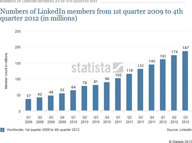
Although this chart doesn’t show 2013 yet, LinkedIn has just announced that January 9th of this year brought them past the 200 million-member mark. They don’t often add new features or change the layout of the network, but 2012 was a big year with changes that could make-or-break this impressive trend.
LinkedIn Navigation and Layout Changes of 2012
The actual layout changes did more than change the way the website looks — they changed the way it worked. This was easily the biggest change for users as they fumbled around to try to figure out where everything was now located. This is the biggest warning companies are given when they consider making a web layout change. A few of the usability and navigation changes that users saw with LinkedIn included:
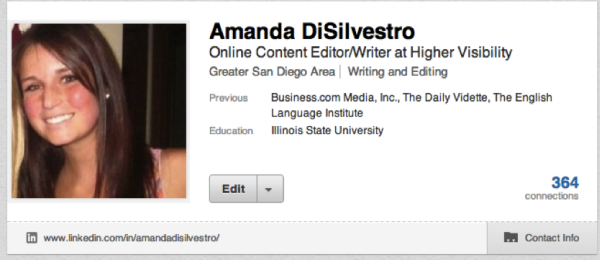
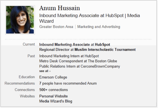
Larger Profile Picture and Different Bio Box Information
Pretty-self explanatory; LinkedIn decided to make the profile picture larger and change what was a part of the bio box. Although in a different format, the bio box still offers current and past positions, education, and number of connections; however recommendations and websites have been removed. Below is a screenshot of the old LinkedIn and now the new LinkedIn (new on top):
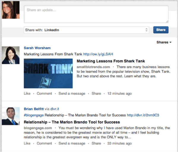
Recent and Relevant Articles Placed at the Top of the Homepage
Your homepage (not to be confused with your profile page) will look very similar to a Facebook newsfeed with a splash of Twitter characteristics. Unlike the old profile where things that people have shared showed up way at the bottom, the new layout features these at the top and puts those that seem the most relevant (based on connections as well as keywords) at the tip-top. This is the first thing that I saw on my homepage today:
Skills and Endorsements
This new feature was one that seemed to take off immediately as it was introduced. The new “skill and endorsements” section allows you to update some of the skills you feel you have, and your connections can then endorse you for these skill. As you can see here, I have added six different skills that I feel I possess and could offer a company. Many people have endorsed me for these skills, and their picture shows up right next to the skill:
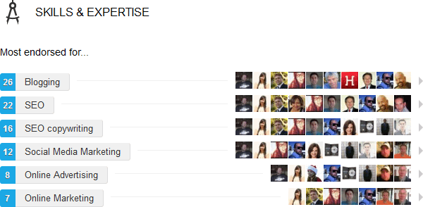
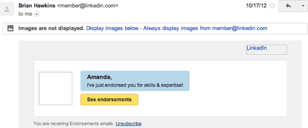
Endorsing someone is as easy as scrolling down and clicking “endorse,” which you can see if you hover next to one of the skills listed on someone’s profile (like the screenshot above). Then, that person receives a notification that you have endorsed them for one of their skills. This is a great way to remind your connections that you’re there, active, and appreciate the work they do (and not to mention remind them that you wouldn’t mind an endorsement as well!). Below is a screenshot of the email someone receives when they are endorsed:
A few other less notable changes include real-time notifications if someone does something that affects you, event recommendations for any city if you type the name of the city into the search bar (great for business travelers), mobile apps that are synced with the web, and icons for each of the groups that a person has joined.
It is also worth mentioning that business pages went through the same renovation and sync up well with the personal profile design.
Benefits and Pitfalls of the LinkedIn Changes
As with anything in business, there are both benefits and pitfalls to consider. Below lists a few of the ways that LinkedIn succeeded and a few areas where they could have used a bit more time planning and testing:
The Pros of the New Layout
- Better Targeted Content. Companies can target their content better because LinkedIn puts the most relevant content at the top of a user’s stream.
- Modern Feel. A larger profile picture and a more defined summary box give the layout a more aesthetically pleasing and modern look. The network is keeping up with the changing times.
- Relevant Navigation. The layout seemed to put focus on areas that are very important to users as well as employers. Products and services are listed as opposed to hidden by a link, so it’s more accessible.
- Engage with Connections. Putting relevant news that your connections share on the top of the layout was aimed to help people engage better with their connections. It helps you to stay current.
- Connections Have a Say. The old LinkedIn layout allowed users to rate themselves when it came to particular skills, but the introduction of endorsements allows connection to make these moves. In general, a good endorsement coming from someone else means more than one coming from the actual person.
The Negatives of the New LinkedIn Layout
- Websites Hidden from Profile Section. Although it’s great that the profile/header section of the site is a nice large picture and clearly states the person’s current position, the website section has been removed. Connections often like to click on a profile and check out a blog or a website that person manages, and that option is unfortunately no longer at the top.
- Looking More Like Facebook. This is one of the biggest complaints that users have with the new layout. While it’s great, the whole idea of a stream on the homepage makes it seem a lot like Facebook. You know every single time one of your connections makes a move on the network, just like Facebook. As I’ve said before, “in the past LinkedIn was one social network that allowed users to bypass the obsessive and move straight to the productive” and they seem to be straying from that ideal.
How to Take Full Advantage of the New Layout Changes
The best part about the new changes is the fact that you can use them to your advantage. They are about more than just looking a little bit nicer or making things easier to use—LinkedIn expects users to take the changes and run with them. A few of the ways you can make sure you’re taking full advantage include:
- Update Your Status. People will begin to see relevant results much more easily than before, so be that relevant result. Make sure your status is always covering something in the news or something appropriate for that particular day, and LinkedIn will surely show this status to those interested.
- Use Better Images. Not only are the profile images larger, but also the images you include in your updates are larger. Grab the attention of your connections by utilizing this platform. When it comes to images in your articles as well as your actual profile image, you have to also keep in mind that they will require a higher resolution than before. If you need to, consider changing your profile image from the one you had before so that it is perfectly clear.
- Share Your Articles. Updating your status is one thing, but sharing your articles is quite another. Just as always, LinkedIn gives you the opportunity to share your article and write a little comment to go with it (and it doesn’t have to be 140 characters). The difference now is that the article you are sharing gets put right at the top under the new “Activity” section. After your bio box, it’s the first thing people will see when they visit your profile. If that’s not a good way to show off your content I don’t know what is!
- Give Back an Endorsement. Giving endorsements can earn you a couple of benefits. As discussed above, this is a great way to show others in your industry that you appreciate their work, and it puts you and your profile in their heads. Another great benefit, however, is the idea that you could get an endorsement in return. There seems to be an understanding in the community that if you’re endorsed, you endorse someone back. You of course do not have to, but many do because they appreciate the work of the other person — they just needed a bit of reminding.
- LinkedIn Today. It’s also a good idea to get started with LinkedIn Today, because LinkedIn made this easier to use as well by creating a “Trending in Your Network” button. As a user, you can head over here and find relevant articles to help you further your education (or satisfy that Friday 4:00 boredom).
Because these changes have been made to help you optimize your profile, this is the perfect time to try and add more contacts. Consider going to “Connections” up at the top of your page, and then click “Add Connections.” This will make it easy to sync up your email with your LinkedIn so you can quickly send an invitation out to everyone you’ve emailed in the past with whom you’re not yet connected.
What You Can Learn from the Changes
Your website might be completely different than LinkedIn (in fact, this is most likely the case), yet there is still quite a bit you can learn from all of the changes LinkedIn underwent this past year. Below are a few different ways that LinkedIn handled some classic business lessons.
- Public Pressure. You have to be prepared for the reactions of the public and make sure you give them enough time to adjust. If you don’t, it’s likely that users will get discouraged and find another blog to read or another website to visit.
- LinkedIn’s Solution: Have a tutorial as well as a detailed article discussing how to use the new site. This helps to reduce frustration and gives users a place to find the answers to all of their questions. In the case of LinkedIn, this was published on their official blog, which is something I’d recommend for any company.
- Number Fluctuations. For starters, creating such a large website change is going to affect your numbers because of reasons discussed above. In other words, people might be initially turned off.
- LinkedIn’s Solution: LinkedIn waited until their website well trusted enough and they had a solid customer base to make the change. Doing something like this too fast turns readers away quicker than if you really establish a loyal base. With 200 million users and very few changes since its launch, I’d say LinkedIn had the ability to take this risk.
- Announcement. Making any sort of announcement about a change is risky for a company. You want to make sure everything is worded correctly and readers aren’t confused as to what is going to be happening. Unfortunately, this is one step where companies often fail, and the website sometimes goes right along with it.
LinkedIn’s Solution: LinkedIn has a large enough following that making a formal announcement on their blog seemed appropriate. What LinkedIn did was create a live stream of their Press event that introduced the new layout. Once the live stream was over, they posted their video of the Press event that clearly lays out all of the changes that were made.
Your Turn to Voice Your Opinions
In the end, LinkedIn is still one of the most authoritative social networks out there and going strong with over 200 million registered users in more than 200 different countries, so it’s pretty safe to say they walked this slippery slope without a glitch. Do you agree?
What do you think of the new LinkedIn layout? Are you a fan of the new homepage and the section for endorsements? Is there anything you miss from before the changes were made? Share your thoughts in the comments below.
Photo Credit: assistsocialmedia.com
This YouMoz entry was submitted by one of our community members. The author’s views are entirely their own (excluding an unlikely case of hypnosis) and may not reflect the views of Moz.


Comments
Please keep your comments TAGFEE by following the community etiquette
Comments are closed. Got a burning question? Head to our Q&A section to start a new conversation.