10 Brilliant Tools for Creating Infographics & Visualizations
Hello there! I'm Miranda Rensch, Product Manager at SEOmoz and lover of visual communication. Communicating visually is one of the most effective ways to explain complex concepts and relationships, and can be a great way to explain your services/products and create valuable site content. I often use diagrams and whiteboarding in order to communicate new features and concepts internally with my team.
I've compiled a list of tools you can use to create visualizations, or simply use to communicate visually with your teammates. Enjoy, and feel free to add your own suggestions in the comments!
Tools for creating simple infographics and data visualizations
1. Piktochart
Piktochart is a web-based tool that has six decent free themes (and a whole bunch more for the paid version) for creating simple visualizations. You can drag and drop different shapes and images, and there is quite a bit of customization available. You can also add simple line, bar, and pie charts using data from CSV (or manual entry). You can export to PNG and JPG in either print or web quality. Note that with the free version, you get a small Piktochart watermark on the bottom of the PNG / JPG downloads.
2. Easel.ly
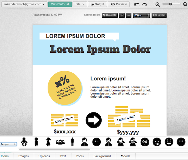
Easel.ly is another free web-based tool for creating infographics. You cannot create graphs using real data with this tool, but its really good for conceptual visualizations and storytelling. It has a beautiful user interface and the themes you can start with are gorgeous. The themes support many common purposes: map, flow-chart, and comparison/relationship graphing. This tool has the best selection of well-design objects (people, a bunch if icons, landmarks, maps, animals, etc.) and backgrounds that I've seen throughout this list of tools. Additionally, you can upload your own images with the free version. You can download a web-quality version as JPG. This tool is still in beta, but it seemed to work pretty well to me!

3. Infogr.am
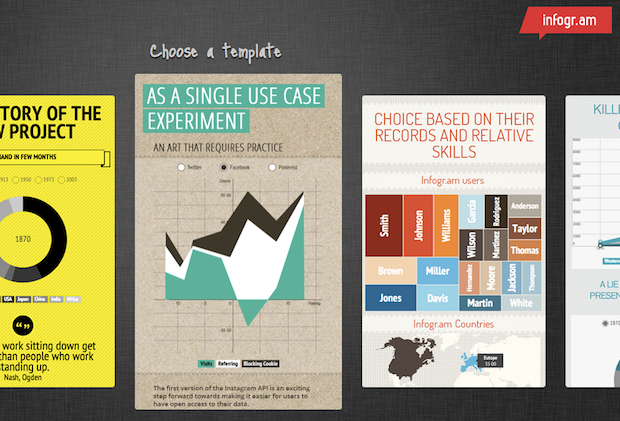
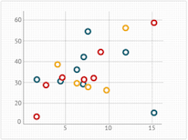
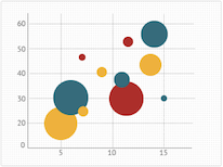
Infogr.am is another free, web-based tool with some really nice themes and a great interface for creating simple infographics. This option also allows you to create charts using real data. There are 31 chart options that offer some really cool displays, like a radial bar graph, scatter charts, bubble graphs, and map charts. You can also add your own images and video. When you're done creating your infographic, you can embed it on a website and publish it to the infogra.am site (I wasn't able to find a way to download). This app is also in beta, but again, seemed pretty solid to me.

4. Visual.ly
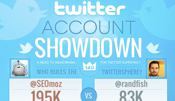
Visual.ly (I know, these visualization tools love their '.ly's!) has some simple free tools worth mentioning, many of which integrate with social networks to analyze Twitter and Facebook data. You can create fun Venn diagrams, Twitter account show-downs, visuals that analyze hash tags, and a few others, but there's almost no customization available. However, they offer a marketplace where you can get connected with visual designers and motion graphics artists who specialize in infographics. The site itself also has a ton of great info graphics to inspire you or your designers. There is some serious data visualization eye candy in there, people.
5. Tableau
Tableau has some free tools for creating data visualizations. It is not web based, so you have to download the software. Once you do, you can upload a spreadsheet or CSV and create a variety of interactive data visualizations types, including heat maps showing density of an activity by location, Venn diagrams to show associations, bar charts, line graphs, and others. This tool is for Windows only. See Tableau's gallery for examples of the types of visualizations you can create or learn more about how it works.
.png)
[Bonus!] Looking for some more fantastically geeky data viz options?
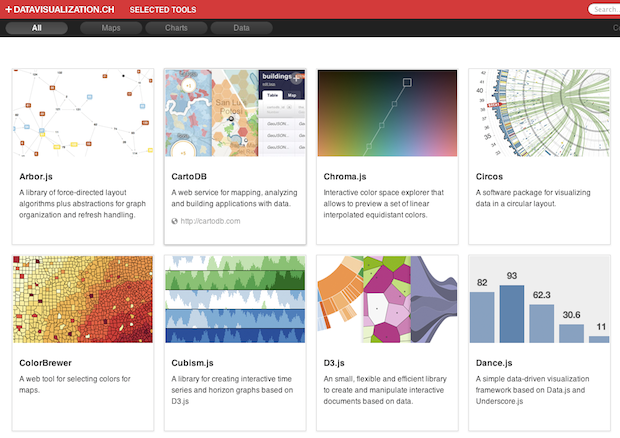
Datavisualization.ch has created an excellent list of packages, libraries, and data visualization frameworks for creating more complex and interactive visualizations using your own data sets and dev environments.
Tools for diagraming and wireframing
6. OmniGraffle
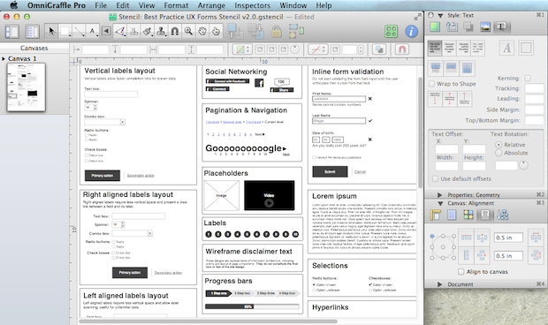
This is a desktop application that I use all the time at work. The interface is very intuitive, and it's quite an effective tool for wireframing in detail. You can customize and stylize objects to the extent that you can use the tool to create whole infographics exactly as you want them using this tool (it's difficult to do data visualizations with actual data, though). There are tons of free downloadable stencils which make it super easy to diagram mobile and web interfaces, architecture diagrams, and even office/home layouts. This tool has its cons, though; it's not the cheapest tool at $99 for standard and $199 for the pro version, and it's offered for Mac only.
7. Balsamiq
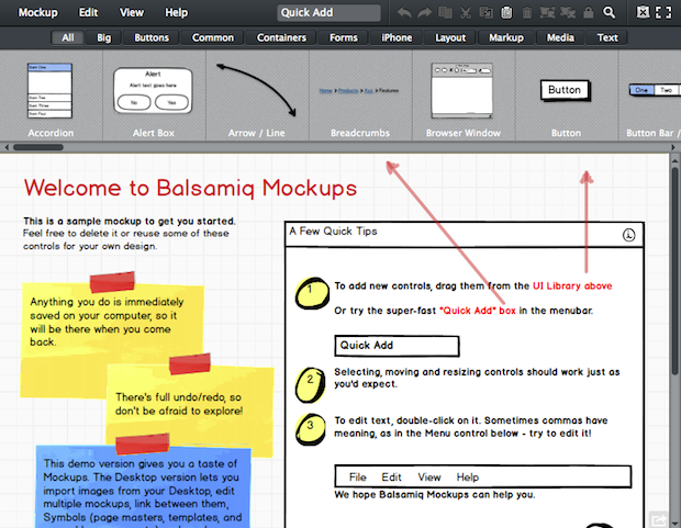
This is another nice wireframing tool good for creating simple diagrams of web and mobile interfaces. It's $79 for the desktop version, but there's also a free web demo which is sufficient for simple diagramming.
Other tools for visual communication
8. Make a video
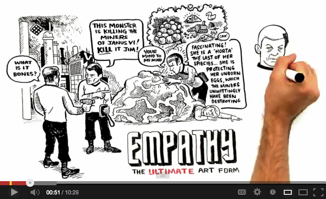
The RSA Animate series (illustrations done by CognitiveMedia) is a really good example of using visual communication to accompany a verbal explanation of something. You can hire an illustration artist to do something like this, or do it up yourself Whiteboard Friday-style and draw on a whiteboard while you explain your topic (this works great in internal meetings too; try it next time you're trying to explain a concept to someone and see how it goes). If you hire an illustration artist, deliver the verbal script that they'll need to animate to and add points where you can see visuals supporting the topics, but give them freedom to explore creative ways to visualize, too.
9. TimelineJS
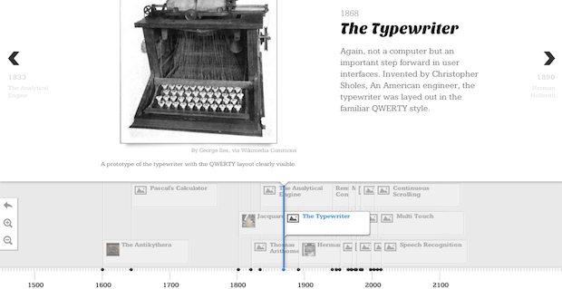
TimelineJS uses a google spreadsheet with links to YouTube, Flickr, Twitter, Sound Cloud, and other media sources to create really nice-looking timelines. You could use this tool to create an interactive visualization of the starting of your company, your client's company, tell the story of an industry, etc.
10. Present.me
Present.me allows you to create presentations where you record yourself talking next to the slides you're presenting. This tool might be a good way for people working remotely to share a proposal or concept, or for documenting presentations you've given on your blog or site.

Planning your infographic
So now you've got a bunch of tools you can play with, but before you go too crazy adding bubble charts and radial bar graphs, take some time to really plan out your infographic and what you want people to take away from it. Here are some tips on researching and planning a great visualization:
1. Learn from others
If you're not sure what type of info graphic to create, these sites can be great places to see what other people are doing:
- Visual.ly has a ton of great infographics to inspire you or your designers.
- Informationisbeautiful.net has a ton of great data visualizations.
- Datavisualization.ch has a variety of interactive data visualizations and information graphics.
2. Understand graph options and themes
It can also be helpful to think about the different types of visualizations that exist and the purpose they serve. Many Eyes by IBM Research made a really great list of graphing types and when to use them (i.e. when to use a stack graph vs bar chart vs scatterplot). Visual-literacy.org also made a really awesome Periodic Table of Visualizations that shows examples of every kind of graph type you can imagine.
There are also a few themes you can identify in the world of infographics; I've listed some of them below. Consider where yours might fit in.
Humor and social commentary: Make an observation about humanity, wine, beards, etc.
Communicate relationships: Show density, proportion, and differences.
Decision flow chart: Clarify options and paths.
Timeline: Show a sequence of events.
3. Plan your visualization
When you're beginning to brainstorm and develope your visualization, here are a few steps you can take:
- Identify the take-away. What do you want your audience to learn from this visualization? Is there an action you want them to take? Is there a way you want them to feel (e.g. amused, surprised, like they understand an issue better)?
- Brainstorm a "script" or flow for your infographic. Sit down with a notebook (or, better yet, with a whiteboard) and a few creative people, and list as many options for conveying your story as you can in thirty minutes or an hour. Don't get too attached to any one concept; just get a bunch out there to start. Consider the types of data available to you and how you could represent it (timeline, flow chart, relationship/proportion graphs, etc.).
- See what other people are doing (there are some sites for inspiration listed above). Add any ideas you get for layout and graphic representation to your list of ideas.
- Choose one idea and wireframe it (again, there are a couple tools listed above). Run the concept by a few people. Ask them if any of it is confusing, or if there's something else related to what you've planned that they're curious about that you could consider adding.
- Create the graphic using one of the tools listed above, or hire someone to help you out. Here are some options for hiring contract infographics designers that we love: Freelancer, 99 designs, Designcrowd, Upwork, Nowsourcing, Columnfive, Infog8, and Mikewirthart.
- Promote it! Justin Briggs wrote a nice article a while back about strategies for promoting infographics.
Good luck, visualizers! If you have any other suggestions for great ways to communicate visually on the web or IRL, please feel free to share!

.png)



Comments
Please keep your comments TAGFEE by following the community etiquette
Comments are closed. Got a burning question? Head to our Q&A section to start a new conversation.