
Are You Forcing Your Users to Superfluously Click?
The author's views are entirely their own (excluding the unlikely event of hypnosis) and may not always reflect the views of Moz.
Unnecessary clicks really put the "super" in "superfluous," yet we run into them all the time. Whether they're the fancy yet impractical creation by a site designer, a lazy workaround courtesy of an apathetic developer, or a misguided "I've been trying to architect this site for two months now and I can no longer see straight" decision by an SEO, these seemingly innocent clicks can have a negative impact on conversion rates or, simply put, they can irritate users. Below are a few examples of some clicks that cause me to grit my teeth and shake my fist.
Example #1: The "Manual 301" Click
The other day I was looking at graduate school options offered by the University of Washington (the alma mater of me and at least 1/4 of my coworkers). I've previously blogged about my consideration of going back to school to obtain an MBA, and every so often I still consider doing it. Our COO and lawyer, Sarah, has often said that she thinks I'd make a good lawyer (maybe it's because I argue with Rand a lot? ;P), and she recently told me about the UW's concurrent degree program whereby one could get a law degree and an MBA at the same time. I decided to check it out out of curiosity's sake. Here's the UW's Graduate School's program offerings page:
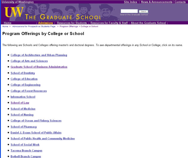
I clicked on the "School of Law" link and was taken to this page:

Example #1: The "Manual 301" Click
The other day I was looking at graduate school options offered by the University of Washington (the alma mater of me and at least 1/4 of my coworkers). I've previously blogged about my consideration of going back to school to obtain an MBA, and every so often I still consider doing it. Our COO and lawyer, Sarah, has often said that she thinks I'd make a good lawyer (maybe it's because I argue with Rand a lot? ;P), and she recently told me about the UW's concurrent degree program whereby one could get a law degree and an MBA at the same time. I decided to check it out out of curiosity's sake. Here's the UW's Graduate School's program offerings page:

I clicked on the "School of Law" link and was taken to this page:

Instead of automatically redirecting me to the School of Law's new homepage, the page let me sit there and stare at the link until I finally sighed and clicked on it. Not only would implementing a 301-redirect be beneficial to users and reduce that extra click, it would move nearly 70 links over to the new homepage. Granted, our own site, SEOmoz.org, has a "Click here to continue" prompt whenever you save changes to your user profile or a blog post, but we also automatically direct you to the appropriate page after a few seconds (which I never wait for because I'm impatient):

Example #2: The "Joke's On You--That's Not Clickable!" Click
The next couple examples are courtesy of our own site, lovely little SEOmoz.org. Our recent site redesign resulted in a new side-navigation box that runs along the blog. Several times I have fallen victim to clicking on the little plus sign bullet point icon that sits to the left of my user name and the main navigational categories because I think they'll collapse the category content. (They don't. Much like nipples on men, they're just there for looks.)
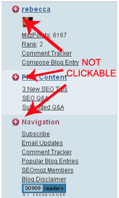

I pointed this out to Rand and he was like, "Holy crap, I click on them too! Okay, we've gotta fix that..."
Example #3: The "Are These Many Clicks Really Necessary?" Clicks
Another SEOmoz example, comin' your way! Say I want to edit my profile avatar. I go into my profile and account settings and scroll down to where my photo is. Next to my grinning mug is a checkbox that says "Delete Photo." I click on that, then hit "Save Changes."
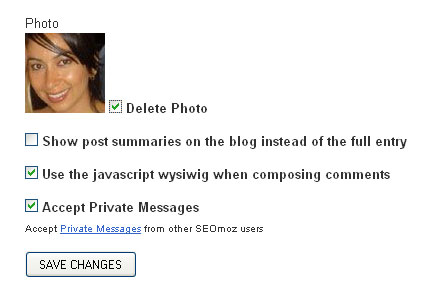
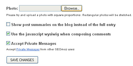
Once my changes have been saved, I'm taken back to the My Account page, where I have to go back into "Edit Profile & Settings." I scroll back down to where my photo would be and browse for a new one.
Example #3: The "Are These Many Clicks Really Necessary?" Clicks
Another SEOmoz example, comin' your way! Say I want to edit my profile avatar. I go into my profile and account settings and scroll down to where my photo is. Next to my grinning mug is a checkbox that says "Delete Photo." I click on that, then hit "Save Changes."
Once my changes have been saved, I'm taken back to the My Account page, where I have to go back into "Edit Profile & Settings." I scroll back down to where my photo would be and browse for a new one.
I find my avatar and hit "Save changes." Done! I've just changed my avatar...in about 6 clicks. Whenever I go through this process, my brain internally screams "There's got to be a better way!" Yes, the "change your avatar" process has got me sounding like an infomercial audience. A better approach would be to give the option to "Change my avatar" instead of just deleting it, which would eliminate a few of the steps and thus, the clicks.
Example #4: The "I Can't Believe You've Taken My Eyes Hostage" Click
You've all experienced this: You're clicking through a site's article that has been broken into multiple pages, or you're looking at a slideshow of images. Then, without warning, instead of page 4 of the article or the 7th image in the series, you're looking at a page-filled ad for Axe Body Spray with a teeny, tiny "skip this ad" link jammed into the furthest corner of the screen. This happened to me when I went to The Onion's homepage:
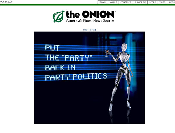

First of all, what the hell is that an ad for? A cyborg that serves you martinis? (Wait, that actually sounds pretty cool...damnit, I should have clicked on that.) Secondly, I'm not going to your site to buy a cyborg (well...), I'm going there to read satirical news. Promising your users one thing and serving up something completely different AND forcing them to click past what they didn't want in order to see what they do want (effectively making your user click twice) is just bad, bad, bad. I understand that the site's trying to make a buck off its advertising and this method probably works on some folks, but it's a nuisance to me (and to a lot of you, I'm willing to bet).
Example #5: The "No I don't Want to Sign In" or the "Why the Hell Didn't You Keep Me Signed In?" Clicks
There are instances where you want to be signed in and there are instances where you don't. Let's start with the Don't. Lots of retail sites require you to be signed in or have an account before you buy something. Take Amazon as an example. Once you try to add something to your shopping cart, you're taken to this page:
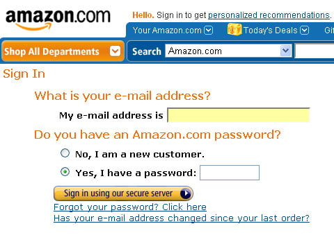

If you're a random user who happened to find the product you're looking for and just want to quickly buy it, you're probably not happy about having to create a login, especially if you're unfamiliar with the site. Amazon's not an ideal example here because it's a trusted site that offers millions of products. But say you're looking for a present for your uncle, who happens to love vintage model cars. You find a random site that sells model cars and other uncle-approved stuff, so you find something for him and try to buy it until you are taken to a "Create a new account" page. Why would you create a new account for a site that sells stuff you're not even interested in? Can't you just do a one-off purchase and be on your way? Now you've got to spend extra clicks creating an account you'll likely never use.
A nice alternative for retail sites would be a setup like this, which delias.com (a female clothing site) employs:
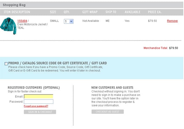
A nice alternative for retail sites would be a setup like this, which delias.com (a female clothing site) employs:

The site gives you the option to sign in if you're an existing member or, if you're a new customer, to checkout as a "guest" and not be required to sign in or create a new account. How lovely!
As for the "Why the Hell Didn't You Keep Me Signed In?" click, it seems like Digg and reddit are pretty chronic offenders. There's nothing more annoying than logging in, checking the "Keep me logged in" box, working for a bit, returning to the site later, finding a story you like, clicking to upvote it, and pulling up a "Please sign in" prompt. A few clicks later, you still haven't voted up that story. Argh.
The above examples are a small sampling of how superfluous clicks can aggravate your user. They can be small-scale and cause nothing more than brief gripes, or they can be a large nuisance and adversely affect your conversion process. Regardless of the result, when designing your website keep a few things in mind:
- Try to accomplish your goal in as few steps as possible while still remaining logical. Can you shorten a 7 click path down to 3 clicks? Start thinking of ways to cut corners without compromising the user experience.
- Don't force your users to do the work for you. If you've moved a page, use a redirect. Your users and your links will thank you! (Well, they probably won't even notice the redirect, but hey, ignorance is bliss.)
- Don't create "false clicks." Don't make non-linked text look like a clickable link, don't use icons or buttons that look clickable but aren't, and don't feed your mogwai after midnight. (Wait, I think the last tip pertains to something else...)
- Don't promise your user one thing and deliver something else. If you ask your user if he wants to stay logged in, keep him logged in. If your user wants to buy an item and clicks on the little shopping cart to begin the checkout process, don't force him to create an account or try out some "free trial" magazine subscriptions. Don't show a big freakin' ad when your user is expecting to see a picture or an article.


Comments
Please keep your comments TAGFEE by following the community etiquette
Comments are closed. Got a burning question? Head to our Q&A section to start a new conversation.