Creating a Buzz Pre-Launch
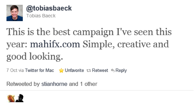
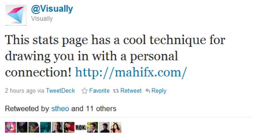
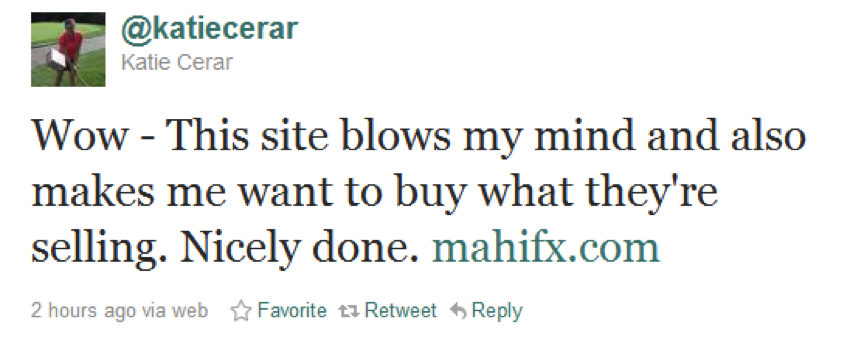
Hi Mozzers! Today I wanted to share with you a recent experience that highlights the value of hiring an inbound marketer/strategist prior to launch of a new product and some recent success a project I worked on has had in generating loads of links, tons of Twitter hype, some great traffic - and most importantly some solid lead generation... with just a holding page.

Obvious disclaimer: As stated above, this is a project I have worked on and I am associated with the site to that extent - duh, how else can I write a meaningful case study? The client has been kind enough to allow me to share this information with you, which is both rare and exciting, and hopefully will give you guys some great ideas.
A Case Study
I’ve recently been working on a project with a client that truly “gets” online marketing and it’s been a great opportunity to try out some new things. They wanted to invest heavily in inbound marketing pre-launch and commissioned a team of experts to develop a social strategy, brand messaging, information architecture and keyword research as well as an international rollout plan and linkbuilding strategy document. This, in my view, was really smart forward thinking and hopefully justification for others as to how important and valuable it can be to involve inbound marketers BEFORE a site is built and use their input for a launch strategy.
For me, by far the most exciting part of this experience was being involved in the development of the pre-launch strategy. The formal launch of the client company’s Forex trading platform is set for early 2012. But with excitement building for a platform set to markedly improve the trading experience for Forex traders world-side – the founders gave us free reign to spec and launch a holding page months before the true launch of the site.
Now, we've all seen your standard holding page, but we decided to do something a bit different - why should the ongoing development of the site prevent us from generating a buzz? The idea originally came from hearing Dave Naylor speak at a4uexpo last year. Dave spoke about building links to new folders on a site and walling them off using robots.txt because it "makes the spiders hungry". This seemed like a brilliant idea to me, but I was nervous about building links to any part of the site for which we did not yet have content - user experience and the rest of it. After a number of chats with my partner in crime on this project, (and a number of other projects in the past), Neal Dougan, we came up with an idea to invest in design, make something different, and take advantage of the budget we had been granted. We explored the feasibility of using parallax scrolling (a la Ben the Bodyguard) but needed to create something that would be meaningful to our users and hadn't been done to death.
We pushed the idea of creating an interactive infographic to attract attention and interaction with the holding page. The real creative came from a New Zealand based design agency (STRATEGY) and some Django/HTML 5 wizards also based out of New Zealand (Sons & Co.). The end result takes personal input from the user, compares it against a high flyer in the financial trading space, and contains a hook to get users to sign-up. To have a look at the end result you can check out the holding page which is live on Mahi Forex.
The combination of getting the user to engage, and using new and emerging web technologies to create something interactive makes all the difference and it's pretty clear to me that there are many better ways to attract an audience than using tired techniques like "regular" infographics.
Results
The holding page went live on Saturday, October 1 - but we saved our initial push for Monday (October 3). At time of publication (Monday, October 10) this holding page has received:
- > 25,000 Visits from 130 countries.
- Links from more than 250 referring sources (including coverage from really exciting/high quality websites)
- 697 Tweets
- >1,000 Facebook likes

And most importantly we had more than 450 people submit their email addresses asking for an invitation to the platform - from people seeing how quickly a famous trader can earn your yearly salary and responding to the prompt "Perhaps it's time to start trading - Email me an invitation". This is clearly part of a broader marketing play – but I think the number of sign-ups is what has us most excited. Anyone who has worked in the affiliate space around forex and trading knows the value of getting people signed up.

There will always be people who are sceptical of anything that include marketing messaging, or undertones and people hate to be marketed to generally speaking but for me, if something is fun and exciting I don’t mind watching it. And I think the sign-ups indicate that we’ve got some of the right people involved and most excitingly, some people who may not have heard about us otherwise.
Why it Worked
Right, far be it for me to claim the credit for this one - without the help of Neal, the design agency, the amazing development team out in New Zealand, and the fact that the client "got it" this wouldn't have worked, but I think there are a number of reasons that this play worked in this instance.
First of all, I do think it plays to Rand's post the other day about thought leadership. The forex space is an increasingly crowded one, yet it is largely populated by sites that display very technical information in an inaccessible and uncreative way, and the market leaders (from a ranking perspective) are sites that have been around since the dawn of the internet. As a result - we decided the only way to make an impact was to make a splash and appeal to the design savvy, the marketing types, and folks who may not hear about the brand through the financial circles and press. So we decided to try something relatively new - and certainly new to the space.
Another reason this worked as well as it did, was that the design and development was truly good enough that it didn't just get flamed by the community and featured prominently on a number of design sites and CSS galleries.
The outreach and seeding on this has been really strong as well, but ultimately, the site attracts natural links and people naturally want to share it - and it was designed very specifically with this aim.
The Lessons
1. You should engage your marketing team long before you launch a new product or website. I know a lot of people say "you shouldn't pay for SEO until such and such a point" but I personally think that's nonsense. None of this would have happened had the client not recognised the value in inbound pre-launch. As a consequence, you can also be sure that the CMS will be client and SEO friendly, there will be a portion of the site dedicated to posting fun branded content, the information architecture will be well organised and the international rollout plan and targeting will be in the bag.
It costs a lot less to get this right the first time than to redesign and redirect a bunch of poorly organised content.
2. Do something unique. I know this sounds like a cop-out, but honestly, a plain old infographic will never get as many natural links as something experimental. With this project, we really needed to do something different to shake up the market so that we can compete with the platforms that started as currency calculators in year dot.
3. Take a risk every now and again. We couldn't promise numbers on how many links this would generate, how many leads, or how much traffic but we assured the client it would be successful - and I think if any of you have worked in the affiliate space in forex you know how much these leads alone are worth.

4. Consider your target audience. A successful piece of linkbait (in my view) should target your main client base as well as one other community and this should be evaluated on an individual basis for anything you put out for the purpose of creating buzz. It only made sense for us to target the design/internet community in this case because - who better to create a buzz - but you have to be true to the audience. You can't approach the design/dev community or tight niche communities like Reddit with some contrived crap. We didn't do it to get links, we did it to create interest, to make use of new technologies and to start a long process long before the site was ready.
5. Don't be cheap. I know that not all clients have big budgets to play with, but as I argued earlier: this holding page EASILY paid for itself with the lead generation alone, forget about the value of the links. It's hard to quantify the reward but there is no benefit to half-assing something. If you're going to bother to do a piece of linkbait, go as far as you can with your budget and bear in mind that done right, it's easy to cover your costs! This is especially important if you're hoping to get support from the online community.
6. Don't always do it for the links. I think this is especially important when considering a launch or a holding page. Yes we want links but that was not the purpose of this exercise. We wanted to engage and excite users about a cool new product that isn't quite ready to go to market yet. That was our primary focus and the links came naturally.
7. Downtime doesn't have to be suck-time. There is no reason that a delay in the development of a site needs to be time wasted. You can start building your brand and building up equity to your site long before launch and could easily do the same to launch subsequent new sections of a site - just remember to think outside the box!
An aside - it wasn't all dewdrops on roses and whiskers on kittens. Everyone seems to like the creative, but some seem to find the reality a bit harsh/sad. A bit of an unplanned for externality, particularly with all of the #occupy stuff going on this week but we hadn't really planned on that when we started developing the concept almost six months ago.
Thanks all for reading, I'd love to hear your thoughts on the site and on the bigger picture stuff/lessons you've learned with this sort of thing as well! Feel free to find me on Twitter or Neal if you have any questions!
The author's views are entirely their own (excluding the unlikely event of hypnosis) and may not always reflect the views of Moz.

![Brand and SEO Sitting on a Tree: K-I-S-S-I-N-G [Mozcon 2025 Speaker Series]](https://moz.rankious.com/_moz/images/blog/banners/Mozcon2025_SpeakerBlogHeader_1180x400_LidiaInfante_London.png?w=580&h=196&auto=compress%2Cformat&fit=crop&dm=1749465874&s=df8aa6d34a976c4a941727c03aba118d)
![How To Launch, Grow, and Scale a Community That Supports Your Brand [MozCon 2025 Speaker Series]](https://moz.rankious.com/_moz/images/blog/banners/Mozcon2025_SpeakerBlogHeader_1180x400_Areej-abuali_London.png?w=580&h=196&auto=compress%2Cformat&fit=crop&dm=1747732165&s=d887ee9e0e183cbb2bf4d61c717c2aa3)

Comments
Please keep your comments TAGFEE by following the community etiquette
Comments are closed. Got a burning question? Head to our Q&A section to start a new conversation.