
First Thoughts On Google's New Tabbed Sitelinks
The author's views are entirely their own (excluding the unlikely event of hypnosis) and may not always reflect the views of Moz.
On the 6th of July I accidentally came across (what could be any time soon) Google's new tabular mega sitelinks. They became available to me purely by coincidence but the unique opportunity to see something which was unavailable to most searchers was more than welcome.
I must admit that I instantly found the tabbed sitelinks very appealing, straightforward and easy to use. I instantly started testing several search queries and ended up writing up a post on the benefits of tabbed sitelinks for brands if Google (ever) decides to roll them out the same way as they appeared on my screen.
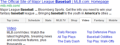
Even though I was aware that Google was testing some sort of tabular sitelinks format, the privilege of having a first-hand experience was greatly appreciated. Despite Google's confirmation that this as a test, I thought sharing some screenshots and thoughts of what could be (sooner or later) the new sitelinks, would be beneficial to everyone (including Google). Therefore, any comments, feedback and insights are more than welcome.
What Has Changed
This could be the biggest change Google has ever made into brand listings appearing in the SERPs after introducing the expanded site links (mega sitelinks). Currently, brand listings consist of up to six sitelinks excluding the standard link to the site's homepage.
However, in the new version there are from five to nine tabs, each one containing from four to 13 sitelinks. That means that the number of linked pages appearing in the SERPs would drastically increase, which would definitely impact brand traffic metrics in various ways.
This is how the SEOmoz listing appears with the new tabbed layout:

Note how similar the sitelinks that appear in the 'Top Links' tab are to those in the previous non-tabbed version:
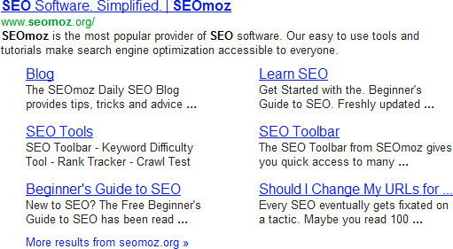
However, the interesting stuff appears when clicking on any of the other tabs - let's take a look at the 'Blogs' tab:
In this particular case the blog's text snippet is being pulled in from the page's meta description. However, this is not always the case as we will see later in other examples.
The 'Blog' tab consists of four links:
- A link to the main blog
- A link to the Rand's post '21 Tactics to Increase Blog Traffic'
- A link to YouMoz
- A link to the second page of the main blog.
What really stands out like a sore thumb is Rand's post, published in January 2012, which I presume is one of the most popular posts on the blog with thousands of visits and pageviews, good dwell time and excellent user engagement and social signals.

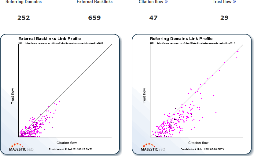
As one would expect, the post has attracted a very high number of links from hundreds of different domains. Presumably, the post is one of the most linked posts on SEOmoz but Rand and his team would know a lot more on this. Open Site Explorer reports the following astonishing link popularity and social metrics:

Majestic SEO fresh index metrics are also in agreement but it is difficult to say whether links to this post are the most authoritative and trusted ones compared to those pointing to other blog posts on SEOmoz. Nevertheless, link equity must have played a part in making the post appear as a sitelink in the 'Blog' tab.
Moving on to the 'SEO Tools' tab, the user comes across four sitelinks:

Again, the user can now access directly from Google's SERPs pages that before would require a few clicks and a bit of fiddling around with the site's navigation bar. It seems like Google's intention is to offer a better user experience by reducing the time users need to reach popular deep pages.
Many users search for a brand's name in Google, only because they are interested in a particular service or product. Making a high number of popular pages available in the search results will certainly speed up the user journey as users won't need to spend time browsing within a site, trying to find their way towards the page they are after.
Arguably, the bounce rate on pages appearing in sitelinks will increase but at the same time sitelinks should drive higher quality traffic, potentially increasing user engagement and conversion as more users will be able to quickly land on the pages they desire. However, this will shift a great portion of traffic from the homepage to other pages on a site, essentially breaking the standard user journey into many shorter ones. The number of one page visits will also have a negative impact on the average time on page/site. When a user visits just one page and then leaves the site, the time on page will be shown as zero, which highlights the need to pay more attention to dwell time.
Consequently, this would lead to new strategic decisions in terms of information architecture, content structure and internal linking as the number of deeper pages operating as entry points to the site, will increase.
News Sites
Looking at websites from the news sector, the various tabs provide quick access to various popular pages and sections on a news site. For instance, the 'Sport' tab that appears on the BBC listing, offers users with instant access to several popular sports in the UK. Trying to access any of those pages (e.g. the football hub page) from the site's homepage would require more effort and time, especially if the user is new to the site.

It is very likely the overall number of pageviews on the BBC homepage will drop but for a good reason as more users will be driven directly to the specific pages they are looking for. This could have a negative impact on the overall number of pageviews on the BBC website, as fewer pages will be visited for navigational purposes only. For news sites where pageviews are often used as the main KPI, this will need to be addressed.
Another good example of how the tabular format enhances the user experience, is the following one for the Elle UK magazine. For those who are unfamiliar with the magazine, the tabs (below) could quickly provide an overview of what (Google thinks) the content of the site is about:
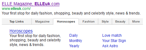
Note how easily users can instantly navigate to the various pages within the horoscopes section and read about their daily, monthly or yearly horoscopes. In this case, Google has correctly pulled the six sitelinks from the main subcategories that appear on the horoscopes' page of Elle UK.
Interestingly, the equivalent tab on Elle.com is called 'Astrology' and on this occasion the sitelinks consist of the daily/weekly/monthly horoscopes, as well as links to three individual horoscopes:
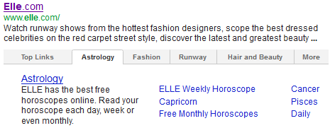
It would be interesting to know if Capricorn, Cancer and Pisces are the three most common horoscopes in the US but the bottom line is that webmasters should be able to update their sites' sitelinks so they include what is really useful to their audience, rather than what Google's algorithm decides is best.
In the following example, Google's choices in the 'Fashion' tab have been very poor.

Browsing the fashion page makes it clear that Trends and News are two very useful subsections to include in the sitelinks but all other sitelinks do not seem to make much sense.
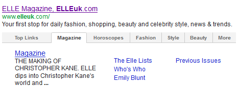
Below is another good example where Google's algorithm does not offer the best available information to the user. The text snippet that appears in the 'Magazine' tab is not fed by the page's meta description, but by some text that appears in the page' source code, which is not even visible to the user when the page loads. Definitely, 'The Making of Christopher Kane' is not the best phrase to describe what the magazine is about.
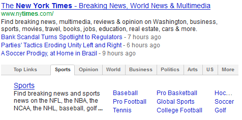
The New York Times appears with nine tabs, which is not very common but it seems to be due to the short category names Google has chosen to display in the tabs:
Ecommerce Sites
The potential of the new sitelinks format for Ecommerce sites is enormous. Popular categories can acquire their own tabs, and popular subcategories can become more visible, increasing user click-through and traffic to those deeper pages. On the other hand, digital marketers would need to adapt their online content strategies accordingly as the user journey for many users will become shorter.
With the new sitelinks the number of users bypassing the homepage will increase, therefore things like offers and special deals would need to become prominent in the deeper pages too. Of course this is not something new, but will definitely carry more weight after the tabular sitelinks are rolled out.
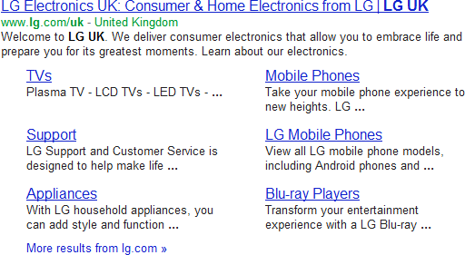
The following screenshot is a very good example of the new traffic opportunities that open up for LG UK from different product ranges that appear in the 'Appliances' tab:

Without any doubt, the above format is more user friendly compared to the previous sitelinks format (below) as it provides several navigational paths into six different appliance types.
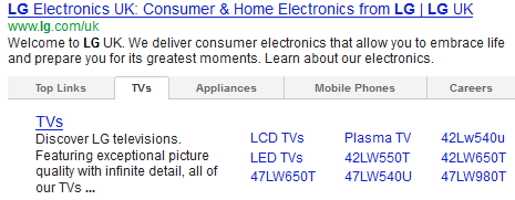
What is also interesting is the number of sitelinks a tab can contain. In the following example, the 'TVs' tab for LG UK includes 10 sitelinks altogether, pointing to a combination of category and product pages.
On the other hand, looking at a similar tab on Comet, there seems to be quite a few issues, probably due to Google's interpretation of the site's structure and internal linking:
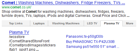
Note that:
- The description of the tab includes file locations from the page's source code, which is not useful to users
- The product titles are far too long, resulting in just three product pages appearing as sitelinks
As it has already been mentioned, with the use of tabs in sitelinks, the number of pages that become available to users can increase significantly. The tabular listing of the Next retail site consists of eight tabs and an outstanding number of 53 sitelinks in total.
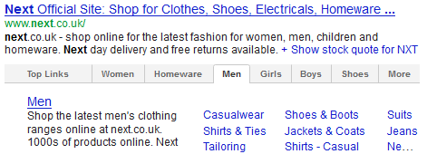
Note that the 'Men' tab alone contains 10 sitelinks, although one of them has been truncated in a rather odd way making it impossible to read.
On the other hand, in the following tab from the Marks & Spencer's listing there is room for more sitelinks in the 'Food & Wine' tab. Alsom the populated sitelinks do not seem as the most representative ones for the Food & Wine section.
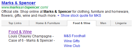
Harrods get awarded six and much more relevant sitelinks into their 'Food & Wine' tab.
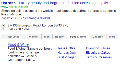
Wouldn't Marks & Spencer's like to be able to amend their sitelinks so they can better reflect the products available within the Food & Wine section?
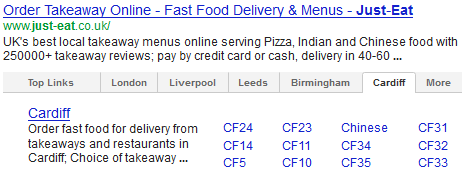
The maximum number of sitelinks in one tab I came across is 13 as in the following example:
Travel Sites
Brands within the travel sector are also very likely to benefit from the new sitelinks layout as the most popular services and destinations are likely to appear as individual tabs. Users starting their journey from the site's homepage, would need more time and effort to access those pages. This is how users interested in P&O Cruises can get a quick glimpse of the main boats as well as links to specific sections for each boat.
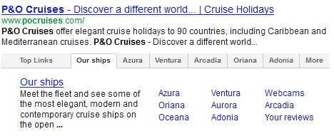
For each one of the most popular boats, there is a dedicated tab offering several options such as information about the cabins and decks, reviews and access to webcams.

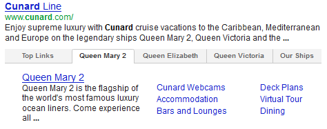
Google offer a very similar user experience for the Ventura and Queen Mary 2 cruise ships even though they belong to totally different sites.
However, Google is still testing the tabbed sitelinks layout which certainly has quite a few flaws and isn't ready yet. Browsing Easyjet's sitelinks from within the UK, one of the tabs appeared in German although all other tabs appeared in English.

Conclusion
It will be very interesting to see whether and when the sitelinks tabs will start appearing in the SERPs for everyone. The new layout should help users navigate sites more easily and quickly too as it provides an increased number of shortcuts to a site. It seems that with this update Google is trying to address common usability and site performance issues, aiming to improve the overall user experience allowing searchers to quickly find what they are looking for.
As some of the previous examples demonstrate, some of the tabs and sitelinks Google offers by default are not always useful. Even though such issues may be caused by a site's structure and internal linking, there needs to be a better way for webmasters to influence how sitelinks appear in Google's SERPs. Demoting sitelinks URLs via Webmaster Tools won't be enough to offer a great user experience. Introducing extra functionality in Webmaster Tools, so webmasters can work more on their own sitelinks, would be more beneficial. Alternatively, some special HTML markup could be used.
As already discussed, the new, tabbed mega sitelinks will almost certainly affect several analytics metrics and the impact will be bigger on those sites with higher volumes of branded traffic. For more information on how the new sitelink format could affect traffic, pageviews, bounce rate and other areas, please refer to the '10 Ways Tabular Site Links Could Affect Online Businesses'.
Note: I would like to thank my colleagues Adam Skalak, Luke Smith and Allyson James for their valuable comments and feedback, which have definitely influenced parts of both posts.



Comments
Please keep your comments TAGFEE by following the community etiquette
Comments are closed. Got a burning question? Head to our Q&A section to start a new conversation.