Illustrating the Long Tail
The author's views are entirely their own (excluding the unlikely event of hypnosis) and may not always reflect the views of Moz.
The long tail of search demand has been around since the dawn of web search and, since that time, search marketers have been attempting to tap into the powerful stream that high quantities of unique content can provide. I recently came across some great data from Hitwise (about 1 year old, but still highly relevant) showing off just how substantive the long tail can be. Bill Tancer's post - Sizing Up the Long Tail - gives some stats:
...the head and body together only account for 3.25% of all search traffic! In fact, the top terms don’t account for much traffic:
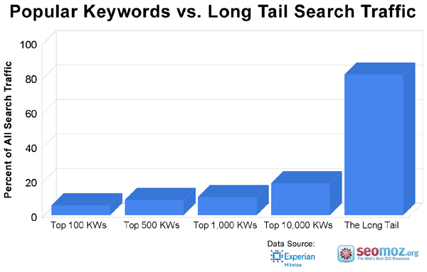
• Top 100 terms: 5.7% of the all search traffic
• Top 500 terms: 8.9% of the all search traffic
• Top 1,000 terms: 10.6% of the all search traffic
• Top 10,000 terms: 18.5% of the all search trafficThis means if you had a monopoly over the top 1,000 search terms across all search engines (which is impossible), you’d still be missing out on 89.4% of all search traffic. There’s so much traffic in the tail it is hard to even comprehend. To illustrate, if search were represented by a tiny lizard with a one-inch head, the tail of that lizard would stretch for 221 miles.
Top 10,000 Search Terms by Percentage of All Search Traffic
The truth is my research is still greatly understating the true size of the tail because:
• The Hitwise sample contains 10 million U.S. Internet users and a complete data set would uncover much larger portions of the long tail.
• The data set I used filtered out adult searches.
• I only looked at 3-months worth of data (which were some of the slower months for search engines).
To help put this in perspective, I made a few spiffy charts that can help to illustrate these points:
In this first chart, you can see a representation of Hitwise's data from the four chunks Bill broke down.
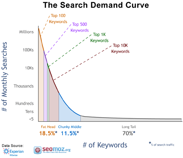
In this next representation, I'm showing the classic "long tail" style curve, but color-coded to help show the various areas of keyword demand. Note that you could conceptually say that the 9,000 of the top 10,000 terms should technically fit into the chunky middle. Bill classified them thusly in his post, but I tend to think that at those demand levels, we're still talking about "head" of the curve figures.
For both of these graphics, there's a large, high-res version available by clicking the chart. You can find lots, lots more on our Free Charts page :-)


Comments
Please keep your comments TAGFEE by following the community etiquette
Comments are closed. Got a burning question? Head to our Q&A section to start a new conversation.