
Link Profile Tool to Discover Paid Links or Other Anomalous Linking Activity
The author's views are entirely their own (excluding the unlikely event of hypnosis) and may not always reflect the views of Moz.
NOTE: After publishing the initial version of this post I realised I had a concentration lapse and you actually need the paid API to get the full automation from this tool. I have updated the post now with a work around for those without the API that requires an extra step to export the data from OSE. Sorry about that, folks!
A couple of months ago I got pulled in on a project for a new client, who admitted that their previous 'SEO guy' had bought them some links. Not a lot of links (they didn't have a lot!), but it seemed that had been the extent of their SEO efforts. One of the things we needed to do was evaluate what amount of damage might have been done.
What I'm going to share today is a tool I've built that automates the process I used to evaluate how our clients link profile looked and whether it stood out against other domains in its niche. I'm going to show you the real data I saw for that client (who we knew had bought links) and how you can use the same tool to identify domains that have maybe bought links or other anomalous link profiles. Or you may just want to use it compare your domains link profile to your competitors, and see if anything stands out.
1. The Process
I'd previously encountered a nice way to break down a link profile via my Distilled deskmate, Dave (@dsottimano), and subsequently discovered that Dr. Pete (@dr_pete) had also introduced such a technique in a previous SEOmoz post. The premise of the method is that you break the links to a domain down by the Domain Authority of the linking root domains, and measure how many links are at each level. Here is how Distilled.net's Link Profile looks:
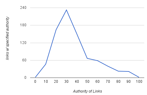
You can also do it via Page Authority, but in this post I'm going to concentrate on DA.
As Dr. Pete discusses in his post, these graphs can in and of themselves be very informative. However, for my purposes I needed to go further: I needed to compare the link profile of our new client to other companies in the same niche and see how far off our client was. As a side note, it is important that you compare like for like when looking at link profiles - different niches tend to have different link profiles.
So, it seemed pretty simple: we'll just chuck the link data for several competitors and our client all on the same graph and all our problems will surely be sorted, right? Here is how the data looked:
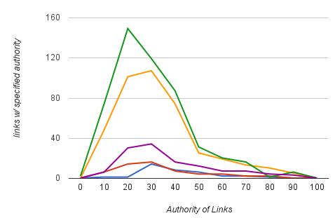
Hrm, ok. This wasn't particularly helpful!
The problem is that different domains of different ages and popularity have different numbers of links. You cannot really see much from this graph, other than how many links each domain has compared to each other, which has far simpler ways to visualise! However, if you normalise this data, accounting for the total number of links by instead examining the percentage of linking root domains each of these domains has for each DA level and we get something quite different:
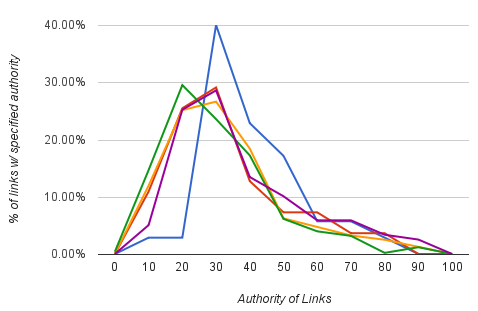
BOOM! Can you guess which one is the client? The blue line stands out like a sore thumb, it doesn't fit to the natural curve of the others. Those of you with sharp eyes will notice that we had less overall links and so with far fewer data points you'd expect the graph to be a bit more jittery than the others. However, the red line shows a competitor with a not dissimilar number of linking root domains and they seem to fit pretty nicely to the curve.
You can see there is a spike where all of a sudden a whole bunch more root domains in the DA 30 bin (relating to a DA of 25-34) are linking in; domains in that range are common candidates for the positioning of paid or spammy links.
If we can spot this so easily, then it seems plausible that Google can too.
Not convinced that the client's link profile is that far off from the others? Let's go wild and do some maths (sorry, I'm British, we do maths not math)…
I did the pairwise Pearson's correlation of the domains, meaning I compared every combination of them and noted their Pearson co-efficient. Using the built in PEARSON() function in Google Spreadsheets you get a number between 0 - 1 to indicate how closely correlated two sets of data are, with 1 being a perfect correlation. I averaged each domains correlation coefficients against the others to produce a graph of how each domain's link profile correlates with all the others on average:
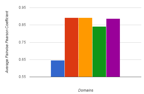
Oh oh. Not looking an better!! This graph isn't perfectly scientific, but it is often both practical and illuminative.
Using the link profile graph, you can begin to identify any anomalies which you think may warrant further investigation, which I go into in section 3 below. You won't always get such a clear cut situation as this, but fairly often you'll turn something up.
Firstly, let's make this all a little easier with the power of the Linkscape API and Google Docs...
2. The Tool
The tool I've put together is built in Google Docs, so it is easy and free for you to make a copy for yourself. The link to the Google Doc is here:
You'll need to be logged in to a Google account to access it; once in go to the File menu and select "Make a copy" to create your own private copy of the tool you can use.
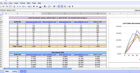
Unfortunately, only after finishing the tool did I realise you can only full automate the process with the Paid API, so with the free API you have an extra step. Please follow the relevant instructions.
Free Account
With the free API you can only get 3 linking root domains via the API, but you can get all you need from OpenSiteExplorer.org. If you aren't registered, get a free community account. Go to OSE and enter your domain and let OSE do it's thing. Then switch to the "Linking Domains" tab at the top:

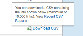
Spot the "Download CSV" link on the right? Click that and wait a moment for the report to process so you can download it.
You'll find 3 sheets; one named 'Data' and one named 'OSE Importer ', you can ignore the 'Config' sheet. Go to the Data sheet where you'll find spaces to enter a list of domains; because you've not entered API details in the Config sheet nothing will happen - it is waiting for import data from OSE.
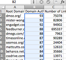
Open the CSV file you downloaded from OSE in either GDocs, Excel or another spreadsheet app. You'll probably find the list of DA figures starts in cell B2; copy that whole column without the header (B2 down to the last entry). Now open the 'OSE Importer' sheet and paste the data under the relevant domain name.
Repeat this process for each domain name you want to analyse and then return to the 'Data' sheet to see the pretty graphs and analyses.
Paid API
You'll find 3 sheets; one named 'Data' and one named 'Config', you can ignore the 'OSE Importer' sheet. In the Config sheet you'll find a space to enter your SEOmoz API details; I use the Links API and only the free elements so you don't need a Pro account. However, without a Pro account you'll be limited to 1000 root domains, so if you want to run this analysis on bigger domains bear that in mind. If you don't know your API details then you can grab them from the API page. You can also select how many root domains you'd like to include (todo small: if you are looking to investigate very large domains (above 10,000 linking root domains) then Google Docs will struggle to manage without using the APIs pagination facilities which I've not included here).
Now go to the Data sheet where you'll find spaces to enter a list of domains; do so without including the http:// portion of the URL. The graphs and data should begin to automatically populate the spreadsheet, and now if you scroll over a bit you'll find your link profile graph waiting for you.
3. Uses
Awesome, so now you can profile various domains links, what can you actually do with it?
Firstly, a few points to bear in mind:
- Not all anomalies are paid links or something else dodgy
- It can be fairly common for multiple domains in a niche to be employing dodgy tactics. Be aware.
- Basically, the tool will point you in the right direction, but you need to investigate.
So, I think there are probably a lot of uses for this sort of graph, so please make suggestions in the comments. I'll get the ball rolling:
- Identifying possible link buying or other spam linking.
- Verify the link health of new customer.
- Discover powerful link strategies your competitors are using (i.e widgetbait, link-potent PR etc).
- Just for the sheer fun of seeing how you domain fits in against the others in your niche.
Things to look for on the graphs:
- Is there a disproportionate spike in the number of low to mid strength inbound links?
- Is a particular domain more successful in attaining higher quality links on average?
- Do any of the domains not fit to an approximate bell curve type profile?
4. A Quick Test
As is known, GoCompare.com previously bought links, and not good quality links like some of their competitors were maybe doing, but really low-quality spammy links. So, let's see if we can pick up those remnants (the problem with mass buying of links is it is hard to clear them up) with the tool. I threw GoCompare.com into the tool along with competitors of theirs that I grabbed from the first page of results for the search 'car insurance': morethan.com, admiral.com, elephant.co.uk and lv.com.
Here's the link profile:
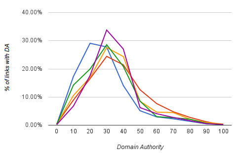
We can see that GoCompare.com (blue) and LV.com (purple) are both slightly outlying. Also note that the GoCompare spike occurs around the DA 20 range - indicating low-quality links as was reported. Lets take a look at the average correlations:
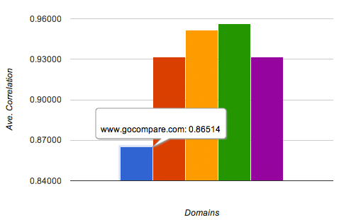
We can see that whilst GoCompare correlates well with the others, it is the furthest off. Whilst not conclusive, it seems to suggest that they are working on it but still have a bit more work to do. With this example, we again knew what we were looking for, but hopefully you can see that if we were just looking to confirm suspicions or do a bit of research, this tool can help you along the way.
5. Wrap Up
The tool I've presented is not supposed to be an in depth analysis, but as part of your armoury it can allow you to very quickly and very easily evaluate a domains link profile and hopefully gain some insight into where to dig deeper.
It seems that SEOmoz have got yet more awesomeness up their sleeves in the coming months, including rolling out an improved Domain Authority algorithm that is going to more closely correlate with the SERPs. That change will likely improve the potency of this tool yet further.
If you have suggestions of other applications or similar techniques you are using, please do share in the comments! :)


Comments
Please keep your comments TAGFEE by following the community etiquette
Comments are closed. Got a burning question? Head to our Q&A section to start a new conversation.