
My Presentation Creation Process
Last year, I created 44 unique presentations, delivered via a variety of mediums - webinars, keynotes, private presentations and conference panels. It's certainly not a skill I've perfect, but it is something I've been asked about quite a bit, so I thought I'd share my methodology and some examples in the hopes that it can help those of you who've learned to love (or at least live with) Powerpoint.
Step 1: Understanding the Presentation's Goals & the Audience
Before I start a deck, I try to learn as much about the audience attending the event/presentation as possible. When it comes to our PRO member webinars, we have lots of survey data and direct feedback, but for outside events, it's critical to connect with the organizers. Here are 5 questions I like to ask:
- What roles/titles are represented in the audience? What do the attendees do for a living and to whom are they reporting?
- What level of knowledge do they have about the topic? How many years of experience are likely under their belts?
- How do these folks hope/intend to apply the knowledge? What do they want to accomplish
- What segment(s) are being targeted by attendees? Are they B2B/B2C, small-medium business, enterprise, agency, consultant, etc.?
- How long do I have to present and how much time should be left for Q+A?
If you forget #5, you can often run into lots of trouble - make sure to get that one :-)
Step 2: Build an Outline in Email
It might seem like an odd way to craft a presentation outline, but I love to use my Google mail account. It autosaves, it can be accessed on my mobile if I want to add/edit/review and I don't need to worry about which computer (home/work/laptop) it's on.
A sample outline might look like:
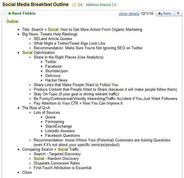
The outline above comes from a presentation I gave in November to the Social Media Breakfast Club in Seattle (at the kind request of Kristy Bolsinger).
The outline accomplishes several key goals:
- It can be easily shared in email with organizers or team members for a review prior to building out the Powerpoint
- I can review it from a narrative perspective to see if the slides and concepts are going to create an intelligent "flow"
- If there's any additional research or digging around I need to do ahead of time, the outline can help indicate where those might exist
- I can copy and paste any relevant URLs into the outline directly and use them as references later on
- It's easy to put alongside Powerpoint on a wide monitor so I have a perspective on the outline while I'm building the deck in an adjacent window
Step 3: Create a Presentation Shell
Next, I build an "empty shell" presentation in Powerpoint using a template. Most often, that's the SEOmoz template, featuring lots of Roger and a consistent color scheme, but some events have their own requirements around templates and in those instances, I'll build the shell from their example.
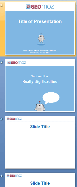
The shell is especially easy to build because I can put it alongside the email with my outline and simply work from that spec, massaging slide titles, etc. One piece that's key for me is the segmentation of themes/topics. Whenever I move from a topic/discussion point to a whole new area, I use transitional slides that signal to the audience we're moving on. These slides in the SEOmoz template are blue and contain only a headline + Roger mozBot and his word bubble. I typically fill these with something relevant or fun.
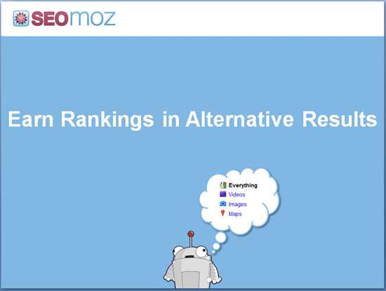
In the transitional slide example above, the section covers inclusion in vertical/universal-style listings. Hence, Roger's alluding to Google's left-hand search menu.
Step 4: Add Pictures, Screenshots and Graphics
The next step is typically the most time-consuming and challenging.
My goal is to have as few words and bullet points in slides as possible (using them only where necessary). Thus, 90%+ of my slides are usually graphics, screenshots, diagrams, charts or drawings that represent the tactic or idea I'm attempting to convey. As you might imagine, this gets hard (which is why many presenters use the simpler bullet point/text format).
Below are a few examples of the types of slides I like to create:

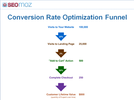
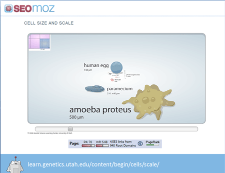
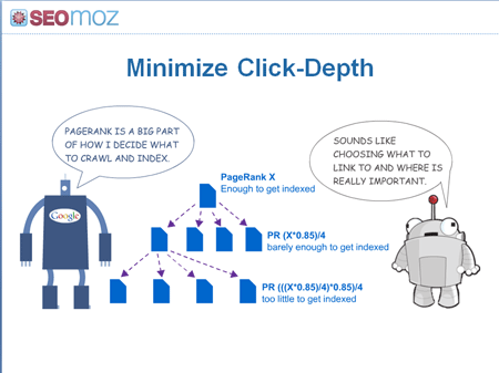
I worry less about making beautiful, aesthetically-pleasing slides and more about graphics that help tell the story effectively. That said, I'm insanely jealous of those who manage to mix both phenomenal design/layout and powerful storytelling into their slide art. In the future, it's possible I might hire help specifically to help create those stunning, well-designed types of slide decks (currently, I make all my own decks).
NOTE: SEOmoz uses Shutterstock's stock photography, but I also will sometimes using Creative Commons licensed photos from Flickr (and/or anything my wife takes).
Step 5: Insert Highlights, Arrows & Effects
Once the graphics are in, I'm in polishing mode. Oftentimes, that means adding effects to the deck, though I try to be very minimalist with these. You can see a few examples below:
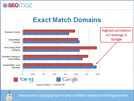
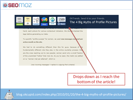
I almost never use visual effects like fade-in/out, motion, sound, video, etc. Not only are there occasional (and painful) compatability problems with these features, but I haven't found them useful 90%+ of the time I see them or have tried to apply them.
Step 6: Run it By My Team / the Organizer(s)
Last, but not least, I send the slide deck out for feedback, either to SEOmoz's marketing team and/or to the organizers of the event. In the example below, Jen Lopez's feedback was invaluable. I added 4 additional slides covering the concepts she mentioned and it seriously improved the webinar we gave.
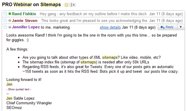
Even if I'm creating ~4 slide decks each month, the opinions and insight of others is invaluable to making every presentation better. When I don't have this luxury (up late the night before a presentation making something), it's never as good.
Below are a few embedded finished products:
Some Caveats to this Process
The methodology I described won't work well for everyone, and I should make some more things clear:
- I don't create or memorize a script, but I do rely on the slide deck itself to provide an order and narrative to the story I'm telling.
- I only present on topics I've personally invested time and energy into doing (and thus can feel confident about adding value). I'll occasionally talk about a topic about which I'm not extremely proficient (e.g. raising venture capital, which I failed at in 2009), but these are rare and include lots of caveats.
- I've tried some other formats, like an all-whiteboard-drawn presentation and using Prezi (like Martin Macdonald's brilliant one on the MayDay update) and even, long ago, some hand-made, Flash slide decks. None have worked as well for me personally, though I certainly encourage others to get creative and give it a shot.
- I often re-use slides, individual graphics, charts and talking points, but I almost never give the same presentation twice. Although audiences differ, there's frequently at least some overlap (often other speakers) and the world of web marketing/SEO moves so quickly that it demands fresh content and topics. I've also found that I'm best when giving a presentation for the first time - I'm more excited about the material and it shows through in my delivery.
- I set a goal of being in the top 3-5 presentations as rated by the audience at any given event. Someday, I hope to improve that goal to #1, but currently, . I'm religious about asking organizers for my scores and any written feedback to help improve. To date, nearly every time I present, there are a small handful of comments asking for more basic, beginner-level content and a slightly smaller handful who request more advanced material. Someday, I hope to find a balance, though I suspect this will always be challenging.
- I have several verbal disfluencies that frustrate me and that I intend to work on diligently this year. As I recently tweeted, I'm going to look into a professional coach / trainer to assist (recommendations are welcome!).
Hopefully, you can put this methodology (or portions of it) to good use and crank out some awesome presentations of your own!
p.s. If you want to see some of the best in action, join me (and the Distilled team) in London on March 18th and/or New Orleans on March 25th for the first ever Link Building Conference. I expect it to be phenomenal.
p.p.s. One important note (from my personal experiences) - when giving presentations in the US/Canada, Q+A is often a big part of the event and very important to attendees. In the UK, Australia, New Zealand + Germany, it's slightly lower. In other countries Q+A can be very, very dead, (even if private Q+A after the session is very lively) so make sure to plan accordingly.
The author's views are entirely their own (excluding the unlikely event of hypnosis) and may not always reflect the views of Moz.


Comments
Please keep your comments TAGFEE by following the community etiquette
Comments are closed. Got a burning question? Head to our Q&A section to start a new conversation.