
Successful Site Architecture for SEO [SES London 2011]
For today’s blog post, I’m going to write about my favourite topic of all, site architecture for SEO. This write up is based on my recent presentation at SES London 2011, and rather than just posting the slide deck I thought it might be fun to write up a few of the slides with a commentary for each.
To help me recall all of the points I made, I’ll imagine myself stood at a podium with my speaker lanyard round my neck while I’m writing...
What is site architecture?
For me, great site architecture is all about improving how users and search engines find their way around your site. It’s about getting the best, most relevant content in front of users and reducing the number of times they have to click to find it. The same applies to search engines, by flattening your site architecture; you can make potential gains in indexation metrics such as the number of pages generating search engine traffic and the number of pages in a search engine index.
How many clicks from your homepage to your deepest content?
If you’ve never watched Rand’s Whiteboard Friday on Flat Site Architecture, you definitely should. The principle of reducing the number of clicks between your homepage and your deepest layer of content is as important today as it was back in March 2009:
SEOmoz Whiteboard Friday - Flat Site Architecture from Scott Willoughby on Vimeo.
What does a not so good site architecture look like?
Let me explain with this handy diagram:
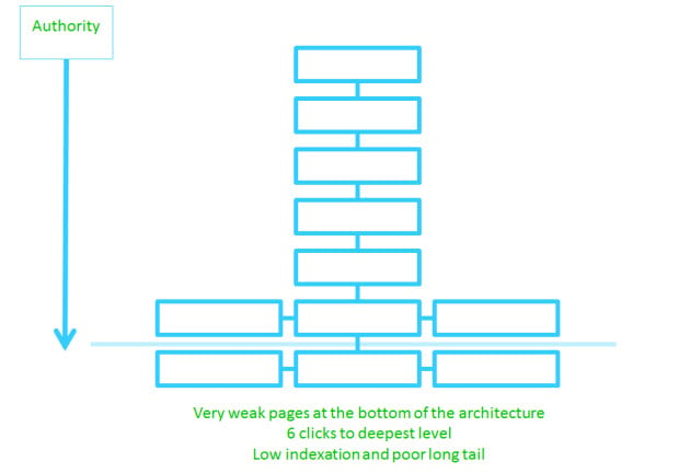
Imagine this sitemap describes a very simple site layout. To get all the way to the bottom (the very deepest layer of content) search engines and users are expected to embark on a 6 click descent. That’s a lot of clicks! That level of depth certainly isn’t ideal; you might expect pages that are deeply buried in the architecture to have fewer internal links and be less visible in search engine results, even for very long tail queries.
Creating a flatter site architecture
Most SEOs argue that pages buried very deeply in the architecture might not receive enough link juice to be visible in search engine rankings. Certainly it remains true that by promoting content “up” the architecture, you can improve its overall rank. This process is called “flattening”.
Let me explain with this handy diagram: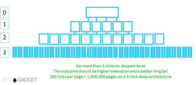
Here, we've increased the number of links on each page and reduced the number of clicks to the very deepest level of content, effectively flattening the site architecture.
There’s another important point that’s worth covering before we move forward. The concept of cross linking and silos.
What’s a Silo?
In a really simple sitemap, pages tend to link down to their "children". The homepage links to a category level page, and category pages link to product pages. Sometimes, a child can link back to a parent via the breadcrumb.
In this situation, you’ve got a vertical silo. There’s lots of link juice flowing down your site architecture, but not across.
Let me explain with this handy (but not quite so well drawn) diagram:
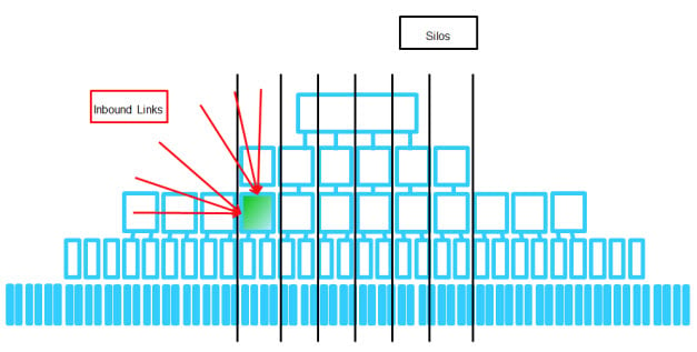
You can see in the diagram, we’ve got a well linked to internal page stuck in a silo. A useful way to solve this problem is to devise methods to cross link your content, focusing on what users might find handy in their journey around your site.
Here are a few examples of cross links in travel, retail and article based architectures:
.jpg) Travel
Travel
- Similar destinations
- Nearby hotels / Landmarks
- Most popular / top countries
- Most popular / top cities
- Recently reviewed locations / hotels / resorts
Retail
- Popular products in this category
- Related (complimentary) products
- Users who viewed this item eventually bought
- Top rated / recently reviewed items
- Frequently searched items / categories
Articles / Blogs
- Similar posts
- Popular posts
- Recent comments
.jpg)
Sometimes improving your cross link strategy can be as simple as reviewing your site wide links. Here’s an example of a “top products” navigational element on a retail site on this “mother’s day gifts” category page. Our friends at PrezzyBox vary their links based on the page the user is on, creating more cross links and potentially adding more user value at the same time.
Navigation that reflects user behaviour
What are users looking for when they land on one of your pages? Sometimes, they tell you. When was the last time you looked at your internal site search data on a page specific level to find out?
In analytics, head to Content > Site Search and take a look at the “Top Searched Content” report. You’ll see the number of searches conducted on your site by URL and you can drill down to find out what those search terms were.

If users are looking for a very specific thing on one of your webpages, and they’re frequently having to search, maybe they can’t see it on the page. Try creating navigation to reflect internal site search behaviour.
Firebox.com link to popular searches from their homepage. These links could easily be swapped with links to the most relevant category page or product but either way, it's pretty easy to see what's popular on their site and I imagine it's a potential usability / CRO win too.

You want how many links on my homepage?
In my presentation I acknowledged that sometimes, it’s hard to fit in all the links we need on a page while maintaining the integrity of the site design. In my presentation I gave a special nod to two examples of navigation that I think are pretty cool for users and work just fine for search engines.
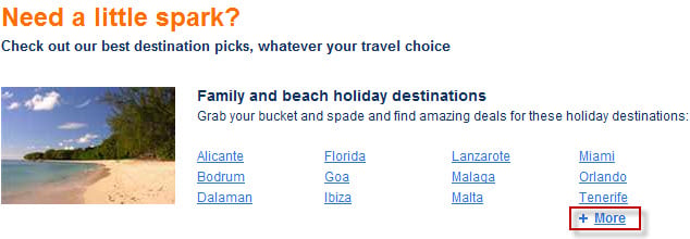
Cheapflights have CSS styled dhtml drop down style navigation on their homepage to show more links to destinations of interest to their visitors. If a user clicks “more” they get more options.
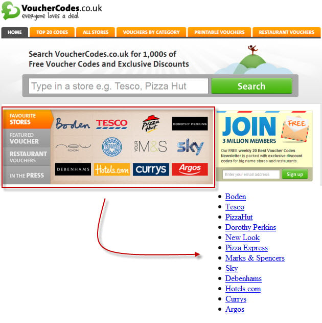
I’ve liked the vouchercodes.co.uk architecture for a long time. They code very nicely too. Check out this CSS styled carousel on their homepage. The links are marked up nicely, visible in text only mode (as the diagram shows), the CSS takes care of the layout and images and a little JavaScript takes care of the rest.
![]()
I covered a lot more examples in the presentation, but those were my favourite. Here's the slide deck for the rest: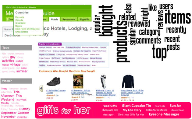
Architecture is more than just internal links
Obviously there’s a lot more to site architecture than internal links – I’d be honoured to take requests for future posts, so if there’s something you’d like to see covered, let me know in the comments.
In the mean time, if you'd like the slide deck, head over to Scribd or download it from our downloads page.
The author's views are entirely their own (excluding the unlikely event of hypnosis) and may not always reflect the views of Moz.


Comments
Please keep your comments TAGFEE by following the community etiquette
Comments are closed. Got a burning question? Head to our Q&A section to start a new conversation.