Working with Navigation in SEO [SEO Fundamentals]
The author's views are entirely their own (excluding the unlikely event of hypnosis) and may not always reflect the views of Moz.
Building a solid foundation in your site architecture using search engine friendly navigation is a founding principle in good search engine optimization, but what does that actually mean, and what recommendations can you make to enhance your clients (or your own) SEO?
In this article, we’ll look at a few examples of well coded, search friendly navigation and look at ways to enhance your site architecture for SEO.
Technically speaking
What makes for a spider friendly navigation? In today’s out of the box CMS world, most navigation is already pretty SEO friendly, but just every now and again you come across a real car crash of a navigation that needs rebuilding from scratch.
If you’re reviewing a website with a suspect navigation (or "dodgy", as my friends in the US love to hear me say), you’ll probably see some of the following signs:
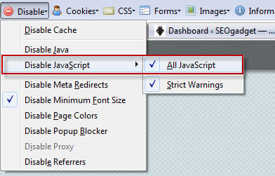
- No drop downs work with JavaScript disabled
- Global / header links are image based rather than text
- A heap of internal links disappear when you’re browsing the site with JavaScript and CSS disabled
- The SEOmoz toolbar reports a lower than expected number of internal, followed links
- The Google cached, text only version of your page is missing those precious internal links too

Search engine friendly navigation requires only properly structured HTML combined with CSS for all the fancy bits. Technically speaking, if you’re specifying a new navigation for your website, you should be asking for a "cross-browser drop-down cascading validating menu". Can you say that 5 times in a row?
The HTML is fiendishly simple, and you should be looking out for something like this unordered list of links in the cached (text only) or CSS / JavaScript disabled view of your web page:
If you want to see a great list of examples you’d be well advised to bookmark CSSplay.co.uk’s CSS menus page and, while I was researching this post, this CSS styled paginated navigation caught my eye, via this post. If you want to see a live example, take a look at this site with JavaScript and CSS disabled in Web Developer Toolbar:

There are so many other examples out there; I think I spent more time clicking around the interwebs than I did putting this post together! If you have some good examples of amazing, search engine friendly navigation be sure to add them in the comments.
Using CSS navigational elements for SEO
Drop down menus needn’t always be “drop down”, as such. Think about it – have you ever had a problem where design wise, it was too difficult to increase the number of internal links you have in a navigational section on your website? Next time you’re in that situation, think about how you might use this approach to increase the number of links on your pages.
Interested in testing this for yourself? Take a look at these navigational ideas:
- View all hotels in Prague
- See events within 500m of this location
- See more case studies on CRM
- See all flights to Turkey
- Other users also bought / most popular products in this category
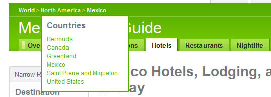
- List the top 6 countries by continent (see example below)
Breadcrumb navigation that expands with a CSS drop down:

A simple example expanding a list of options for a user searching for flights:

Improving your navigation can have a positive impact on your site architecture. By making sure these fundamentals are covered, you can build your marketing efforts on a solid foundation knowing your website is crawlable and super-friendly to search engines. What are your favorite examples of great navigation?


Comments
Please keep your comments TAGFEE by following the community etiquette
Comments are closed. Got a burning question? Head to our Q&A section to start a new conversation.