
Why, Hello There MSN Image Search!
As a writer/editor for Drivl, I do a lot of image searches in order to add relevant, amusing pictures to supplement stories that either I've written or that one of our users has submitted. At first, I would default to Google for all of my image searching needs, but the relevance is often low (and sometimes porn-tastic). Yahoo! Images is sometimes better, sometimes worse in terms of relevance, though it typically provides less results than Google. In my opinion, the clear-cut winner of image search isn't Google or Yahoo!--it's MSN.
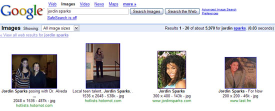
For example, today I was searching for images of Jordin Sparks, an American Idol contestant. A Google image search returns "about 5,790 results," which seems like a lot, but a lot of these images are of the American Idol judges, former American Idol contestants, and even a kitty. Only 11 images out of 20 on the first page of results were actually of Jordin Sparks. In other words, these aren't terribly relevant search results.
A Yahoo! Image search returned about 30 results for "Jordin Sparks." Only 30 results? That's pretty disappointing, although these images were much more relevant than Google's. 18 images out of 20 on the first page were of her, though several out of the 18 were photos of her with a group of people, whereas I was looking for images of her by herself.
Now let's move onto MSN. A search for the American Idol contestant returned "about 1,299" results, which is smack dab in between Google and Yahoo's results. I am presented with row upon row of photos of the grinning teenager. Unlike Google or Yahoo!, these image results are fantastically relevant, with fewer group photos and kitty cats.
Okay, so I'm happy with how relevant MSN's image search results are. What about the interface? Does that beat out Google and Yahoo!? To that question I respond with a resounding "yes."
Here's what Google's image search results page looks like:
Now Yahoo!:
.jpg)
Both sites offer paginated results, displaying 20 results on each page. I found myself clicking through page after page (especially on Google) trying to find an image I wanted to use.
MSN, on the other hand, tries a different approach:
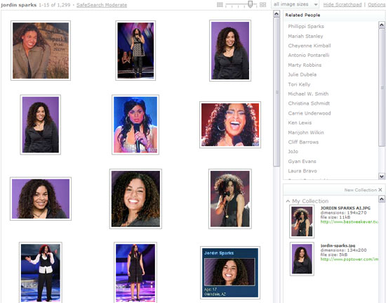
First of all, they don't paginate the results. If you want to see more images, scroll down to the bottom and they'll show you more. I like this because, in my opinion, it makes it easier and faster to scan through all of the images.
Secondly, at the top of the search results there is a little slide bar that allows you to adjust the zoom level on the image sizes--that way, you can choose whether you want to see more images per row (which will be smaller) or less (which will be larger). You can also sort the images by their size, so if you're looking for large images you don't have to waste your time hunting through all of the thumbnails to find the size you want.
My favorite feature is the Scratchpad, which is located on the right side of the results page. As you can see in the above screenshot, it allows you to drag the images you may want and store them in a collection. In the past I would end up downloading tons of images and then have to sift through them on my desktop and eliminate the ones I ultimately didn't want to use. The Scratchpad is an easy, fast way to bookmark any images you may be interested in using.
I also like MSN's interface when you click on an image. Google and Yahoo! both take you away from your search result and emphasize the page the image was originally found on (I didn't screenshot the actual content on each page, just the top of each result):


Conversely, when you click on one of MSN's image search results, you'll open up the original page where the image was found, but the image results are still displayed along the left-hand side. You can click on other results and consequentially change the page in the center.
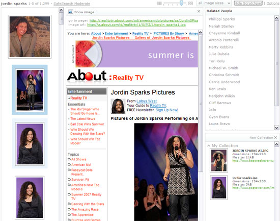
Also, I love that MSN plainly and simply lists the page's URL and the image's URL at the top, thus making both URLs very easy and quick to find, unlike Google ("See full-size image" is four lines above the page's actual URL) and Yahoo! ("View Image" is also four lines above the page's URL).
I really wish Google and Yahoo! would take note of how successful and positive MSN's image search experience is. I am much more satisfied using MSN than the other two engines. (Ask, by the way, returned 14 results. Many of the images returned a Not Found error when I clicked through, and the images themselves were of poor quality.) I'm not sure how many people regularly perform image searches, but I nonetheless feel that the quality of the search experience doesn't need to be compromised, even if it's not a popular feature. MSN proves that by delivering solid search results and a positive experience.
For example, today I was searching for images of Jordin Sparks, an American Idol contestant. A Google image search returns "about 5,790 results," which seems like a lot, but a lot of these images are of the American Idol judges, former American Idol contestants, and even a kitty. Only 11 images out of 20 on the first page of results were actually of Jordin Sparks. In other words, these aren't terribly relevant search results.
A Yahoo! Image search returned about 30 results for "Jordin Sparks." Only 30 results? That's pretty disappointing, although these images were much more relevant than Google's. 18 images out of 20 on the first page were of her, though several out of the 18 were photos of her with a group of people, whereas I was looking for images of her by herself.
Now let's move onto MSN. A search for the American Idol contestant returned "about 1,299" results, which is smack dab in between Google and Yahoo's results. I am presented with row upon row of photos of the grinning teenager. Unlike Google or Yahoo!, these image results are fantastically relevant, with fewer group photos and kitty cats.
Okay, so I'm happy with how relevant MSN's image search results are. What about the interface? Does that beat out Google and Yahoo!? To that question I respond with a resounding "yes."
Here's what Google's image search results page looks like:

Now Yahoo!:
.jpg)
Both sites offer paginated results, displaying 20 results on each page. I found myself clicking through page after page (especially on Google) trying to find an image I wanted to use.
MSN, on the other hand, tries a different approach:

First of all, they don't paginate the results. If you want to see more images, scroll down to the bottom and they'll show you more. I like this because, in my opinion, it makes it easier and faster to scan through all of the images.
Secondly, at the top of the search results there is a little slide bar that allows you to adjust the zoom level on the image sizes--that way, you can choose whether you want to see more images per row (which will be smaller) or less (which will be larger). You can also sort the images by their size, so if you're looking for large images you don't have to waste your time hunting through all of the thumbnails to find the size you want.
My favorite feature is the Scratchpad, which is located on the right side of the results page. As you can see in the above screenshot, it allows you to drag the images you may want and store them in a collection. In the past I would end up downloading tons of images and then have to sift through them on my desktop and eliminate the ones I ultimately didn't want to use. The Scratchpad is an easy, fast way to bookmark any images you may be interested in using.
I also like MSN's interface when you click on an image. Google and Yahoo! both take you away from your search result and emphasize the page the image was originally found on (I didn't screenshot the actual content on each page, just the top of each result):

Google result

Yahoo! result
Conversely, when you click on one of MSN's image search results, you'll open up the original page where the image was found, but the image results are still displayed along the left-hand side. You can click on other results and consequentially change the page in the center.

Also, I love that MSN plainly and simply lists the page's URL and the image's URL at the top, thus making both URLs very easy and quick to find, unlike Google ("See full-size image" is four lines above the page's actual URL) and Yahoo! ("View Image" is also four lines above the page's URL).
I really wish Google and Yahoo! would take note of how successful and positive MSN's image search experience is. I am much more satisfied using MSN than the other two engines. (Ask, by the way, returned 14 results. Many of the images returned a Not Found error when I clicked through, and the images themselves were of poor quality.) I'm not sure how many people regularly perform image searches, but I nonetheless feel that the quality of the search experience doesn't need to be compromised, even if it's not a popular feature. MSN proves that by delivering solid search results and a positive experience.
The author's views are entirely their own (excluding the unlikely event of hypnosis) and may not always reflect the views of Moz.


Comments
Please keep your comments TAGFEE by following the community etiquette
Comments are closed. Got a burning question? Head to our Q&A section to start a new conversation.