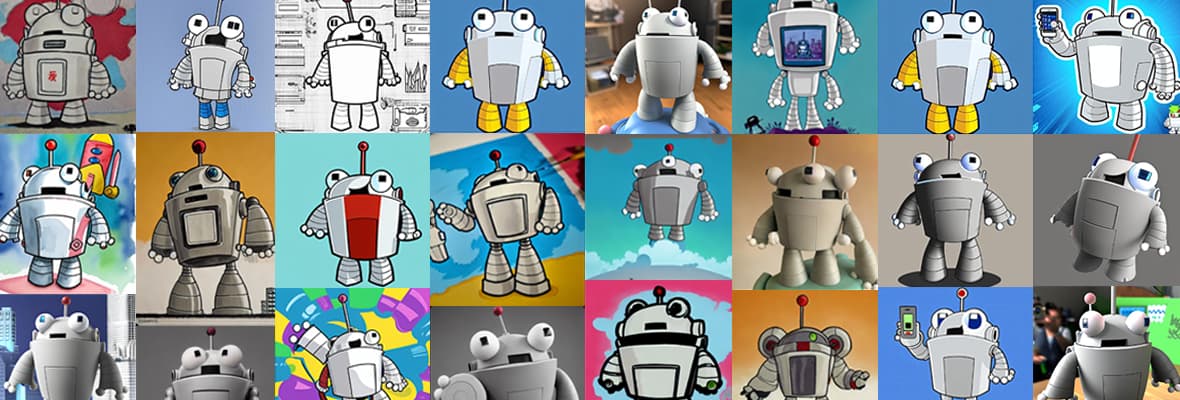

The Mozbot Mashup: Roger Explores the World of Generative AI Imagery
AI image generation has taken big leaps forward in the last year. It’s fun to play with. It’s a little bit weird. It can produce some mind-blowing results — and often laughable ones. But is it useful in a marketing context? We decided to find out, and our valiant SEO robot, Roger, was volunteered to be our first test subject.